-
flex 없이 탭 네비게이션 만들기프론트엔드/CSS 2021. 11. 4. 20:32728x90
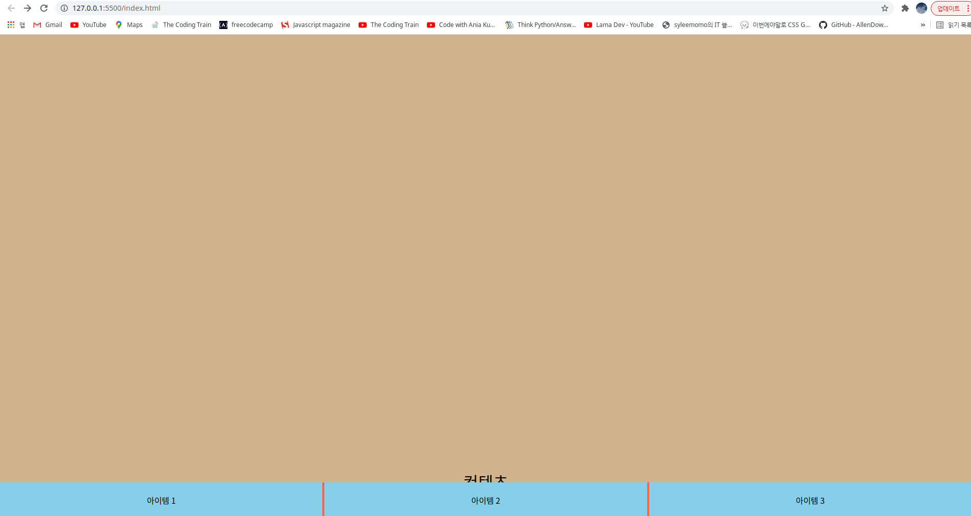
* 기본 구조 만들기
<!DOCTYPE html>
<html lang="en">
  <head>
    <meta charset="UTF-8" />
    <meta name="viewport" content="width=device-width, initial-scale=1.0" />
    <meta http-equiv="X-UA-Compatible" content="ie=edge" />
    <link rel="stylesheet" href="style.css" />
    <title>Flexbox</title>
  </head>
  <body>
    <div id="entire">
      <div id="contents">
        컨텐츠
      </div>
      <div id="container">
        <div class="item">아이템 1</div>
        <div class="item">아이템 2</div>
        <div class="item">아이템 3</div>
      </div>
    </div>
  </body>
</html>
body { padding: 0; margin: 0; } #entire { width: 100%; height: 100vh; } #contents { background: tan; height: 120vh; text-align: center; line-height: 200vh; font-size: 2rem; } #container { width: 100%; height: 70px; background: tomato; text-align: center; position: fixed; bottom: 0; z-index: 1; font-size: 0; /* inline-block의 기본 마진값 제거*/ } .item { width: 33.2%; height: 100%; line-height: 70px; background: skyblue; display: inline-block; font-size: 1rem; /* 부모의 font-size 때문에 설정함 */ } .item:nth-child(2) { margin-left: 0.2%; margin-right: 0.2%; } @media screen and (width: 375px), (width: 360px) { .item { width: 33%; height: 100%; line-height: 70px; background: skyblue; display: inline-block; font-size: 1rem; /* 부모의 font-size 때문에 설정함 */ } .item:nth-child(2) { margin-left: 0.5%; margin-right: 0.5%; } }컨테이너 너비가 100%이고 마진이 0.4%일때 남는 공간은 99.6%가 되고 아이템의 너비는 3등분하면 33.2%가 된다.
inline-block 의 기본 마진을 제거하려면 컨테이너의 font-size를 0으로 설정하면 된다.
탭 네비게이션 만들기 * 응용하기
Symbol
What is it? These special symbols are real text and available to copy and paste to anywhere, such like Microsoft Word, Facebook, Twitter, HTML or Blogging. Click icon to copy to clipboard Recently Used This will automatically collect your most recent and f
www.piliapp.com
<!DOCTYPE html>
<html lang="en">
  <head>
    <meta charset="UTF-8" />
    <meta name="viewport" content="width=device-width, initial-scale=1.0" />
    <meta http-equiv="X-UA-Compatible" content="ie=edge" />
    <link rel="stylesheet" href="style.css" />
    <title>Flexbox</title>
  </head>
  <body>
    <div id="entire">
      <div id="contents">
        컨텐츠
      </div>
      <div id="container">
        <div class="item">Home</div>
        <div class="item">About</div>
        <div class="item">Setting</div>
      </div>
    </div>
  </body>
</html>
body { padding: 0; margin: 0; } #entire { width: 100%; height: 100vh; } #contents { background: tan; height: 120vh; text-align: center; line-height: 200vh; font-size: 2rem; } #container { width: 100%; height: 70px; background: tomato; text-align: center; position: fixed; bottom: 0; z-index: 1; font-size: 0; /* inline-block의 기본 마진값 제거*/ } .item { width: 33.2%; height: 100%; line-height: 70px; background: skyblue; display: inline-block; font-size: 1.5rem; /* 부모의 font-size 때문에 설정함 */ } .item:nth-child(1)::before { content: "☃"; padding-right: 5px; } .item:nth-child(2)::before { content: "☎"; padding-right: 5px; } .item:nth-child(3)::before { content: "❆"; padding-right: 5px; } .item:nth-child(2) { margin-left: 0.2%; margin-right: 0.2%; } @media screen and (width: 375px), (width: 360px) { .item { width: 33%; height: 100%; line-height: 70px; background: skyblue; display: inline-block; font-size: 1rem; /* 부모의 font-size 때문에 설정함 */ } .item:nth-child(2) { margin-left: 0.5%; margin-right: 0.5%; } } /* 네비게이션 아이콘만 나타나게 함 */ @media screen and (width: 320px), (width: 280px) { .item { font-size: 0px; } .item:nth-child(1)::before { font-size: 1.5rem; content: "☃"; padding-right: 5px; } .item:nth-child(2)::before { font-size: 1.5rem; content: "☎"; padding-right: 5px; } .item:nth-child(3)::before { font-size: 1.5rem; content: "❆"; padding-right: 5px; } }
아이폰 S5 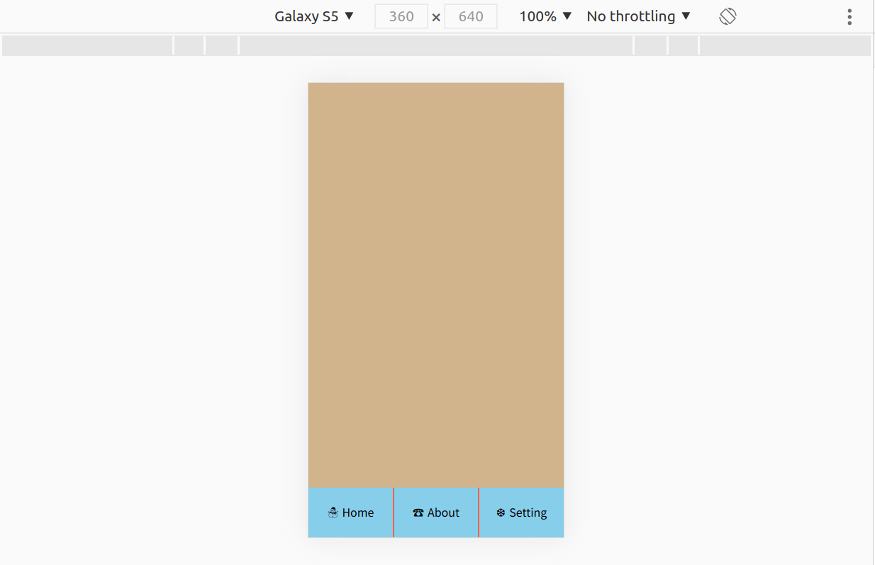
갤럭시 S5 728x90'프론트엔드 > CSS' 카테고리의 다른 글
Flexbox 수업 - 요약 (0) 2022.07.06 flex 로 블로그 레이아웃 만들기 (0) 2021.11.04 flex 없이 중앙정렬하기 (0) 2021.11.04 flex 없이 카드 레이아웃 만들기 (반응형 포함) (0) 2021.11.04 칼럼 (Column) 레이아웃 (0) 2021.10.24