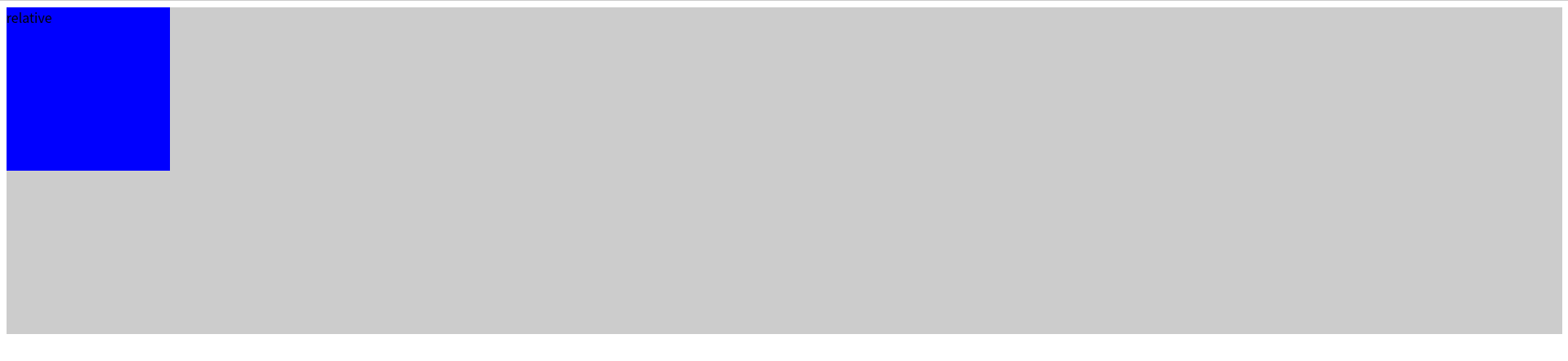
* position: relative - 자신의 현재위치를 기준으로 상대적으로 배치
실습을 위하여 아래와 같이 코드를 작성한다.
<!DOCTYPE html>
<html lang="en">
<head>
  <meta charset="UTF-8">
  <meta http-equiv="X-UA-Compatible" content="IE=edge">
  <meta name="viewport" content="width=device-width, initial-scale=1.0">
  <title>Document</title>
  <link rel="stylesheet" href="style.css">
</head>
<body>
  <div class="container">
    <div class="static">static</div>
    <div class="relative">relative</div>
  </div>
</body>
</html>
.container{
background-color: #ccc;
}
.static, .relative{
width: 200px;
height: 200px;
}
.static{
background-color: yellowgreen;
}
.relative{
background-color: blue;
}
.container{
background-color: #ccc;
}
.static, .relative{
width: 200px;
height: 200px;
}
.static{
background-color: yellowgreen;
}
.relative{
background-color: blue;
position: relative; /* 추가 */
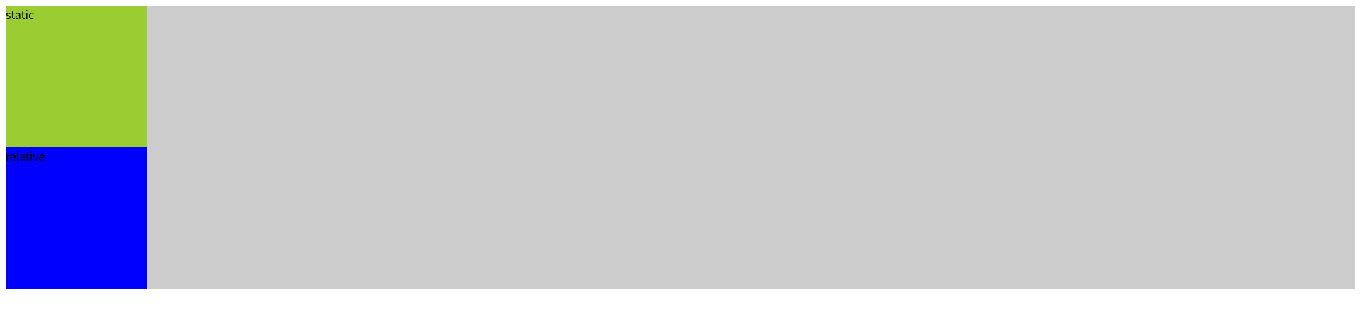
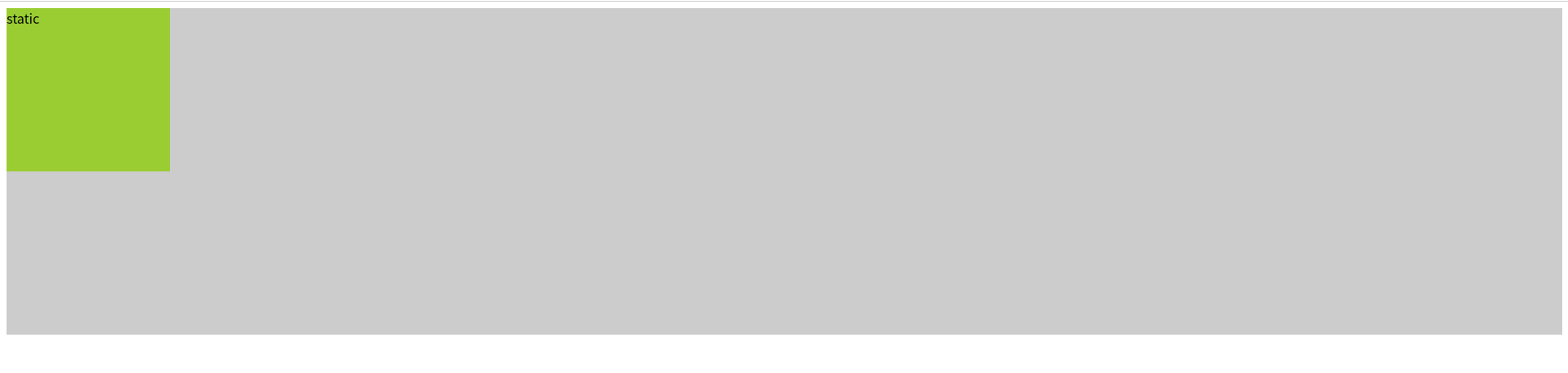
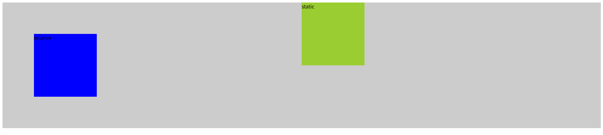
}relative 클래스가 적용된 요소에 position: relative 를 적용하더라도 아무것도 변하지 않는다. 하지만 이제부터 relative 가 적용된 요소는 다른 요소와는 독립적으로 위치를 잡을수 있는 준비상태가 된다.
.container{
background-color: #ccc;
}
.static, .relative{
width: 200px;
height: 200px;
}
.static{
background-color: yellowgreen;
}
.relative{
background-color: blue;
position: relative; /* 추가 */
top: 50px; left: 50px; /* 추가 */
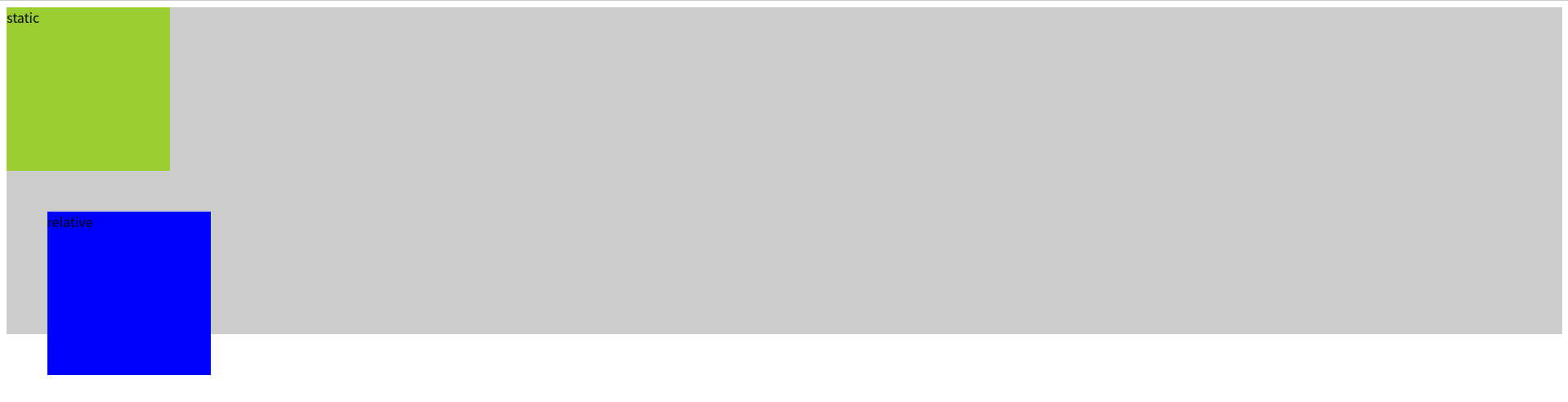
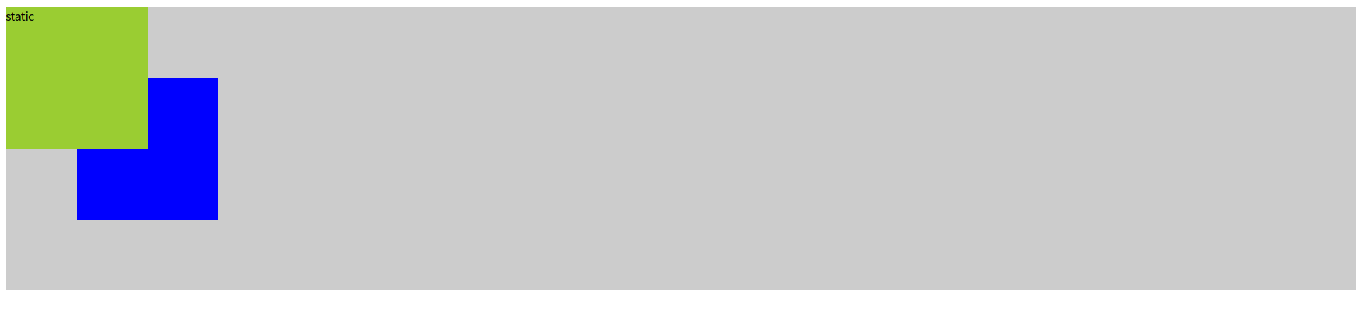
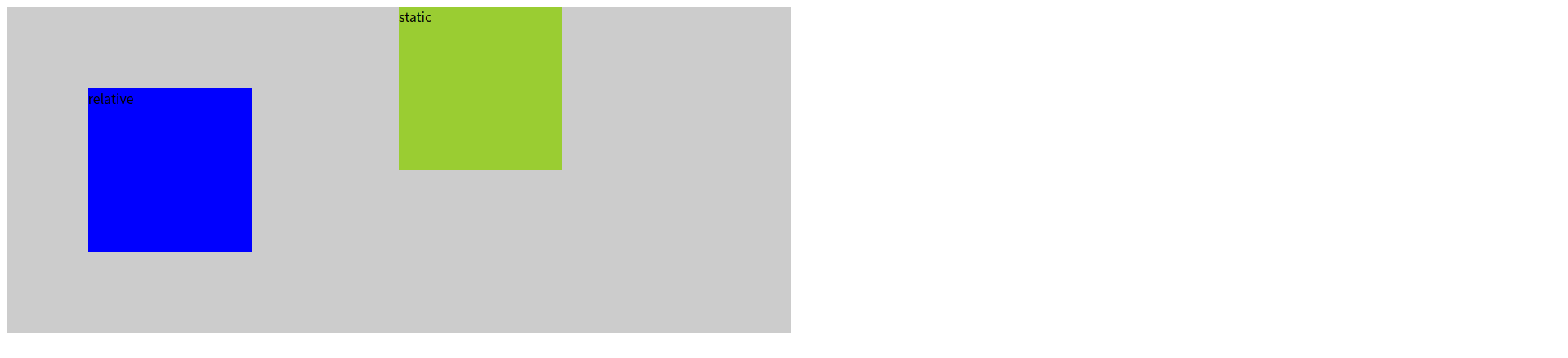
}이제 relative 클래스가 적용된 요소의 위치를 조정하기 위하여 left, top 속성을 추가하였다. 아래와 같이 자신의 현재 위치에서 left, top 속성값만큼 상대적으로 위치가 움직인다. 이때 statice 클래스가 적용된 요소와 컨테이너의 위치에는 영향을 주지 않고 독립적으로 움직인다.
.container{
background-color: #ccc;
}
.static, .relative{
width: 200px;
height: 200px;
}
.static{
background-color: yellowgreen;
}
.relative{
background-color: blue;
position: relative; /* 추가 */
top: -50px; left: -50px; /* 추가 */
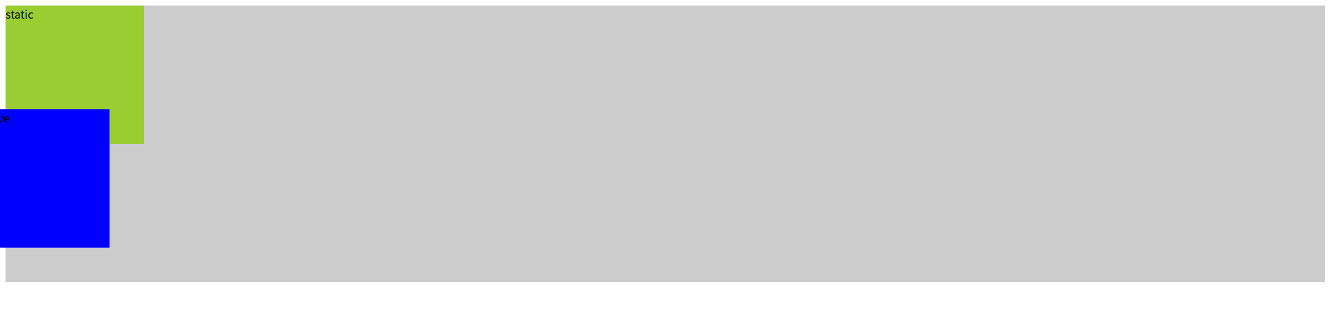
}left, top 에 음수값을 설정하면 아래와 같이 요소의 위치가 왼쪽, 위쪽으로 이동한다.
.container{
  background-color: #ccc;
}
.static, .relative{
  width: 200px;
  height: 200px;
}
.static{
  background-color: yellowgreen;
}
.relative{
  background-color: blue;
  position: relative; /* 추가 */
  top: -200px; left: 0px; /* 추가 */
}
이때 top 을 요소 높이와 동일하게 음수값으로 설정하면 아래와 같이 두 요소가 겹치게 된다. relative 클래스가 적용된 요소가 나중에 위치하기 때문에 위쪽으로 올라온다.
만약 겹친 상태에서 static 클래스가 적용된 요소가 위로 올라오려면 어떻게 하면 될까?
.container{
  background-color: #ccc;
}
.static, .relative{
  width: 200px;
  height: 200px;
}
.static{
  background-color: yellowgreen;
  z-index: 1; /* 추가 */
}
.relative{
  background-color: blue;
  position: relative; /* 추가 */
  top: -200px; left: 0px; /* 추가 */
}
위와 같이 static 클래스가 적용된 요소에 z-index: 1 을 설정하더라도 아무런 변화가 없다.
.container{
  background-color: #ccc;
}
.static, .relative{
  width: 200px;
  height: 200px;
}
.static{
  background-color: yellowgreen;
  z-index: 1; /* 추가 */
  position: relative; /* 추가 */
}
.relative{
  background-color: blue;
  position: relative; /* 추가 */
  top: -200px; left: 0px; /* 추가 */
}
이유는 z-index 가 동작하기 위해서는 position 속성이 반드시 존재해야 하기 때문이다.
.container{
  background-color: #ccc;
}
.static, .relative{
  width: 200px;
  height: 200px;
}
.static{
  background-color: yellowgreen;
  z-index: 1;
  position: relative;
}
.relative{
  background-color: blue;
  position: relative; /* 추가 */
  top: -100px; left: 100px; /* 추가 */
}
현재 상태에서 relative 가 적용된 요소의 위치를 위와 같이 수정하면 아래와 같이 배치된다.
.container{
  background-color: #ccc;
}
.static, .relative{
  width: 200px;
  height: 200px;
}
.static{
  background-color: yellowgreen;
  z-index: 1;
  position: relative;
}
.relative{
  background-color: blue;
  position: relative;
  top: -100px; left: 100px;
  z-index: 2; /* 추가 */
}
relative 클래스가 적용된 요소에 z-index 를 static 클래스가 적용된 요소보다 더 크게 설정하면 아래와 같이 레이어가 뒤바뀐다.
.container{
  background-color: #ccc;
}
.static, .relative{
  width: 200px;
  height: 200px;
}
.static{
  background-color: yellowgreen;
  z-index: 1;
  position: relative;
  left: 50%; /* 추가 */
}
.relative{
  background-color: blue;
  position: relative;
  top: -100px; left: 100px;
  z-index: 2;
}
static 클래스가 적용된 요소에 left: 50%를 적용하면 아래와 같이 자신의 현재 위치에서 부모요소인 컨테이너 너비의 절반만큼 오른쪽으로 이동한다.
.container{
  background-color: #ccc;
  width: 50vw; /* 추가 */
}
.static, .relative{
  width: 200px;
  height: 200px;
}
.static{
  background-color: yellowgreen;
  z-index: 1;
  position: relative;
  left: 50%;
}
.relative{
  background-color: blue;
  position: relative;
  top: -100px; left: 100px;
  z-index: 2;
}
부모요소인 컨테이너 너비의 절반만큼 이동한 것이 맞는지 재확인을 위하여 컨테이너의 너비를 50vw로 설정하고 다시 확인해보았다.
.container{
  background-color: #ccc;
  width: 50vw;
}
.static, .relative{
  width: 200px;
  height: 200px;
}
.static{
  background-color: yellowgreen;
  z-index: 1;
  position: relative;
  left: 50%; top: 50%; /* 수정 */
}
.relative{
  background-color: blue;
  position: relative;
  top: -100px; left: 100px;
  z-index: 2;
}
static 클래스가 적용된 요소를 아래쪽으로 이동시키기 위하여 top 속성을 추가하였으나 제대로 동작하지 않는다.
.container{
  background-color: #ccc;
  width: 50vw;
  height: 100vh; /* 추가 */
}
.static, .relative{
  width: 200px;
  height: 200px;
}
.static{
  background-color: yellowgreen;
  z-index: 1;
  position: relative;
  left: 50%; top: 50%;
}
.relative{
  background-color: blue;
  position: relative;
  top: -100px; left: 100px;
  z-index: 2;
}
그래서 부모요소인 컨테이너에 height을 설정해주었다. 이렇게 하니까 아래와 같이 제대로 이동한다.

.container{
  background-color: #ccc;
  width: 50vw;
  height: 50vh; /* 수정 */
}
.static, .relative{
  width: 200px;
  height: 200px;
}
.static{
  background-color: yellowgreen;
  z-index: 1;
  position: relative;
  left: 50%; top: 50%;
}
.relative{
  background-color: blue;
  position: relative;
  top: -100px; left: 100px;
  z-index: 2;
}
static 클래스가 적용된 요소의 top: 50%가 부모요소인 컨테이너 높이의 50%만큼인지 재차 확인하기 위하여 컨테이너의 높이를 50vh로 수정하고 다시 확인하였다.

결론적으로 position: relative 를 적용하고 left, top 속성을 %로 설정하면 자신의 현재위치에서 부모요소의 너비와 높이의 퍼센트(%) 비율만큼 이동한다.
* position: absolute - 가까운 상위요소 중 position 이 static 이 아닌 요소 기준으로 배치
실습을 위하여 아래와 같이 코드를 작성한다.
<!DOCTYPE html>
<html lang="en">
<head>
  <meta charset="UTF-8">
  <meta http-equiv="X-UA-Compatible" content="IE=edge">
  <meta name="viewport" content="width=device-width, initial-scale=1.0">
  <title>Document</title>
  <link rel="stylesheet" href="style.css">
</head>
<body>
  <div class="container">
    <h1>포지션 실습 : absolute</h1>
    <div class="static"></div>
    <div class="absoulte"></div>
    <h2>absolute 로 움직이는 요소 1</h2>
    <p>absoulte 로 움직이는 요소 2</p>
  </div>
</body>
</html>
.container{
background-color: #333;
color: #fff;
}
.static{
width: 200px;
height: 200px;
background-color: aqua;
}
.absoulte{
width: 200px;
height: 200px;
background-color: orange;
}
.container{
background-color: #333;
color: #fff;
}
.static{
width: 200px;
height: 200px;
background-color: aqua;
}
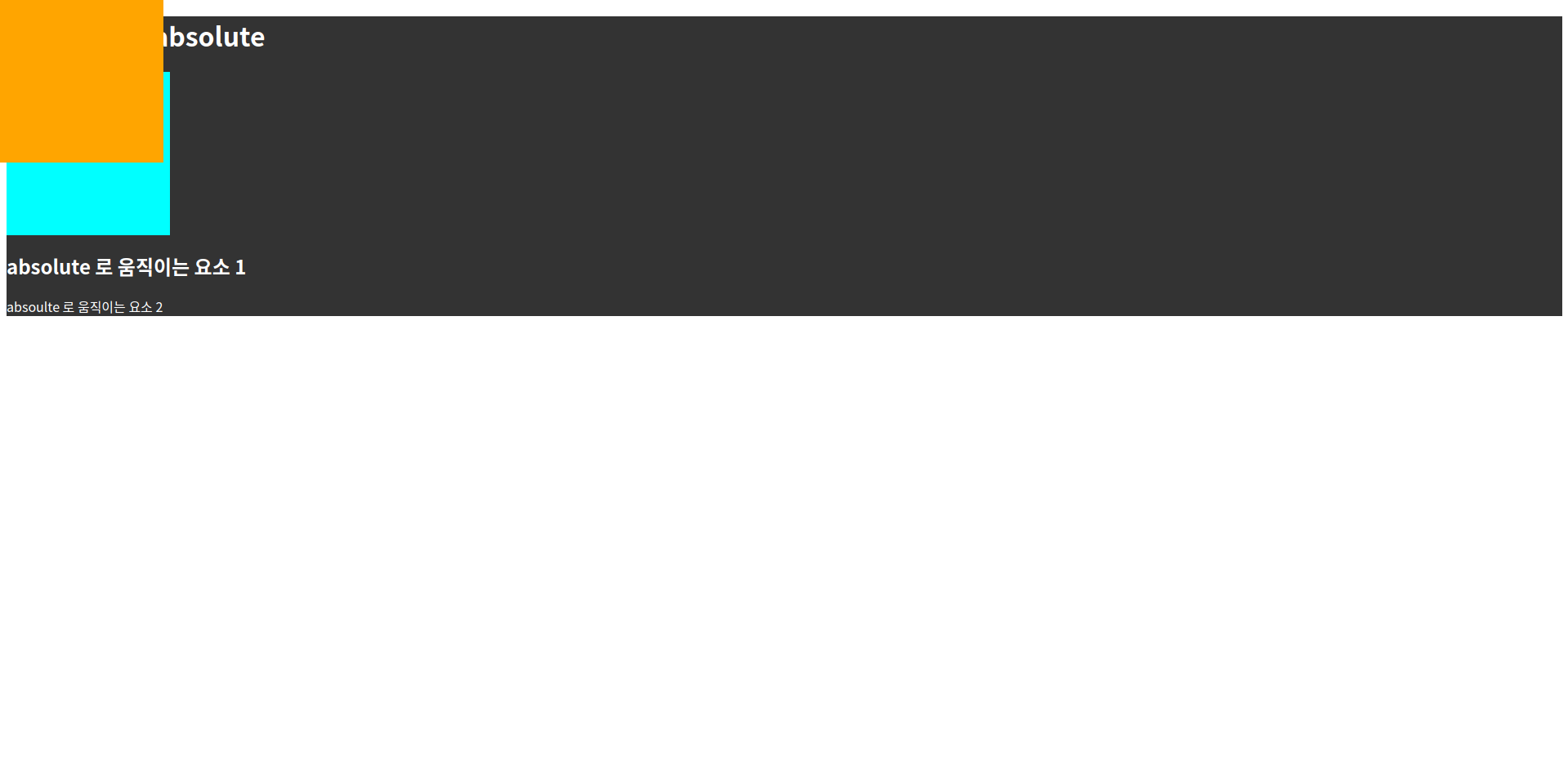
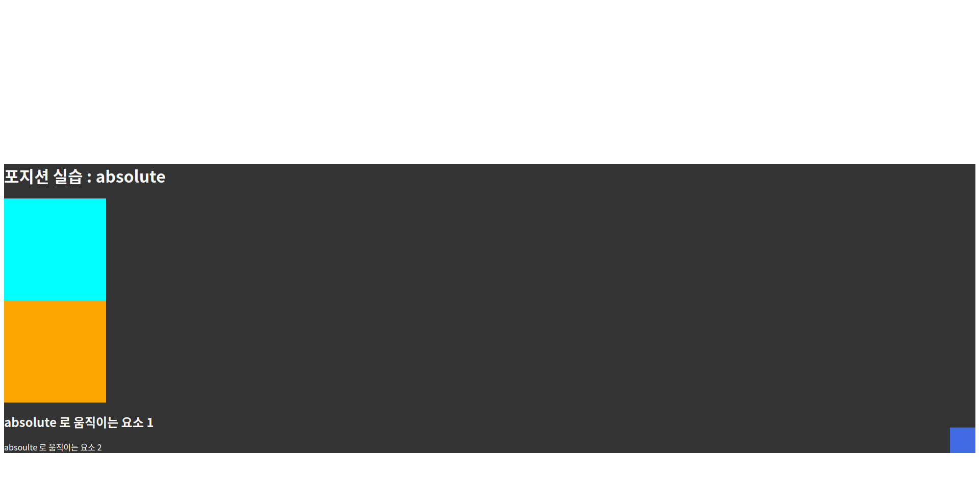
.absoulte{
width: 200px;
height: 200px;
background-color: orange;
position: absolute; /* 추가 */
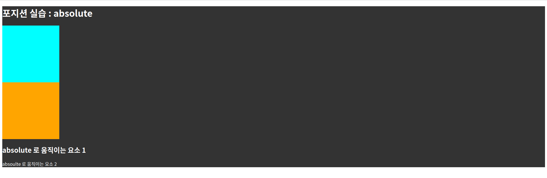
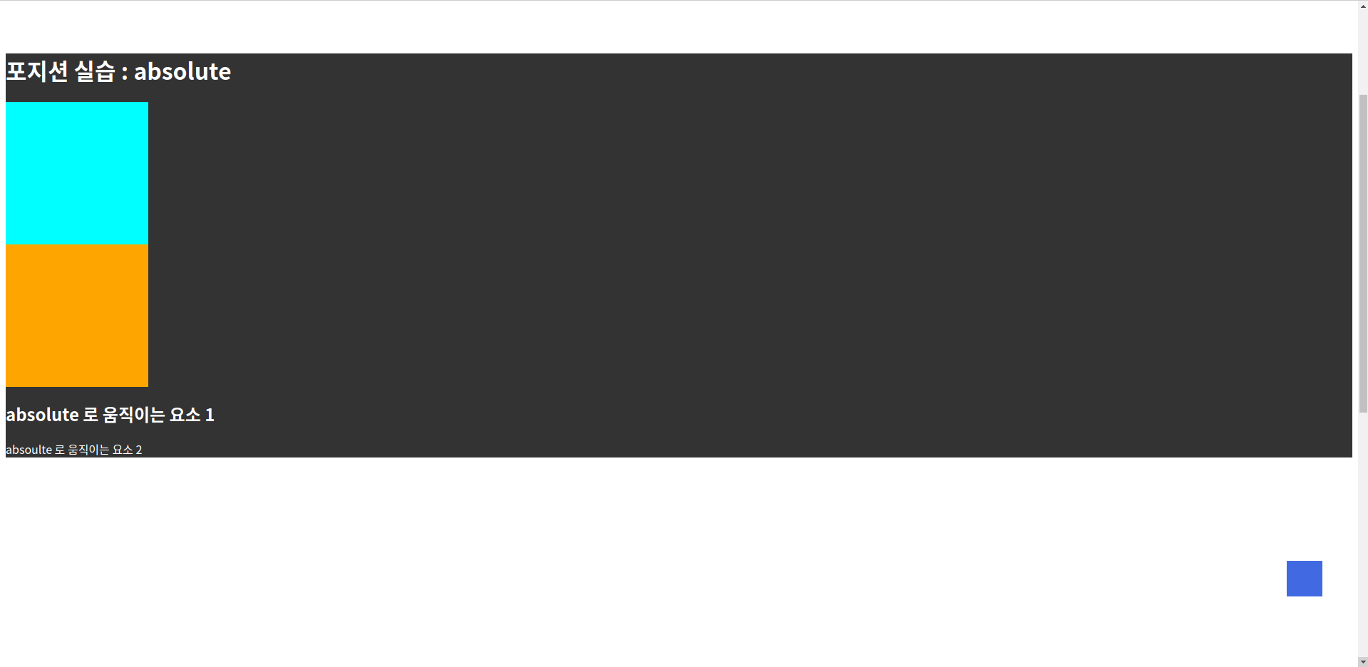
}오렌지색 상자에 position: absolute 를 추가하면 아래와 같이 오렌지색 상자는 문서 흐름에서 벗어나 완전히 독립적으로 위치한다. 즉, 완전히 다른 레이어에서 움직이게 된다.
.container{
background-color: #333;
color: #fff;
}
.static{
width: 200px;
height: 200px;
background-color: aqua;
}
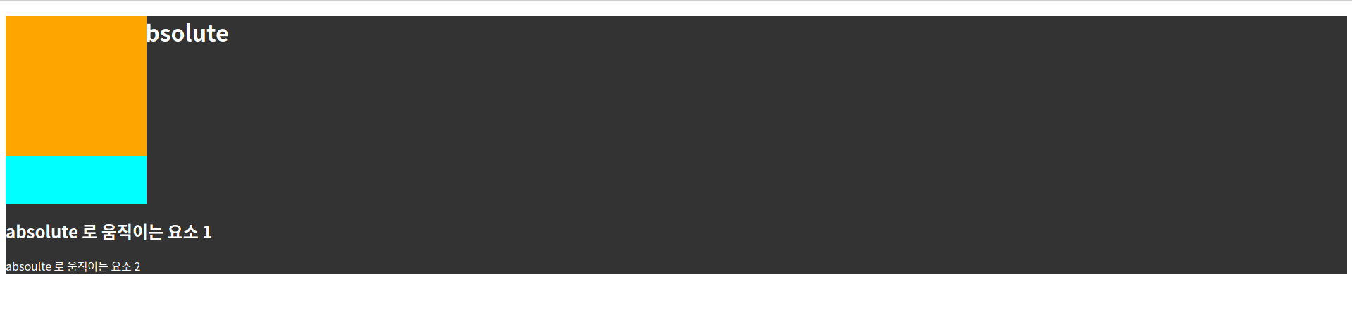
.absoulte{
width: 200px;
height: 200px;
background-color: orange;
position: absolute; /* 추가 */
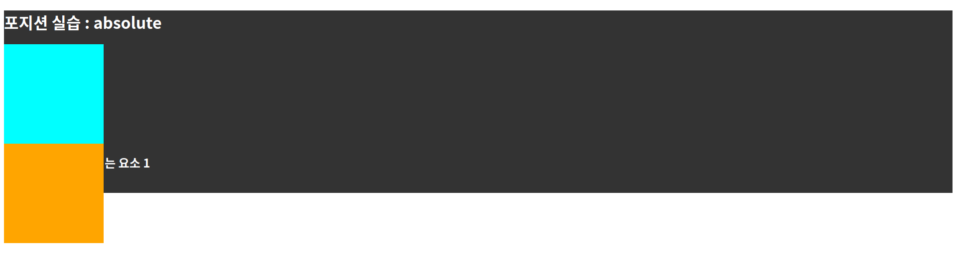
left: 0; top: 0; /* 추가 */
}기준점을 확인하기 위하여 left:0, top:0 를 추가한다. 그럼 아래와 같이 브라우저의 좌측 상단 꼭지점이 기준이라는 것을 확인할 수 있다.
이처럼 position: absolute 로 설정된 오렌지색 상자는 자신의 상위요소(container, body) 중에 position: static (디폴트값)이 아닌 요소가 없으면 브라우저 화면을 기준으로 위치를 잡는다.
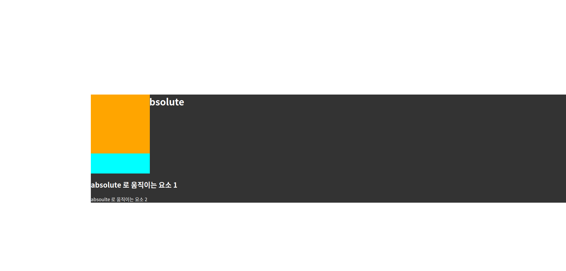
.container{
  background-color: #333;
  color: #fff;
  position: relative; /* 추가 */
}
.static{
  width: 200px;
  height: 200px;
  background-color: aqua;
}
.absoulte{
  width: 200px;
  height: 200px;
  background-color: orange;
  position: absolute;
  left: 0; top: 0;
}
컨테이너에 position: relative 를 설정하면 오렌지색 상자의 상위요소인 컨테이너의 position 이 디폴트값이 아니기 때문에 컨테이너를 기준으로 위치가 결정된다.
.container{
  background-color: #333;
  color: #fff;
  position: relative; /* 추가 */
  left: 300px; top: 300px; /* 추가 */
}
.static{
  width: 200px;
  height: 200px;
  background-color: aqua;
}
.absoulte{
  width: 200px;
  height: 200px;
  background-color: orange;
  position: absolute;
  left: 0; top: 0;
}
컨테이너 기준이 맞는지 재차 확인하기 위하여 컨테이너의 위치를 left, top으로 이동하였다.
컨테이너를 기준점으로 사용하기 위하여 position 속성을 absolute, fixed, sticky 등으로 설정하지 않고 relative 로 지정한 이유는 position 속성을 추가하면서 컨테이너의 위치가 흐뜨려지는 것을 막기 위함이다. 즉, position 속성을 absolute, fixed 등으로 설정하면 컨테이너의 위치도 상위요소를 기준으로 위치가 정해지기 때문에 레이아웃이 깨지게 된다.
.container{
  background-color: #333;
  color: #fff;
  position: relative;
  left: 0; top: 300px; /* 수정 */
}
.static{
  width: 200px;
  height: 200px;
  background-color: aqua;
}
.absoulte{
  width: 200px;
  height: 200px;
  background-color: orange;
  position: absolute;
  left: 50%; top: 0; /* 수정 */
}
컨테이너의 가로방향 위치를 left: 0으로 조정하고, 오렌지색 상자의 가로방향 위치를 left: 50%로 설정한다. 이렇게 되면 오렌지색 상자는 기준점이 되는 컨테이너 너비의 절반만큼 오른쪽으로 이동한다.

.container{
  background-color: #333;
  color: #fff;
  position: relative;
  left: 0; top: 300px;
}
.static{
  width: 200px;
  height: 200px;
  background-color: aqua;
}
.absoulte{
  width: 200px;
  height: 200px;
  background-color: orange;
  position: absolute;
  left: 100%; top: 0; /* 수정 */
}
오렌지색 상자의 수평방향 위치를 left: 100%로 설정하면 컨테이너의 전체너비만큼 오른쪽으로 이동하기 때문에 컨테이너를 벗어난다.

.container{
  background-color: #333;
  color: #fff;
  position: relative;
  left: 0; top: 300px;
}
.static{
  width: 200px;
  height: 200px;
  background-color: aqua;
}
.absoulte{
  width: 200px;
  height: 200px;
  background-color: orange;
  position: absolute;
  bottom: 0; right: 0; /* 수정 */
}
위와 같이 오렌지색 상자에 bottom: 0, right: 0 를 설정하면 아래와 같이 컨테이너의 우측 하단에 붙어서 위치하게 된다.

<!DOCTYPE html>
<html lang="en">
<head>
  <meta charset="UTF-8">
  <meta http-equiv="X-UA-Compatible" content="IE=edge">
  <meta name="viewport" content="width=device-width, initial-scale=1.0">
  <title>Document</title>
  <link rel="stylesheet" href="style.css">
</head>
<body>
  <div class="container">
    <h1>포지션 실습 : absolute</h1>
    <div class="static"></div>
    <div class="absoulte">
      <div class="box"></div>
    </div>
    <h2>absolute 로 움직이는 요소 1</h2>
    <p>absoulte 로 움직이는 요소 2</p>
  </div>
</body>
</html>
이번에는 오렌지색 상자 안에 box 라는 클래스명으로 상자를 하나 더 추가하였다.
.container{
background-color: #333;
color: #fff;
position: relative;
left: 0; top: 300px;
}
.static{
width: 200px;
height: 200px;
background-color: aqua;
}
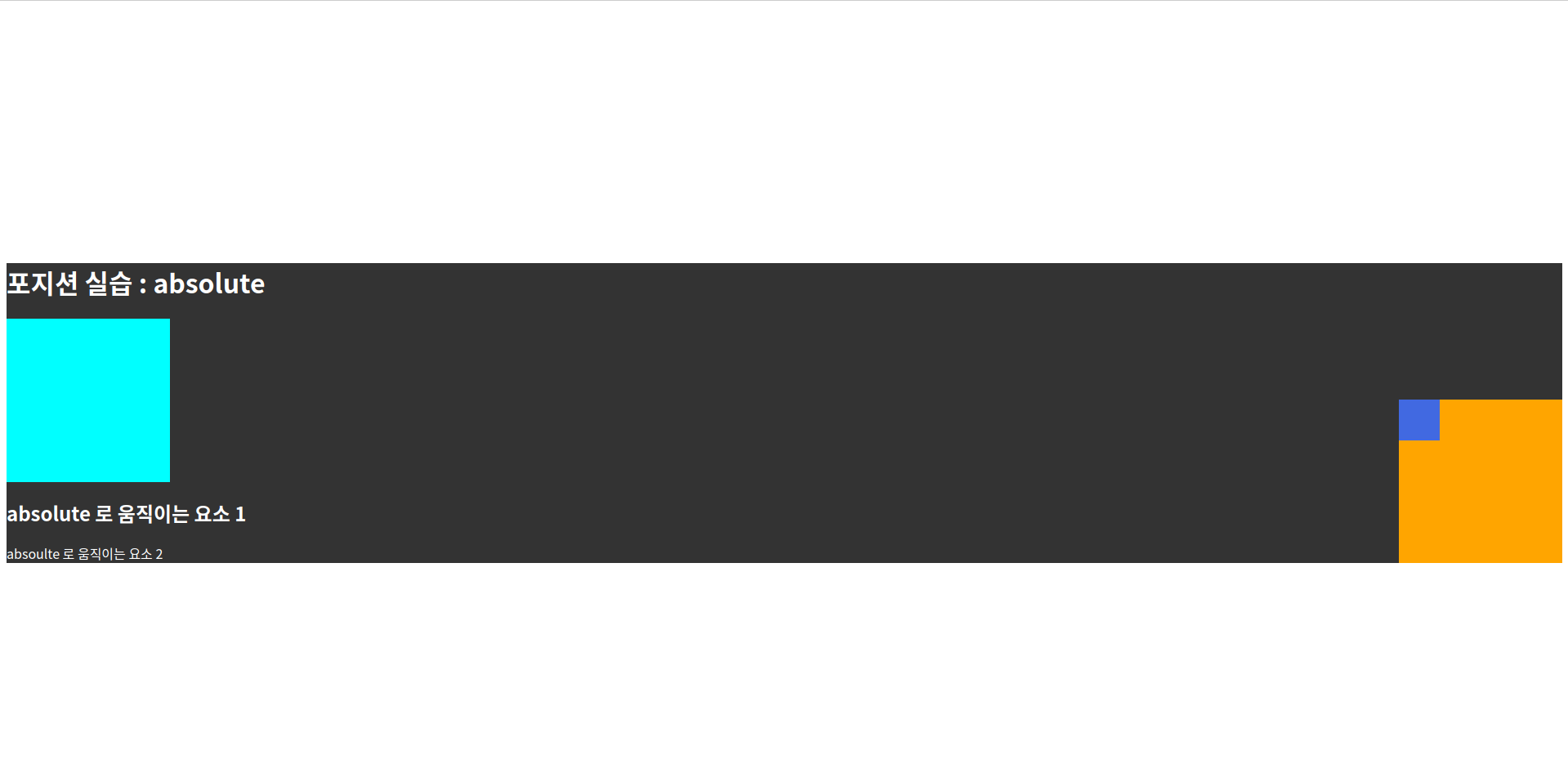
.absoulte{
width: 200px;
height: 200px;
background-color: orange;
position: absolute;
bottom: 0; right: 0;
}
.absoulte .box{ /* 추가 */
width: 50px;
height: 50px;
background-color: royalblue;
}
.container{
  background-color: #333;
  color: #fff;
  position: relative;
  left: 0; top: 300px;
}
.static{
  width: 200px;
  height: 200px;
  background-color: aqua;
}
.absoulte{
  width: 200px;
  height: 200px;
  background-color: orange;
  position: absolute;
  bottom: 0; right: 0;
}
.absoulte .box{
  width: 50px;
  height: 50px;
  background-color: royalblue;
  position: absolute; /* 추가 */
  bottom: 0; right: 0; /* 추가 */
}
작은 파란색 상자에 position: absolute 를 설정하면 기준점은 자신과 가까운 상위요소 중 position: static 이 아닌 오렌지색 상자가 된다. 오렌지색 상자를 기준으로 위치가 이동한다.

.container{
  background-color: #333;
  color: #fff;
  position: relative;
  left: 0; top: 300px;
}
.static{
  width: 200px;
  height: 200px;
  background-color: aqua;
}
.absoulte{
  width: 200px;
  height: 200px;
  background-color: orange;
  /* position: absolute;
  bottom: 0; right: 0;  */
}
.absoulte .box{
  width: 50px;
  height: 50px;
  background-color: royalblue;
  position: absolute;
  bottom: 0; right: 0;
}
만약 오렌지색 상자의 position: absolute 를 주석처리하면 파란색 상자의 기준점은 오렌지색 상자가 아니라 가까운 상위요소 중 position: static 이 아닌 컨테이너가 된다. 즉, 컨테이너의 우측 하단에 고정된다.
body{
  height: 200vh; /* 추가 */
}
.container{
  background-color: #333;
  color: #fff;
  position: relative;
  left: 0; top: 300px;
}
.static{
  width: 200px;
  height: 200px;
  background-color: aqua;
}
.absoulte{
  width: 200px;
  height: 200px;
  background-color: orange;
  /* position: absolute;
  bottom: 0; right: 0;  */
}
.absoulte .box{
  width: 50px;
  height: 50px;
  background-color: royalblue;
  position: absolute;
  bottom: 0; right: 0;
}
브라우저 전체 높이를 200vh 로 설정하면 웹 화면은 스크롤된다. 이때 position: absolute 로 설정된 작은 파란색 상자는 부모요소(기준점)인 컨테이너가 스크롤되면서 함께 이동한다. 즉, position: absolute 로 설정된 요소는 스크롤될때 부모요소(기준점)와 함께 스크롤되면서 이동한다.

* position: fixed - 브라우저 화면을 기준으로 위치가 결정
body{
  height: 200vh;
}
.container{
  background-color: #333;
  color: #fff;
  position: relative;
  left: 0; top: 300px;
}
.static{
  width: 200px;
  height: 200px;
  background-color: aqua;
}
.absoulte{
  width: 200px;
  height: 200px;
  background-color: orange;
  /* position: absolute;
  bottom: 0; right: 0;  */
}
.absoulte .box{
  width: 50px;
  height: 50px;
  background-color: royalblue;
  position: fixed; /* 수정 */
  bottom: 100px; right: 50px; /* 수정 */
}
파란색 상자의 position 속성을 fixed 로 수정하고 bottom, right 의 위치도 조정한다. 그럼 아래와 같이 컨테이너가 스크롤되더라도 파란색 상자의 위치는 브라우저 우측 하단에 고정된다. 다시 말해, 브라우저 화면을 기준으로 위치가 결정되며, 스크롤시에도 위치가 변하지 않고 고정된다.
* position: sticky - 스크롤되다가 지정한 위치에서 fixed 로 고정
body{
  height: 200vh;
}
.container{
  background-color: #333;
  color: #fff;
  position: sticky; /* 수정 */
  top: 0; /* 수정 */
  margin-top: 300px; /* 추가 */
}
.static{
  width: 200px;
  height: 200px;
  background-color: aqua;
}
.absoulte{
  width: 200px;
  height: 200px;
  background-color: orange;
  /* position: absolute;
  bottom: 0; right: 0;  */
}
.absoulte .box{
  width: 50px;
  height: 50px;
  background-color: royalblue;
  position: fixed;
  bottom: 100px; right: 50px;
}
앞선 예제에서 컨테이너에 position: sticky 를 적용하고, top: 0으로 설정하였다. 그리고 상단 마진도 함께 지정하였다. 이렇게 하면 아래와 같이 컨테이너가 스크롤되다가 브라우저 화면 상단에 도달하면 더이상 스크롤되지 않고 멈춘다.

body{
  height: 200vh;
}
.container{
  background-color: #333;
  color: #fff;
  /* position: sticky;
  top: 0;  */
  margin-top: 300px;
}
.static{
  width: 200px;
  height: 200px;
  background-color: aqua;
}
.absoulte{
  width: 200px;
  height: 200px;
  background-color: orange;
  /* position: absolute;
  bottom: 0; right: 0;  */
}
.absoulte .box{
  width: 50px;
  height: 50px;
  background-color: royalblue;
  position: fixed;
  bottom: 100px; right: 50px;
}
컨테이너의 position: sticky 부분을 주석처리하면 아래와 같이 스크롤되면서 컨테이너는 브라우저 화면을 벗어나게 된다.

body{
  height: 200vh;
}
.container{
  background-color: #333;
  color: #fff;
  /* position: sticky;
  top: 0;
  margin-top: 300px;  */
}
.static{
  width: 200px;
  height: 200px;
  background-color: aqua;
}
.absoulte{
  width: 200px;
  height: 200px;
  background-color: orange;
  position: sticky; /* 수정 */
  top: 0; /* 수정 */
}
.absoulte .box{
  width: 50px;
  height: 50px;
  background-color: royalblue;
  position: fixed;
  bottom: 100px; right: 50px;
}
이번에는 컨테이너의 position: sticky 설정은 주석처리하고, 오렌지색 상자에 position: sticky 를 적용해보자!
오렌지색 상자는 스크롤되다가 브라우저 상단에서 멈춘듯 하였으나, 오렌지색 상자의 부모요소인 컨테이너가 스크롤되면서 함께 스크롤되어 사라진다.
'프론트엔드 > CSS' 카테고리의 다른 글
| 슬라이드 이미지 중앙에서 확대하기 (1) | 2024.02.24 |
|---|---|
| SASS 입문 (0) | 2023.07.17 |
| 부트스트랩 5 자주 쓰는 클래스 정리 (0) | 2023.07.14 |
| position 문제 (0) | 2023.07.04 |
| table table-cell 속성을 이용하여 수평으로 나열하기 (0) | 2023.06.24 |