
Sass: Syntactically Awesome Style Sheets
Sass is the most mature, stable, and powerful professional grade CSS extension language in the world.
sass-lang.com
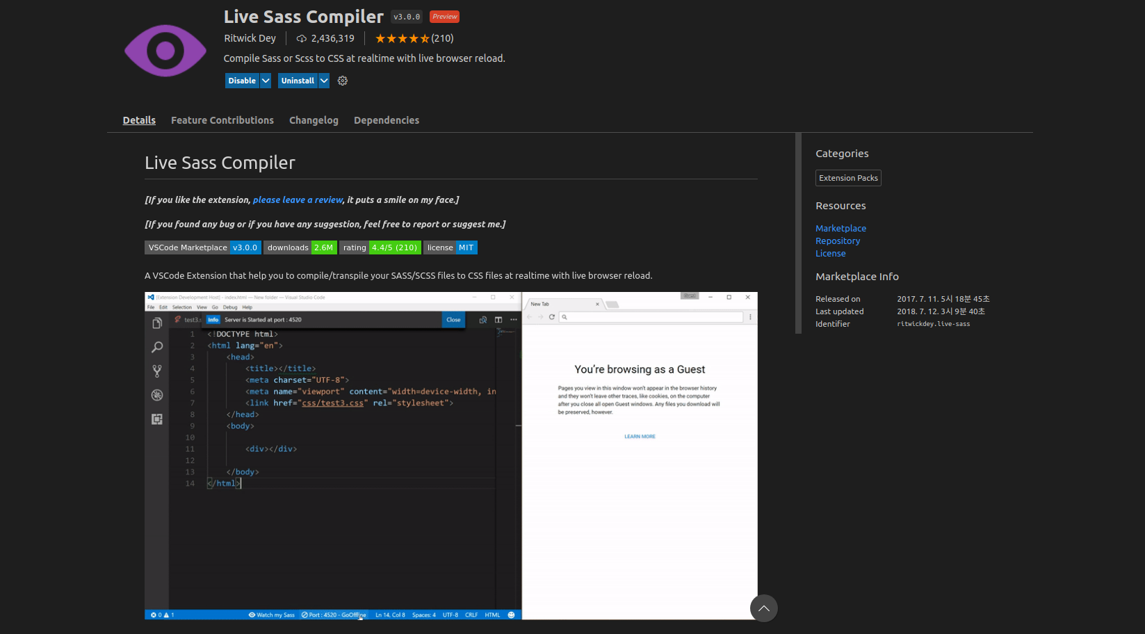
npm 설치없이 sass 파일을 컴파일하려면 비주얼 스튜디오 편집기에서 위의 확장프로그램을 설치하면 된다.
<!DOCTYPE html>
<html lang="en">
<head>
  <meta charset="UTF-8">
  <meta http-equiv="X-UA-Compatible" content="IE=edge">
  <meta name="viewport" content="width=device-width, initial-scale=1.0">
  <title>Document</title>
  <link rel="stylesheet" href="style.css">
</head>
<body>
</body>
</html>
index.html 파일을 위와 같이 작성한다. 그리고 style.scss 파일을 생성하고 링크를 걸어준다. 이때 주의할점은 html 문서에서 링크를 연결할때는 style.css 로 작성하는 것이다. 그런 다음 비주얼 편집기 우측 하단의 Watch Sass 버튼을 클릭하면 style.css 와 style.css.map 파일이 생성된다. 그리고 해당 강의의 className 을 모두 class 로 변경해준다. 그래도 잘 동작하지 않으면 npm 으로 설치한 후 수업을 진행하도록 하자!
* SASS(Syntactically Awesome Style Sheets) 를 사용하는 이유
SASS 는 CSS 전처리기 (SASS 코드를 CSS 코드로 컴파일함)로 스타일 코드의 중복을 최소화하고, 스타일 코드의 재사용성을 높여준다. 말하자면 함수나 변수를 사용하는 이유와 유사하다. 또한, 코드의 가독성과 유지보수에도 도움이 된다.
https://seokzin.tistory.com/entry/SCSS-SCSS-%EB%AC%B8%EB%B2%95-%EC%A0%95%EB%A6%AC
[SCSS] SCSS 문법 정리
프로젝트 규모가 커지고 복잡해질수록 순수 CSS의 한계를 많이 느끼게 됩니다. 그래서 SCSS나 CSS-in-JS의 도입은 사실상 필수가 되었습니다. 이 글을 통해 CSS의 문제점을 개선한 SCSS에 대해 알아보
seokzin.tistory.com
* SASS 에서 변수 사용하기
import { Component } from 'react';
import './App.scss'
function App(){
return (
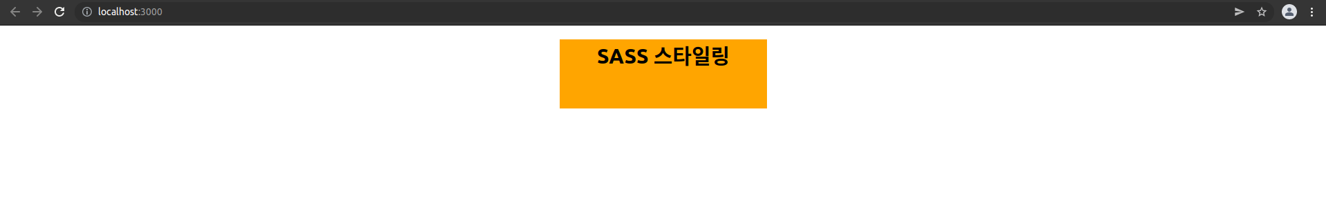
<div className='background'>
<h1>SASS 스타일링</h1>
</div>
)
}
export default AppApp 컴포넌트에서 App.scss 파일을 임포트한다.
$orange: orange;

.background{
  background-color: $orange;
}
App.scss 파일을 위와 같이 작성하자! SASS 에서 변수를 선언할때는 달러($) 문자를 변수명 앞에 붙인다. 그러므로 $orange 는 orange 라는 색상 문자열을 의미한다. background-color 라는 속성값을 변수 $orange 로 설정하였다.
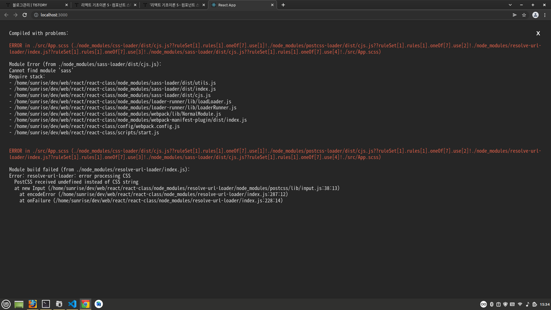
실행하면 Cannot find module 'sass' 라는 에러가 발생한다. 아래와 같이 sass 모듈을 설치해준다. sass 모듈은 scss 코드를 css 코드로 컴파일한다.
npm install sasssass 모듈 설치후 리액트 프로젝트를 아래 명령어로 재실행한다. 재실행하지 않으면 sass 모듈이 적용되지 않는다.
npm start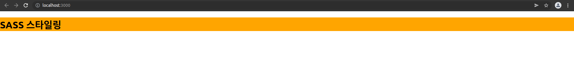
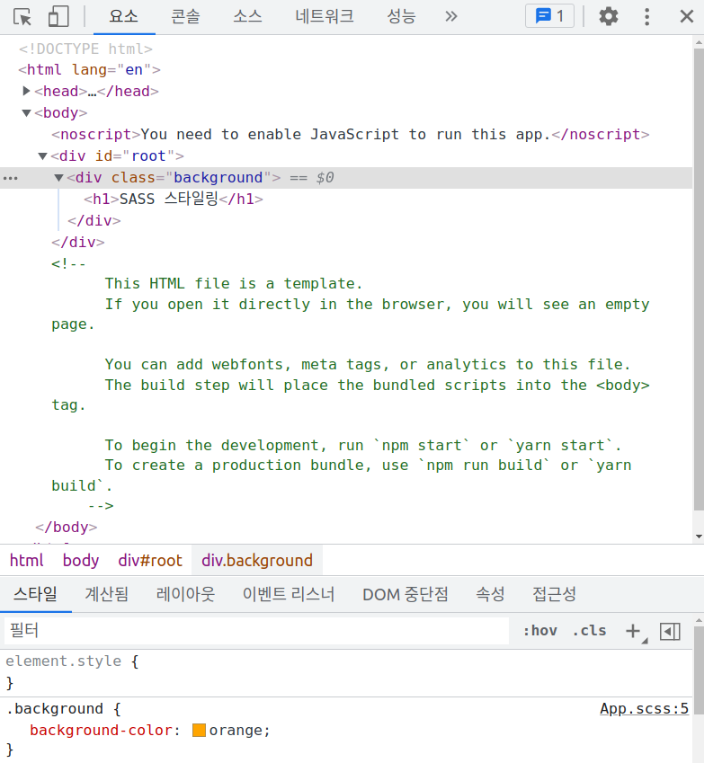
개발자 도구에서 스타일 코드를 확인해보면 SASS 코드가 CSS 코드로 변환되었음을 확인할 수 있다.
* SASS 에서 사칙연산 하기
$orange: orange;

$default-width: 100px; // 기본 너비 설정
$default-height: 50px; // 기본 높이 설정
$default-font-size: 20px; // 기본 글꼴 크기 설정

.background{
  background-color: $orange;

  width: $default-width * 3;
  height: $default-height * 2;
  font-size: $default-font-size - 5px;

  margin: auto;
  text-align: center;
}
프로그래밍에서 변수에 대한 사칙연산을 하는 것처럼 SASS 에서도 가능하다. width 속성은 변수로 정의된 $default-width 값의 3배로 설정된다. height 속성은 변수로 정의된 $default-height 값의 2배로 설정된다. font-size 속성은 변수로 정의된 $default-font-size 값에서 5px 만큼 뺀 값이다.
* SASS 에서 중첩 블록 사용하기
import { Component } from 'react';
import './App.scss'
function App(){
return (
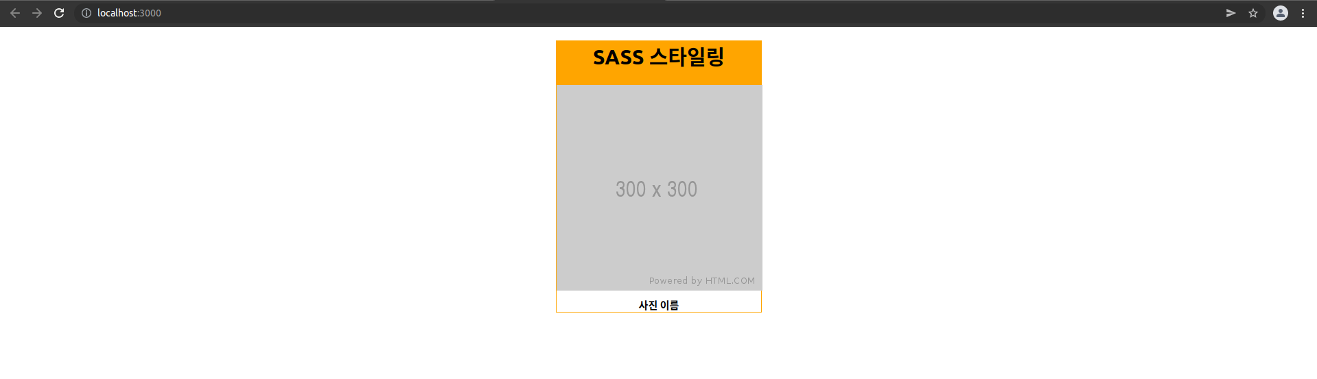
<div className='background'>
<h1>SASS 스타일링</h1>
<div className='photo-box'>
<div className='photo'>
<img src="https://via.placeholder.com/300"/>
</div>
<div className='name'>사진 이름</div>
</div>
</div>
)
}
export default AppApp 컴포넌트를 위와 같이 수정해보자! 리액트 엘리먼트에 photo-box 라는 요소를 추가하였다. 자식요소로는 photo 라는 요소와 name 이라는 요소가 존재한다. 또한, photo 요소의 자식요소로 img 태그가 포함되어 있다. 위와 같은 컴포넌트에 대한 SASS 스타일링은 아래와 같다.
$orange: orange;

$default-width: 100px; // 기본 너비 설정
$default-height: 50px; // 기본 높이 설정
$default-font-size: 20px; // 기본 글꼴 크기 설정

.background{
  background-color: $orange;

  width: $default-width * 3;
  height: $default-height * 2;
  font-size: $default-font-size - 5px;

  margin: auto;
  text-align: center;

   // photo-box 는 background 의 자식요소이므로 중첩됨
  .photo-box{
    border: 1px solid $orange;

    // photo 는 photo-box 의 자식요소이므로 중첩됨
    .photo{
      width: $default-width * 3;
      height: $default-height * 6;
      overflow: hidden;

      &.img{
        width: 100%;
        height: 100%;
      }
    }
    // name 은 photo-box 의 자식요소이므로 중첩됨
    .name{
      font-size: $default-font-size - 5px;
      font-weight: bold;
      padding-top: 10px;
    }
  }
}
App.scss 파일을 위와 같이 수정하자! SASS 에서 부모요소와 자식요소의 상하관계는 중첩된 블록으로 처리한다. 위 스타일 코드에서 photo-box 는 background 의 자식요소이다. 그러므로 background 의 블록({ }) 내부에 정의한다. 또한, photo 와 name 은 photo-box 의 자식요소이다. 그러므로 photo-box 의 블록({ }) 내부에 정의한다. 마지막으로 & 기호는 .photo 를 의미한다. 즉, 중첩블록으로 선택한 선택자 자신을 가리킨다.
photo-box 를 스타일링하는데 미리 정의된 $default-width, $default-height, $default-font-size, $orange 변수가 사용되었다. 이는 CSS 코드와 달리 SASS 코드의 재사용성과 코드 가독성을 보여준다.
* SASS 에서 믹스인 사용하기
import { Component } from 'react';
import './App.scss'

function App(){
  return (
    <div className='background'>

      <div className='photo-box'>
        <div className='photo'>
          <img src="https://via.placeholder.com/300"/>
        </div>
        <div className='name red'>사진 이름 1</div>
      </div>

      <div className='photo-box'>
        <div className='photo'>
          <img src="https://via.placeholder.com/300"/>
        </div>
        <div className='name blue'>사진 이름 2</div>
      </div>

      <div className='photo-box'>
        <div className='photo'>
          <img src="https://via.placeholder.com/300"/>
        </div>
        <div className='name yellow'>사진 이름 3</div>
      </div>
    </div>
  )
}
export default App
App 컴포넌트를 위와 같이 수정하자! h1 요소를 제거하고, photo-box 요소를 2개 더 추가한 다음 name 요소에 각각 red, blue, yellow 라는 클래스명을 추가한다.
$orange: orange;
$red: red;
$blue: blue;
$yellow: yellow;
$name-color: white;

$default-width: 100px; // 기본 너비 설정
$default-height: 50px; // 기본 높이 설정
$default-font-size: 20px; // 기본 글꼴 크기 설정

@mixin border($style){ // 재사용되는 스타일 블록 정의
  border-style: $style;
}

.background{
  // background-color: $orange;

  width: $default-width * 3;
  height: $default-height * 2;
  font-size: $default-font-size - 5px;

  margin: $default-width auto;
  text-align: center;

  // 가로정렬
  display: flex;
  justify-content: center;
  align-items: flex-start;

   // photo-box 는 background 의 자식요소이므로 중첩됨
  .photo-box{
    // border: 1px solid $orange;
    padding-left: 10px;

    // photo 는 photo-box 의 자식요소이므로 중첩됨
    .photo{
      width: $default-width * 3;
      height: $default-height * 6;
      overflow: hidden;

      &.img{
        width: 100%;
        height: 100%;
      }
    }
    // name 은 photo-box 의 자식요소이므로 중첩됨
    .name{
      font-size: $default-font-size - 5px;
      font-weight: bold;
      padding-top: 10px;

      &.red{
        background-color: $red;
        color: $name-color;
        @include border(dotted); // 믹스인 사용
      }
      &.blue{
        background-color: $blue;
        color: $name-color;
        @include border(dashed solid); // 믹스인 사용
      }
      &.yellow{
        background-color: $yellow;
        color: $name-color;
        @include border(groove); // 믹스인 사용
      }
    }
  }
}
믹스인은 재사용되는 스타일 코드 블록을 프로그래밍 언어의 함수처럼 정의한다. 믹스인을 정의할때는 @mixin 을 사용하며, 믹스인 이름이 뒤따라온다. 위 코드에서는 border 라는 이름으로 정의하였다. 믹스인의 파라미터로 $style 이라는 변수가 사용되었다. 믹스인 내부에서는 들어오는 $style 파라미터에 따라 border-style 속성을 설정한다.
// name 은 photo-box 의 자식요소이므로 중첩됨
.name{
  font-size: $default-font-size - 5px;
  font-weight: bold;
  padding-top: 10px;

  &.red{
    background-color: $red;
    color: $name-color;
    @include border(dotted); // 믹스인 사용
  }
  &.blue{
    background-color: $blue;
    color: $name-color;
    @include border(dashed solid); // 믹스인 사용
  }
  &.yellow{
    background-color: $yellow;
    color: $name-color;
    @include border(groove); // 믹스인 사용
  }
}
name 이라는 클래스에 red, blue, yellow 라는 클래스를 추가로 설정한다. red, blue, yellow 클래스 각각의 내부 블록에서는 @include 라는 키워드를 사용하여 믹스인을 사용하고 있다. 마치 함수를 호출하는 것과 유사하다. 이렇듯 재사용되는 스타일 코드 블록을 믹스인으로 정의하고, 호출해서 사용하면 코드 중복을 최소화 할 수 있다.
$orange: orange;
$red: red;
$blue: blue;
$yellow: yellow;
$name-color: white;

// 기준값
$default-width: 100px;
$default-height: 50px;
$default-font-size: 20px;

@mixin border($style){
  border-style: $style;
}
@mixin captionStyle($bg, $tc, $bt){
  background-color: $bg;
  color: $tc;
  @include border($bt);
}

.background{
  // background-color: $orange;

  width: $default-width * 3;
  height: $default-height * 2;
  font-size: $default-font-size - 5px;

  margin: $default-width auto;
  text-align: center;

  // 가로정렬
  display: flex;
  justify-content: center;
  align-items: center;

  .photo-box{
    // border: 1px solid $orange;
    padding-left: 10px;

    .photo{
      width: $default-width * 3;
      height: $default-height * 6;
      overflow: hidden;

      img{
        width: 100%;
        height: 100%;
      }
    }
    .name{
      font-size: $default-font-size - 5px;
      font-weight: bold;
      padding-top: 10px;

      &.red{
        @include captionStyle($red, $name-color, dotted);
        // background-color: $red;
        // color: $name-color;
        // @include border(dotted);
      }
      &.blue{
        @include captionStyle($blue, $name-color, dashed solid);
        // background-color: $blue;
        // color: $name-color;
        // @include border(dashed solid);
      }
      &.yellow{
        @include captionStyle($yellow, $name-color, groove);
        // background-color: $yellow;
        // color: $name-color;
        // @include border(groove);
      }
    }
  }
}
중복되는 스타일 코드를 captionStyle 이라는 믹스인으로 다시 만들면 코드가 조금 더 간결해진다. 믹스인 안에서 다시 include 를 사용해서 다른 스타일 코드를 불러올수도 있다.

* SASS 에서 모듈 불러오기 - utils 함수 분리하기
여러 파일에서 공통적으로 사용되는 글로벌 스타일 코드는 따로 파일로 분리한 다음 임포트하여 사용가능하다. 즉, 여러 SASS 파일에서 공통적으로 사용되는 변수나 믹스인은 따로 파일로 분리하면 유지보수에 편리하다.
src 폴더 하위에 styles 라는 폴더를 생성하고, 그 안에 utils.scss 파일을 만들자! 그런 다음 아래와 같이 App.scss 에서 사용한 변수와 믹스인을 잘라내서 utils.scss 파일로 이동시키자!
$orange: orange;
$red: red;
$blue: blue;
$yellow: yellow;
$name-color: white;

$default-width: 100px; // 기본 너비 설정
$default-height: 50px; // 기본 높이 설정
$default-font-size: 20px; // 기본 글꼴 크기 설정

@mixin border($style){ // 재사용되는 스타일 블록 정의
  border-style: $style;
}
utils.scss 파일을 위와 같이 작성하자!
@import './styles/utils.scss';

.background{
  // background-color: $orange;

  width: $default-width * 3;
  height: $default-height * 2;
  font-size: $default-font-size - 5px;

  margin: $default-width auto;
  text-align: center;

  // 가로정렬
  display: flex;
  justify-content: center;
  align-items: flex-start;

   // photo-box 는 background 의 자식요소이므로 중첩됨
  .photo-box{
    // border: 1px solid $orange;
    padding-left: 10px;

    // photo 는 photo-box 의 자식요소이므로 중첩됨
    .photo{
      width: $default-width * 3;
      height: $default-height * 6;
      overflow: hidden;

      &.img{
        width: 100%;
        height: 100%;
      }
    }
    // name 은 photo-box 의 자식요소이므로 중첩됨
    .name{
      font-size: $default-font-size - 5px;
      font-weight: bold;
      padding-top: 10px;

      &.red{
        background-color: $red;
        color: $name-color;
        @include border(dotted); // 믹스인 사용
      }
      &.blue{
        background-color: $blue;
        color: $name-color;
        @include border(dashed solid); // 믹스인 사용
      }
      &.yellow{
        background-color: $yellow;
        color: $name-color;
        @include border(groove); // 믹스인 사용
      }
    }
  }
}
App.scss 파일의 맨 상단에는 @import 문구를 추가한다. 기능은 동일하지만 만약에 변수와 믹스인을 다른 SASS 파일에서도 사용해야 한다면 위와 같이 분리하면 코드 중복을 최소화 할 수 있다.
* SASS 내장모듈 사용하기
SASS 내장모듈은 SASS 에서 기본적으로 제공하는 라이브러리 개념이다.
Sass: Built-In Modules
Compatibility: Dart Sass since 1.23.0 LibSass ✗ Ruby Sass ✗ Only Dart Sass currently supports loading built-in modules with @use. Users of other implementations must call functions using their global names instead. Sass provides many built-in modules w
sass-lang.com
내장 모듈
이번 포스팅에서는 SCSS의 내장 모듈에 대하여 알아보자.Sass에서 기본적으로 제공하는 내장 모듈에는 많은 종류가 있습니다.Sass Built-in Functions에서 모든 내장 모듈을 확인할 수 있습니다.요소를
velog.io
Color 모듈
Color 모듈은 색상과 관련된 모듈이다.
darken($color, $amount)darken 함수는 색상을 더 어둡게 만들어준다. $amount 는 0~100% 사이의 숫자이다.
import { Component } from 'react';
import './App.scss'

function App(){
  return (
    <div className='background'>
      <button className='dark-btn'>어두운 버튼</button>
    </div>
  )
}
export default App
App 컴포넌트를 위와 같이 작성하자! dark-btn 이라는 버튼을 정의하였다.
@use "sass:color"; // 내장모듈 불러오기

$default-width: 100px;
$default-height: 50px;
$primary: orange;

.background{
  width: 100%;
  height: 100vh;

  display: flex;
  justify-content: center;
  align-items: center;

  .dark-btn{
    width: $default-width;
    height: $default-height;
    background-color: $primary;

    cursor: pointer;
    border: none;
    border-radius: 5px;

    &:hover{
      background-color: darken($primary, 20%); // 내장모듈 사용하기
    }
  }
}
App.scss 파일을 위와 같이 작성하자!
@use "sass:color"; // 내장모듈 불러오기@use 키워드를 사용하면 SASS 내장모듈을 불러올 수 있다. 여기서는 Color 모듈을 불러온다.
$default-width: 100px;
$default-height: 50px;
$primary: orange;
버튼의 크기와 색상을 변수로 정의한다.
&:hover{
  background-color: darken($primary, 20%); // 내장모듈 사용하기
}
버튼 위에 마우스를 hover 하면 darken 함수를 이용하여 버튼을 어둡게 스타일한다.
grayscale($color)grayscale 함수는 색상을 회색으로 변환해준다. $color 는 색상 코드이다. App.scss 파일에서 아래와 같이 적용해보자!
&:hover{
  background-color: grayscale($primary); // 내장모듈 사용하기
}
invert($color)invert 함수는 색상을 반전시켜준다. $color 는 색상 코드이다. App.scss 파일에서 아래와 같이 적용해보자!
&:hover{
  background-color: invert($primary); // 내장모듈 사용하기
}
List 모듈
List 모듈은 배열과 관련된 모듈이다.
append($list, $value)append 함수는 배열에 요소를 추가한다. $list 는 배열이고, $value 는 추가할 아이템이다.
import { Component } from 'react';
import './App.scss'

function App(){
  return (
    <div className='background'>
      <div className='fruits apple'></div>
      <div className='fruits banana'></div>
      <div className='fruits orange'></div>
      <div className='fruits mango'></div>
    </div>
  )
}
export default App
App 컴포넌트를 위와 같이 작성하자! 과일 리스트를 리액트 엘리먼트로 정의하였다. 리스트의 모든 아이템은 fruits 이라는 기본 스타일이 적용된다. 또한, 리스트의 각 아이템은 apple, banana, orange, mango 라는 스타일이 따로 적용된다.
@use "sass:list";

$fruits: "apple", "banana", "orange"; // 리스트 정의하기

.background{
  width: 100%;
  height: 100vh;

  display: flex;
  flex-direction: column;
  justify-content: center;
  align-items: center;

  .fruits{
    background-color: black;
    color: white;
    margin-top: 10px;
    padding: 10px;
    width: 100px;

    $fruits: list.append($fruits, "mango"); // 리스트에 망고 추가하기

    @each $name in $fruits { // 리스트 순회하면서 SASS 코드 생성하기
      &.#{$name}::after{
        content: $name;
        font-size: 20px;
      }
    }
  }
}
App.scss 파일을 위와 같이 작성하자!
@use "sass:list";@use 키워드를 사용하면 SASS 내장모듈을 불러올 수 있다. 여기서는 List 모듈을 불러온다.
$fruits: "apple", "banana", "orange"; // 리스트 정의하기fruits 변수에 리스트를 정의하고 있다. 각 아이템은 문자열 형태이다.
background-color: black;
color: white;
margin-top: 10px;
padding: 10px;
width: 100px;
리스트에서 모든 아이템의 기본 스타일을 fruits 클래스로 정의한다.
$fruits: list.append($fruits, "mango"); // 리스트에 망고 추가하기fruits 변수(리스트) 를 업데이트한다. append 함수는 아이템을 추가한 다음 새로운 리스트를 반환한다.
$fruits: append($fruits, "mango"); // 리스트에 망고 추가하기에러가 나거나 잘 동작하지 않는다면 위와 같이 작성하고 다시 시도해보자!
@each $name in $fruits { // 리스트 순회하면서 SASS 코드 생성하기
  &.#{$name}::after{
    content: $name;
    font-size: 20px;
  }
}
fruits 변수(리스트)를 순회하면서 각 아이템을 조회한 다음 SASS 코드를 생성한다. @each 는 반복문과 유사한 개념이다. & 은 .fruits 와 동일하다. .#{$name} 는 점(.)과 리스트의 각 아이템을 연결한다. 즉, .apple .banana .orange .mango 로 치환된다. content 속성도 마찬가지로 "apple" "banana" "orange" "mango" 로 치환된다. 결과는 아래와 같다.
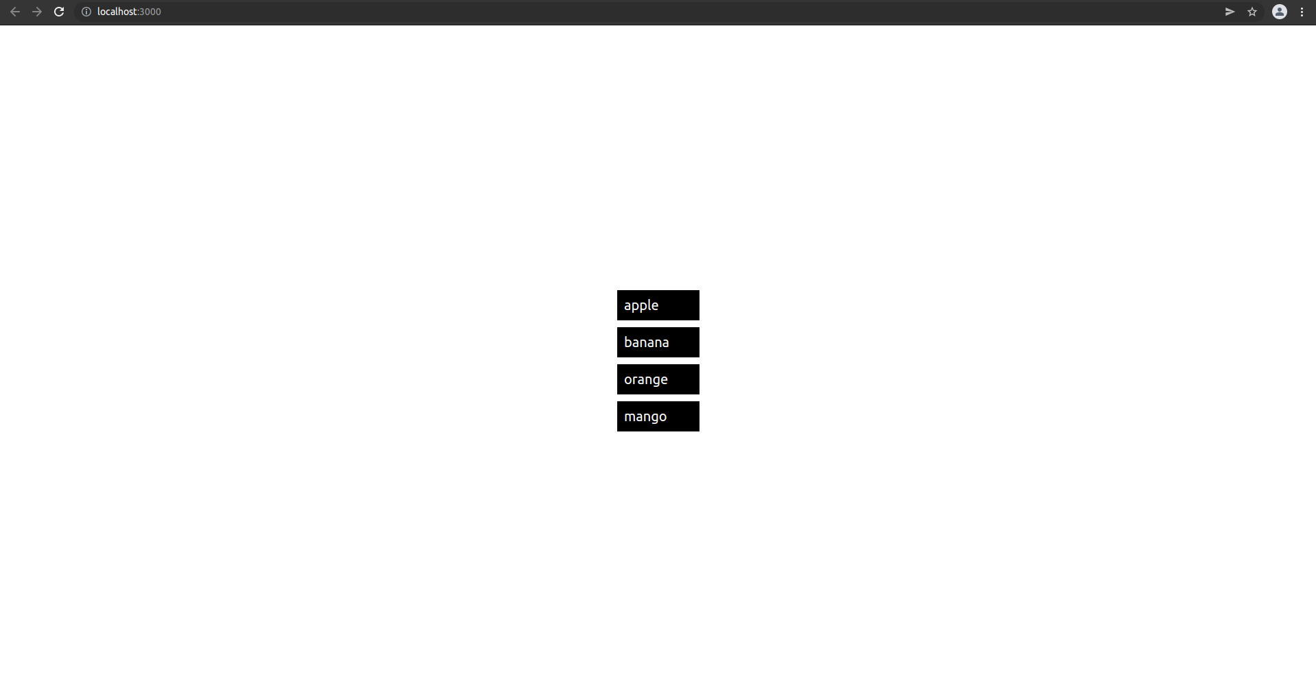
@each 로 생성된 SASS 코드는 아래와 같다.
&.apple::after{
  content: "apple";
    font-size: 20px;
}
&.banana::after{
  content: "banana";
    font-size: 20px;
}
&.orange::after{
  content: "orange";
    font-size: 20px;
}
&.mango::after{
  content: "mango";
    font-size: 20px;
}
index($list, $value)index 함수는 특정 아이템의 인덱스 값을 반환한다. $list 는 배열이고, $value 는 인덱스 값을 얻고 싶은 아이템이다.
import { Component } from 'react';
import './App.scss'

function App(){
  return (
    <div className='background'>
      <div className='fruits'></div>
      <div className='fruits'></div>
      <div className='fruits'></div>
      <div className='fruits'></div>
    </div>
  )
}
export default App
App 컴포넌트를 위와 같이 작성하자! 이번에는 모든 아이템에 공통적으로 fruits 클래스만 설정하였다.
@use "sass:list";

$fruits: "apple", "banana", "orange", "watermelon"; // 과일 리스트 정의하기
$fruit-colors: red, yellow, orange, green; // 과일 색상 리스트 정의하기

.background{
  width: 100%;
  height: 100vh;

  display: flex;
  flex-direction: column;
  justify-content: center;
  align-items: center;

  .fruits{
    background-color: black;
    color: white;
    margin-top: 10px;
    padding: 10px;
    width: 150px;
    font-weight: bold;

    @each $name in $fruits { // 리스트 순회하면서 SASS 코드 생성하기
      $index: list.index($fruits, $name); // 특정 아이템의 인덱스 조회하기

      &:nth-child(#{$index})::after{
        content: $name;
        font-size: 20px;
      }
      &:nth-child(#{$index}){
        background-color: list.nth($fruit-colors, $index); // 과일 색상 리스트에서 인덱스값으로 색상 선택하기
      }
    }
  }
}
App.scss 파일을 위와 같이 작성하자!
@use "sass:list";@use 키워드를 사용하면 SASS 내장모듈을 불러올 수 있다. 여기서는 List 모듈을 불러온다.
$fruits: "apple", "banana", "orange", "watermelon"; // 과일 리스트 정의하기fruits 변수에 과일 리스트를 정의하고 있다. 각 아이템은 문자열 형태이다.
$fruit-colors: red, yellow, orange, green; // 과일 색상 리스트 정의하기fruits-colors 변수에 과일의 색상 리스트를 정의하고 있다. 각 아이템은 CSS 색상값이다.
background-color: black;
color: white;
margin-top: 10px;
padding: 10px;
width: 150px;
font-weight: bold;
리스트에서 모든 아이템의 기본 스타일을 fruits 클래스로 정의한다.
@each $name in $fruits { // 리스트 순회하면서 SASS 코드 생성하기
  $index: list.index($fruits, $name); // 특정 아이템의 인덱스 조회하기

  &:nth-child(#{$index})::after{
    content: $name;
    font-size: 20px;
  }
  &:nth-child(#{$index}){
    background-color: list.nth($fruit-colors, $index); // 과일 색상 리스트에서 인덱스값으로 색상 선택하기
  }
}
과일 리스트를 순회하면서 각 아이템을 하나씩 조회한다. 즉, fruits 변수(리스트)를 순회하면서 각 아이템을 조회한 다음 SASS 코드를 생성한다. @each 는 반복문과 유사한 개념이다.
$index: list.index($fruits, $name); // 특정 아이템의 인덱스 조회하기index 함수를 이용하여 fruits 리스트에서 각 아이템의 인덱스를 조회한다.
$index: index($fruits, $name); // 특정 아이템의 인덱스 조회하기에러가 나거나 잘 동작하지 않는다면 위와 같이 작성하고 다시 시도해보자!
&:nth-child(#{$index})::after{
    content: $name;
    font-size: 20px;
}
nth-child() 의사 클래스를 이용하여 각 아이템마다 서로 다른 스타일을 적용한다. nth-child() 는 인자로 주어진 값에 따라 리스트의 특정 아이템을 선택한다. & 는 .fruits 와 동일한 의미이다. #{$index} 는 SASS 코드에 index 변수를 삽입한다. 자바스크립트의 템플릿 리터럴과 유사하다. 즉, index 함수로 반환된 리스트 아이템의 인덱스 값을 nth-child() 의 인자로 설정한다.
nth($list, $n)nth 함수는 리스트에서 n 번째 값을 반환한다. $list 는 배열이고, $n 은 특정 아이템의 인덱스 값이다.
&:nth-child(#{$index}){
    background-color: list.nth($fruit-colors, $index); // 과일 색상 리스트에서 인덱스값으로 색상 선택하기
}
nth 함수를 이용하여 fruits-colors (과일의 색상 리스트) 에서 index 값으로 주어진 특정 색상 값을 선택한 다음 background-color 속성으로 설정한다.
&:nth-child(#{$index}){
    background-color: nth($fruit-colors, $index); // 과일 색상 리스트에서 인덱스값으로 색상 선택하기
}
에러가 나거나 잘 동작하지 않는다면 위와 같이 작성하고 다시 시도해보자!
@each 로 생성된 SASS 코드는 아래와 같다. App.scss 파일을 아래와 같이 작성해도 동일한 결과를 얻는다.
@use "sass:list";

$fruits: "apple", "banana", "orange", "watermelon"; // 과일 리스트 정의하기
$fruit-colors: red, yellow, orange, green; // 과일 색상 리스트 정의하기

.background{
  width: 100%;
  height: 100vh;

  display: flex;
  flex-direction: column;
  justify-content: center;
  align-items: center;

  .fruits{
    background-color: black;
    color: white;
    margin-top: 10px;
    padding: 10px;
    width: 150px;
    font-weight: bold;

    &:nth-child(1)::after {
      content: "apple";
      font-size: 20px;
    }
    &:nth-child(2)::after {
      content: "banana";
      font-size: 20px;
    }
    &:nth-child(3)::after {
      content: "orange";
      font-size: 20px;
    }
    &:nth-child(4)::after {
      content: "watermelon";
      font-size: 20px;
    }

    &:nth-child(1) {
      background-color: red;
    }
    &:nth-child(2) {
      background-color: yellow;
    }
    &:nth-child(3) {
      background-color: orange;
    }
    &:nth-child(4) {
      background-color: green;
    }
  }
}
join($list1, $list2, $separator(생략가능))join 함수는 두개의 리스트를 하나로 합쳐준다. $list1, $list2 는 모두 배열이다. 중복은 합쳐지지 않고 그대로 연결된다.
length($list)length 함수는 리스트의 아이템 갯수를 반환한다. $list 는 배열이다.
import { Component } from 'react';
import './App.scss'

function App(){
  return (
    <div className='background'>
      <div className='fruits apple'></div>
      <div className='fruits banana'></div>
      <div className='fruits orange'></div>
      <div className='fruits watermelon'></div>
      <div className='fruits strawberry'></div>
      <div className='fruits raspberry'></div>
    </div>
  )
}
export default App
App 컴포넌트를 위와 같이 작성하자! 리스트의 모든 아이템은 fruits 이라는 기본 스타일이 적용된다. 또한, 리스트의 각 아이템은 apple, banana, orange, watermelon, strawberry, raspberry 라는 스타일이 따로 적용된다.
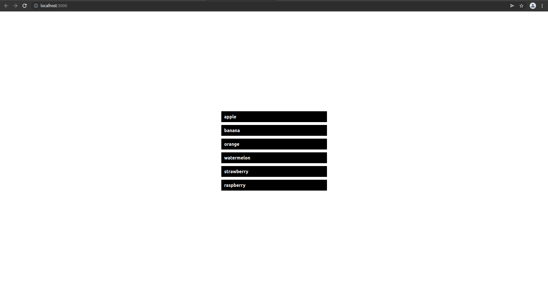
@use "sass:list";

$fruitsA: "apple", "banana", "orange", "watermelon"; // 첫번째 과일 리스트 정의하기
$fruitsB: "watermelon", "strawberry", "raspberry"; // 두번째 과일 리스트 정의하기
$fruits: list.join($fruitsA, $fruitsB);

.background{
  width: 100%;
  height: 100vh;

  display: flex;
  flex-direction: column;
  justify-content: center;
  align-items: center;

  .fruits{
    background-color: black;
    color: white;
    margin-top: 10px;
    padding: 10px;
    width: 150px;
    font-weight: bold;

    @each $name in $fruits{
      &.#{$name}{
        width: 50px * list.length($fruits);
      }
      &.#{$name}::after{
        content: $name;
      }
    }
  }
}
App.scss 파일을 위와 같이 작성하자!
$fruitsA: "apple", "banana", "orange", "watermelon"; // 첫번째 과일 리스트 정의하기
$fruitsB: "watermelon", "strawberry", "raspberry"; // 두번째 과일 리스트 정의하기
두 개의 과일 리스트를 정의하고 있다. 각 아이템은 문자열 형태이다.
$fruits: list.join($fruitsA, $fruitsB);join 함수를 이용하여 두 개의 과일 리스트 fruitsA, fruitsB 를 fruits 라는 하나의 리스트로 합친다.
$fruits: join($fruitsA, $fruitsB);에러가 나거나 잘 동작하지 않는다면 위와 같이 작성하고 다시 시도해보자!
@each $name in $fruits{
  &.#{$name}{
    width: 50px * list.length($fruits);
  }
  &.#{$name}::after{
    content: $name;
  }
}
하나로 합쳐진 과일 리스트를 순회하면서 각각의 아이템을 조회한 다음 SASS 코드를 생성한다. length 함수를 이용하여 fruits 리스트의 길이를 조회한다. 숫자 7이 반환된다. 즉, 리스트의 모든 아이템의 너비(width)는 350px 로 설정된다.
width: 50px * length($fruits);에러가 나거나 잘 동작하지 않는다면 위와 같이 작성하고 다시 시도해보자!
Map 모듈
Map 모듈은 자바스크립트 Map 객체와 관련된 모듈이다. Map 객체는 키(key)와 값(value) 쌍으로 이루어진 객체이다.
Sass: Operators
Sass supports a handful of useful operators for working with different values. These include the standard mathematical operators like + and *, as well as operators for various other types: == and != are used to check if two values are the same. +, -, *,
sass-lang.com
Sass: @if and @else
The @if rule is written @if { ... } , and it controls whether or not its block gets evaluated (including emitting any styles as CSS). The expression usually returns either true or false—if the expression returns true, the block is evaluated, and if the e
sass-lang.com
get($map, $key)get 함수는 Map 객체에서 key 에 해당하는 value 를 반환해준다. $map 은 Map 객체이고, $key 는 조회하려는 value 의 key 값이다.
has-key($map, $key)has-key 함수는 Map 객체에 인자로 주어진 key 가 존재하면 true 그렇지 않으면 false 를 반환한다. $map 은 Map 객체이고, $key 는 존재유무를 판단할 key 값이다.
import { Component } from 'react';
import './App.scss'

function App(){
  return (
    <button className='checkin-btn'>
      <div className='bg-img'></div>
      체크인
    </button>
  )
}
export default App
App 컴포넌트를 위와 같이 작성하자! Map 모듈을 이용해서 간단한 버튼 스타일링을 해보자! checkin-btn 클래스는 버튼의 전반적인 스타일링을 담당하고, bg-img 클래스는 버튼의 아이콘 스타일을 위한 것이다.
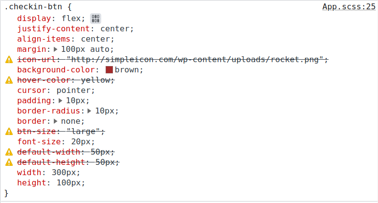
@use "sass:map";

// 버튼 스타일을 Map 객체로 정의함 (Map : key - value)
$btn-style: (
  icon-url: "http://simpleicon.com/wp-content/uploads/rocket.png",
  background-color: brown,
  hover-color: yellow,
  cursor: pointer,
  padding: 10px,
  border-radius: 10px,
  border: none,
  btn-size: "large",
  font-size: 20px,
  default-width: 50px,
  default-height: 50px,
);

// 중앙정렬은 자주 사용하므로 믹스인로 정의함
@mixin alignCenter(){
  display: flex;
  justify-content: center;
  align-items: center;
}
// 버튼 크기도 다양하므로 믹스인으로 정의함
@mixin sizeOfButtn($btn-obj){
  height: map.get($btn-obj, default-height) * 2;

  @if (map.has-key($btn-obj, btn-size) and map.get($btn-obj, btn-size) == "large"){
    width: map.get($btn-obj, default-width) * 6;
  }@else if (map.has-key($btn-obj, btn-size) and map.get($btn-obj, btn-size) == "medium"){
    width: map.get($btn-obj, default-width) * 4;
  }@else if (map.has-key($btn-obj, btn-size) and map.get($btn-obj, btn-size) == "small"){
    width: map.get($btn-obj, default-width) * 2;
  }
}

.checkin-btn{
  @include alignCenter(); // 중앙정렬
  @include sizeOfButtn($btn-style); // 버튼크기 설정
  margin: map.get($btn-style, default-height) * 2 auto;

  // 나머지 속성 설정
  @each $key, $value in $btn-style{
    #{$key}: $value;
  }

  &:hover{
    background-color: map.get($btn-style, hover-color);
  }

  // 아이콘 설정
  .bg-img{
    background: url(map.get($btn-style, icon-url)), no-repeat;
    background-size: cover;
    width: map.get($btn-style, default-width);
    height: map.get($btn-style, default-height);
  }
}
App.scss 파일을 위와 같이 작성하자!
@use "sass:map";

// 버튼 스타일을 Map 객체로 정의함 (Map : key - value)
$btn-style: (
  icon-url: "http://simpleicon.com/wp-content/uploads/rocket.png",
  background-color: brown,
  hover-color: yellow,
  cursor: pointer,
  padding: 10px,
  border-radius: 10px,
  border: none,
  btn-size: "large",
  font-size: 20px,
  default-width: 50px,
  default-height: 50px,
);

// 중앙정렬은 자주 사용하므로 믹스인로 정의함
@mixin alignCenter(){
  display: flex;
  justify-content: center;
  align-items: center;
}
// 버튼 크기도 다양하므로 믹스인으로 정의함
@mixin sizeOfButtn($btn-obj){
  height: map-get($btn-obj, default-height) * 2;

  @if (has-key($btn-obj, btn-size) and map-get($btn-obj, btn-size) == "large"){
    width: map-get($btn-obj, default-width) * 6;
  }@else if (has-key($btn-obj, btn-size) and map-get($btn-obj, btn-size) == "medium"){
    width: map-get($btn-obj, default-width) * 4;
  }@else if (has-key($btn-obj, btn-size) and map-get($btn-obj, btn-size) == "small"){
    width: map-get($btn-obj, default-width) * 2;
  }
}

.checkin-btn{
  @include alignCenter(); // 중앙정렬
  @include sizeOfButtn($btn-style); // 버튼크기 설정
  margin: map-get($btn-style, default-height) * 2 auto;

  // 나머지 속성 설정
  @each $key, $value in $btn-style{
    #{$key}: $value;
  }

  &:hover{
    background-color: map-get($btn-style, hover-color);
  }

  // 아이콘 설정
  .bg-img{
    background: url(map-get($btn-style, icon-url)), no-repeat;
    background-size: cover;
    width: map-get($btn-style, default-width);
    height: map-get($btn-style, default-height);
  }
}
에러가 나거나 잘 동작하지 않는다면 위와 같이 작성하고 다시 시도해보자! map.get 을 map-get 으로 변경하고 시도해보자!
@use "sass:map";@use 키워드를 사용하면 SASS 내장모듈을 불러올 수 있다. 여기서는 map 모듈을 불러온다.
// 버튼 스타일을 Map 객체로 정의함 (Map : key - value)
$btn-style: (
  icon-url: "http://simpleicon.com/wp-content/uploads/rocket.png",
  background-color: brown,
  hover-color: yellow,
  cursor: pointer,
  padding: 10px,
  border-radius: 10px,
  border: none,
  btn-size: "large",
  font-size: 20px,
  default-width: 50px,
  default-height: 50px,
);
버튼 스타일을 Map 객체로 정의한다. Map 객체는 키(key)와 값(value) 쌍으로 이루어져 있다. icon-url, hover-color, btn-size, default-width, default-height 속성은 CSS 예 존재하지 않는 사용자 정의 속성이다.
// 중앙정렬은 자주 사용하므로 믹스인로 정의함
@mixin alignCenter(){
  display: flex;
  justify-content: center;
  align-items: center;
}
중앙정렬은 자주 사용되는 스타일 코드이므로 믹스인을 이용하여 따로 정의한다.
// 버튼 크기도 다양하므로 믹스인으로 정의함
@mixin sizeOfButtn($btn-obj){
  height: map.get($btn-obj, default-height) * 2;

  @if (map.has-key($btn-obj, btn-size) and map.get($btn-obj, btn-size) == "large"){
    width: map.get($btn-obj, default-width) * 6;
  }@else if (map.has-key($btn-obj, btn-size) and map.get($btn-obj, btn-size) == "medium"){
    width: map.get($btn-obj, default-width) * 4;
  }@else if (map.has-key($btn-obj, btn-size) and map.get($btn-obj, btn-size) == "small"){
    width: map.get($btn-obj, default-width) * 2;
  }
}
버튼의 크기를 다양하게 설정하기 위하여 믹스인으로 정의한다. 파라미터로 주어진 btn-obj (Map 객체)에서 btn-size 값에 따라 버튼의 크기(너비, 높이)를 다르게 설정한다.
height: map.get($btn-obj, default-height) * 2;버튼의 높이는 btn-obj (Map 객체)에서 default-height 값의 2배로 설정한다. 즉, default-height 값이 50px 이므로 높이는 100px 이 된다.
@if (map.has-key($btn-obj, btn-size) and map.get($btn-obj, btn-size) == "large"){
    width: map.get($btn-obj, default-width) * 6;
}
버튼의 너비는 has-key 함수와 get 함수를 이용하여 btn-obj (Map 객체)에 btn-size 라는 key 가 존재하면 설정된다. 그렇지 않으면 너비는 설정되지 않는다. 위 코드는 btn-obj (Map 객체)의 btn-size 값이 "large" 인 경우에 버튼의 너비는 default-width 값의 6배로 설정된다. 즉, default-width 값이 50px 이므로 너비는 300px 이 된다.
@else if (map.has-key($btn-obj, btn-size) and map.get($btn-obj, btn-size) == "medium"){
    width: map.get($btn-obj, default-width) * 4;
}@else if (map.has-key($btn-obj, btn-size) and map.get($btn-obj, btn-size) == "small"){
    width: map.get($btn-obj, default-width) * 2;
}
만약 btn-obj (Map 객체)의 btn-size 값이 "medium" 과 "small" 이라면 각각 default-width 값의 4배와 2배로 설정된다. 즉, 너비는 각각 200px 과 100px 로 설정된다. btn-size 값을 "medium" 과 "small" 로 변경해서 버튼 크기를 확인해보자!
@include alignCenter(); // 중앙정렬
@include sizeOfButtn($btn-style); // 버튼크기 설정
margin: map.get($btn-style, default-height) * 2 auto;
@include 로 믹스인을 불러와서 사용한다. 버튼 내부의 컨텐츠를 중앙정렬한다. 또한, 버튼의 크기를 설정한다. 마지막으로 margin 속성으로 버튼의 위치를 지정한다. 버튼의 위아래 위치는 btn-style (Map 객체) 에서 default-height 값의 2배로 설정한다. 즉, 웹페이지 상단으로부터 100px 만큼 아래에 위치하게 된다.
// 나머지 속성 설정
@each $key, $value in $btn-style{
    #{$key}: $value;
}
btn-style (Map 객체) 을 순회하면서 key 와 value 를 조회한 다음 아래와 같이 CSS 속성을 한번에 설정한다.
btn-style (Map 객체) 에서 실제 CSS 에 존재하지 않는 속성이름인 icon-url, hover-color, btn-size, default-width, default-height 은 설정되지 않는다.
&:hover{
    background-color: map.get($btn-style, hover-color);
}
버튼에 마우스가 hover 인 경우의 스타일을 정의한다. get 함수를 이용하여 버튼의 background-color 속성을 btn-style (Map 객체) 의 hover-color 값으로 설정한다. 즉, yellow 로 설정된다.
// 아이콘 설정
.bg-img{
background: url(map.get($btn-style, icon-url)), no-repeat;
background-size: cover;
width: map.get($btn-style, default-width);
height: map.get($btn-style, default-height);
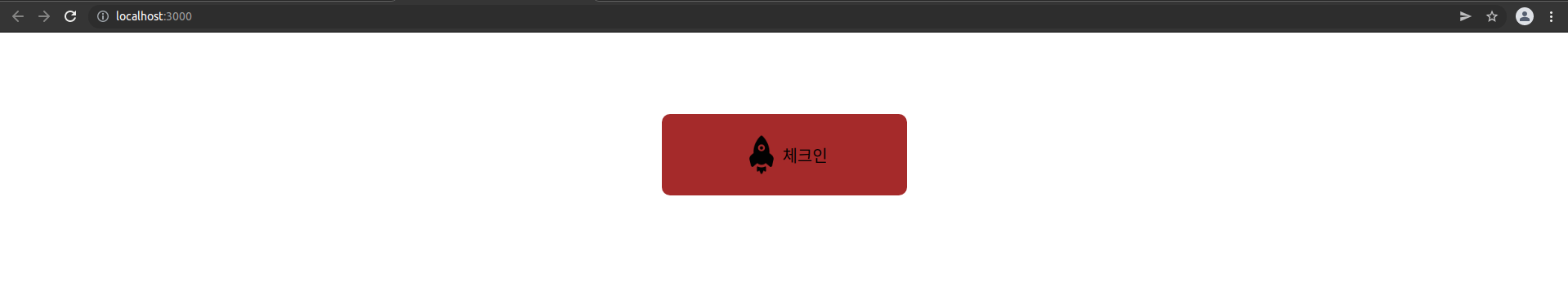
}버튼의 아이콘 스타일을 설정한다. get 함수를 이용하여 background 의 url 경로를 btn-style (Map 객체) 의 icon-url 값으로 설정한다. 아이콘의 크기(너비, 높이)는 각각 btn-style (Map 객체) 의 default-width 와 default-height 값으로 설정한다. 버튼 스타일링 결과는 아래와 같다.
keys($map)keys 함수는 Map 객체의 key 만 추출하여 리스트 (배열) 로 반환한다. $map 은 Map 객체이다.
values($map)values 함수는 Map 객체의 value 만 추출하여 리스트 (배열) 로 반환한다. $map 은 Map 객체이다.
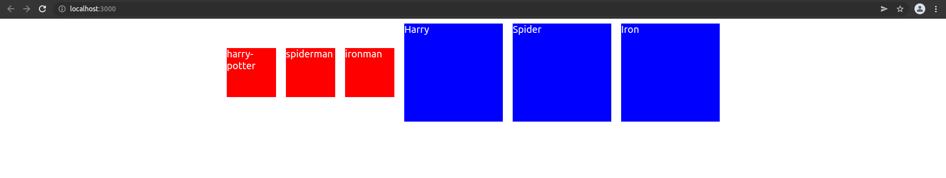
import { Component } from 'react';
import './App.scss'

function App(){
  return (
    <div className='background'>
      <div className='harry-potter'></div>
      <div className='spiderman'></div>
      <div className='ironman'></div>
      <div className='Harry'></div>
      <div className='Spider'></div>
      <div className='Iron'></div>
    </div>
  )
}
export default App
App 컴포넌트를 위와 같이 작성하자! 6개의 서로 다른 클래스를 설정하였다.
@use "sass:map";
$books: (
harry-potter: "Harry",
spiderman: "Spider",
ironman: "Iron"
);
$default-width: 50px;
$default-height: 50px;
$default-margin: 10px;
.background{
display: flex;
justify-content: center;
align-items: center;
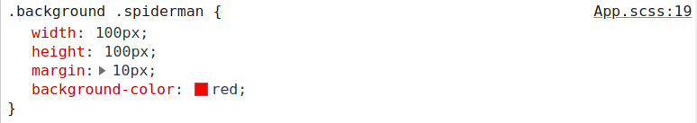
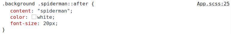
@each $key in map.keys($books){
.#{$key}{
width: $default-width * 2;
height: $default-height * 2;
margin: $default-margin;
background-color: red;
}
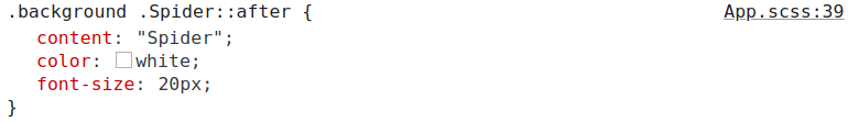
.#{$key}::after{
content: "#{$key}";
color: white;
font-size: 20px;
}
}
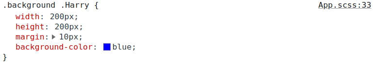
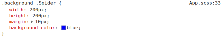
@each $value in map.values($books){
.#{$value}{
width: $default-width * 4;
height: $default-height * 4;
margin: $default-margin;
background-color: blue;
}
.#{$value}::after{
content: $value;
color: white;
font-size: 20px;
}
}
}App.scss 파일을 위와 같이 작성하자!
@use "sass:map";

$books: (
  harry-potter: "Harry",
  spiderman: "Spider",
  ironman: "Iron"
);

$default-width: 50px;
$default-height: 50px;
$default-margin: 10px;

@mixin setStyles($className, $num, $bg){
  .#{$className}{
    width: $default-width * $num;
    height: $default-height * $num;
    margin: $default-margin;
    background-color: $bg;
  }
  .#{$className}::after{
    content: "#{$className}";
    color: white;
    font-size: 20px;
  }
}

.background{
  display: flex;
  justify-content: center;
  align-items: center;

  @each $key in map.keys($books){
    @include setStyles($key, 2, red);
  }

  @each $value in map.values($books){
    @include setStyles($value, 4, blue);
  }
}
setStyles 라는 믹스인을 재활용하면 코드가 훨씬 간결해진다.
@use "sass:map";

$books: (
  harry-potter: "Harry",
  spiderman: "Spider",
  ironman: "Iron"
);

$default-width: 50px;
$default-height: 50px;
$default-margin: 10px;

.background{
  display: flex;
  justify-content: center;
  align-items: center;

  @each $key in map-keys($books){
    .#{$key}{
      width: $default-width * 2;
      height: $default-height * 2;
      margin: $default-margin;
      background-color: red;
    }
    .#{$key}::after{
      content: "#{$key}";
      color: white;
      font-size: 20px;
    }
  }
  @each $value in map-values($books){
    .#{$value}{
      width: $default-width * 4;
      height: $default-height * 4;
      margin: $default-margin;
      background-color: blue;
    }
    .#{$value}::after{
      content: $value;
      color: white;
      font-size: 20px;
    }
  }

}
에러가 나거나 잘 동작하지 않는다면 위와 같이 작성하고 다시 시도해보자! map.keys 를 map-keys 로 변경하고 map.values 를 map-values 로 바꿔서 다시 시도해보자!
$books: (
  harry-potter: "Harry",
  spiderman: "Spider",
  ironman: "Iron"
);
books 라는 Map 객체를 정의한다.
$default-width: 50px;
$default-height: 50px;
$default-margin: 10px;
기본 너비, 높이, 마진을 설정한다.
display: flex;
justify-content: center;
align-items: center;
background 내부의 컨텐츠를 중앙정렬한다.
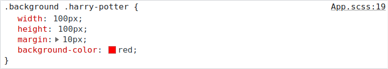
@each $key in map.keys($books){
    .#{$key}{
      width: $default-width * 2;
      height: $default-height * 2;
      margin: $default-margin;
      background-color: red;
    }
    .#{$key}::after{
      content: "#{$key}";
      color: white;
      font-size: 20px;
    }
}
keys 함수를 이용하여 books (Map 객체) 의 키(key)만 추출하여 리스트로 반환한다. 반환된 리스트는 @each 키워드로 각각의 아이템을 조회한다. 조회한 아이템 (key) 을 이용하여 SASS 코드를 생성한다. 결과는 아래와 같다.

@each $value in map.values($books){
    .#{$value}{
      width: $default-width * 4;
      height: $default-height * 4;
      margin: $default-margin;
      background-color: blue;
    }
    .#{$value}::after{
      content: $value;
      color: white;
      font-size: 20px;
    }
}
values 함수를 이용하여 books (Map 객체) 의 값(value)만 추출하여 리스트로 반환한다. 반환된 리스트는 @each 키워드로 각각의 아이템을 조회한다. 조회한 아이템 (value) 을 이용하여 SASS 코드를 생성한다. 결과는 아래와 같다.

merge($map1, $map2)merge 함수는 인자로 주어진 map1 과 map2 를 병합해서 하나의 Map 객체를 반환한다.
remove($map, $value )remove 함수는 특정 키(key)와 값(value)를 제거한 새로운 Map 객체를 반환한다. map 은 Map 객체이고, value 는 제거하려는 key 이다.
* 연습과제 1
컴포넌트 스타일링 수업에서 다룬 버튼 컴포넌트에 대하여 아래 코드를 참고하여 SASS 로 동일하게 스타일링해보자!
import React from 'react'
import './Button.css'

function Button({ children, size, color, width, handleClick, disabled }){
    return <button
                className={`Button ${size} ${color} ${width}`}
                onClick={handleClick} disabled={disabled}
            >{children}</button>
}

export default Button;

Button.defaultProps = {
    size: 'medium',
    color: 'tomato',
    disabled: false
}
.Button {
all: unset;
color: white;
cursor: pointer;
border-radius: 5px;
font-weight: bold;
margin-left: 10px;
display: inline-flex;
align-items: center;
justify-content: center;
}
.Button:hover{
opacity: 0.7;
}
/* 버튼의 크기 설정 */
.large{
height: 70px;
padding-left: 15px;
padding-right: 15px;
font-size: 1.2rem;
}
.medium{
height: 50px;
padding-left: 10px;
padding-right: 10px;
font-size: 1rem;
}
.small{
height: 30px;
padding-left: 5px;
padding-right: 5px;
font-size: 0.8rem;
}
/* 버튼의 배경색 설정 */
.blue{
background:blue;
}
.blue:hover{
background: skyblue;
}
.tomato{
background: tomato;
}
.tomato:hover{
background: lightsalmon;
}
.grey{
background: grey;
}
.grey:hover{
background: lightgray;
}
/* 전체 너비를 차지하는 버튼 */
.fullWidth{
width: 100%;
margin-left: 0px;
margin-top: 10px;
margin-bottom: 10px;
}import './App.css';
import Button from './Button';
function App() {
const handleClick = () => alert('clicked button') // 이벤트핸들러 함수
return (
<div className="App">
<Button size="small" color="blue" handleClick={handleClick} disabled={true}>Add Todo</Button>
<Button size="medium" color="tomato">
<img src="http://simpleicon.com/wp-content/uploads/rocket.png" width="30px" height="30px"></img>
Add Todo
</Button>
<Button size="large" color="grey">Add todo</Button>
</div>
);
}
export default App;<!doctype html>
<html lang="ko">
<head>
<meta charset="utf-8">
<meta name="viewport" content="width=device-width, initial-scale=1">
<title>프로필 섹션 페이지</title>
<link rel="stylesheet" href="style.css">
</head>
<body>
<div class="App">
<button class="Button small blue">Add Todo</button>
<button class="Button medium tomato">
<img src="http://simpleicon.com/wp-content/uploads/rocket.png" width="30px" height="30px"></img>
Add Todo
</button>
<button class="Button large grey fullWidth">Add todo</button>
</div>
</body>
</html>SASS 코드가 제대로 동작하는지 테스트해볼 수 있는 HTML 문서는 위와 같다.
* 연습과제 2
컴포넌트 스타일링 수업에서 다룬 모달 컴포넌트에 대하여 아래 코드를 참고하여 SASS 로 동일하게 스타일링해보자!
import React from 'react'
import './Modal.css'

function Modal({ open, children }){
    return <div className={`Modal ${open? "open": "close"}`}>{children}</div>
}

export default Modal;

Modal.defaultProps = {
    open: false
}
.Modal {
width: 500px;
margin: 100px auto;
border: 1px solid tan;
padding: 10px;
text-align: center;
}
.open{
display: block;
}
.close{
display: none;
}
.header, .body, .footer{
padding: 5px;
}
.header{
font-size: 1.2rem;
font-weight: bold;
}
.body{
font-size: 0.9rem;
margin: 20px;
}
.body input{
width: 60%;
height: 30px;
border: 1px solid lightgray;
border-radius: 5px;
margin-bottom: 10px;
}
.footer{
display: flex;
justify-content: flex-end;
align-items: center;
}import './App.css';
import Modal from './Modal';
import Button from './Button';
import { Component } from 'react';
class App extends Component {
state = {
open: false
}
openModal = () => {
this.setState({ open: true })
}
closeModal = () => {
this.setState({ open: false })
}
render(){
const { open } = this.state
const { openModal, closeModal} = this
return (
<div className="App">
<Button handleClick={openModal}>Add Todo</Button>
<Modal open={open}>
<div className="header">You want to add new todo ?</div>
<div className="body">
<label>todo name: <input type="text"></input></label><br/>
<label>todo description: <input type="text"></input></label>
</div>
<div className="footer">
<Button size="small">Add</Button>
<Button size="small" handleClick={closeModal}>Close</Button>
</div>
</Modal>
</div>
);
}
}
export default App;<!doctype html>
<html lang="ko">
<head>
<meta charset="utf-8">
<meta name="viewport" content="width=device-width, initial-scale=1">
<title>프로필 섹션 페이지</title>
<link rel="stylesheet" href="style.css">
</head>
<body>
<div class="App">
<button type="button" class="Button large tomato">Add Todo</button>
<div class="Modal open" >
<div class="header">You want to add new todo ?</div>
<div class="body">
<label>todo name: <input type="text"></input></label><br/>
<label>todo description: <input type="text"></input></label>
</div>
<div class="footer">
<button type="button" class="Button small grey">Add</button>
<button type="button" class="Button small blue">Close</button>
</div>
</div>
</div>
</body>
</html>SASS 코드가 제대로 동작하는지 테스트해볼 수 있는 HTML 문서는 위와 같다.
* 연습과제 3
아래 코드를 참고하여 동일한 동작을 하도록 CSS 코드를 SASS 코드로 다시 작성해보자!
import './App.css';
import React, { Component } from 'react'

class App extends Component{
  state = {
    isSorted: false,
    products: null,
    sortedProducts: null
  }
  componentDidMount(){
    const API_URL = 'http://makeup-api.herokuapp.com/api/v1/products.json?brand=maybelline'
    // 서버에서 데이터 가져오기
    fetch(API_URL)
    .then((res) => {
        return res.json()
    })
    .then((products) => {
      const sortedProducts = [...products] //  원본복사
      sortedProducts.sort( (p1, p2) => parseFloat(p1.price) - parseFloat(p2.price) )
      this.setState({products, sortedProducts})
    })
  }
  toggleState = () => {
    this.setState({ isSorted: !this.state.isSorted})
  }

  render(){
    const { isSorted, products, sortedProducts } = this.state

    const displayProducts = (product) => {
      const item = (
        <div key={product.id} className='product'>
          <div className='product-img'><img src={product.image_link} alt={product.name}/></div>
          <div className='product-name'>{product.name} (${product.price})</div>
          <div className='product-description'>{product.description}</div>
          <div className='product-type'>{product.product_type}</div>
        </div>
      )
      return item
    }

    return (
      <>
        <div className="header">
          <button className="sort-btns" onClick={this.toggleState}>Price</button><br/>
        </div>

        <div className='root'>
          {isSorted ?
              sortedProducts && sortedProducts.map(displayProducts)
            : products && products.map(displayProducts)}
        </div>
      </>
    )
  }
}

export default App;
.header{
width: 100%;
height: 70px;
position: fixed;
left: 0;
top: 0;
right: 0;
// box-shadow: 1px 1px 5px 5px darkgray;
background: rgba(255, 255, 255, .7);
backdrop-filter: blur(20px);
z-index: 1;
display: flex;
justify-content: flex-start;
align-items: center;
}
.sort-btns{
all: unset;
width: 100px;
height: 50px;
background: rgba(0, 0, 0, .8);
border-radius: 10px;
cursor: pointer;
color: white;
font-size: 1rem;
font-weight: bold;
text-align: center;
margin-right: 10px;
}
.sort-btns:hover{
opacity: 0.8;
}
.root{
width: 60%;
margin: 100px auto;
display: flex;
flex-wrap: wrap;
justify-content: flex-start;
align-items: center;
}
.product{
flex-basis: 200px;
height: 500px;
color: white;
background: rgba(0, 0, 0, .8);
margin: 10px;
overflow: hidden;
}
.product-img{
width: 100%;
height: 180px;
overflow: hidden;
padding-bottom: 1rem;
}
.product-img img{
width: 100%;
height: 100%;
}
.product-name{
font-weight: bold;
font-size: 1.1rem;
text-align: center;
}
.product-description{
font-weight: 400;
font-size: 0.9rem;
text-align: center;
margin-top: 15px;
}
.product-type{
text-align: center;
margin-top: 2rem;
}<!doctype html>
<html lang="ko">
<head>
<meta charset="utf-8">
<meta name="viewport" content="width=device-width, initial-scale=1">
<title>프로필 섹션 페이지</title>
<link rel="stylesheet" href="style.css">
</head>
<body>
<div class="header">
<button type="button" class="sort-btns">Price</button><br/>
</div>
<div class="root">
<div class='product'>
<div class='product-img'><img src="" alt="상품명"/></div>
<div class='product-name'>상품명 ($3)</div>
<div class='product-description'>상품 상세설명</div>
<div class='product-type'>품종</div>
</div>
<div class='product'>
<div class='product-img'><img src="" alt="상품명"/></div>
<div class='product-name'>상품명 ($3)</div>
<div class='product-description'>상품 상세설명</div>
<div class='product-type'>품종</div>
</div>
<div class='product'>
<div class='product-img'><img src="" alt="상품명"/></div>
<div class='product-name'>상품명 ($3)</div>
<div class='product-description'>상품 상세설명</div>
<div class='product-type'>품종</div>
</div>
<div class='product'>
<div class='product-img'><img src="" alt="상품명"/></div>
<div class='product-name'>상품명 ($3)</div>
<div class='product-description'>상품 상세설명</div>
<div class='product-type'>품종</div>
</div>
<div class='product'>
<div class='product-img'><img src="" alt="상품명"/></div>
<div class='product-name'>상품명 ($3)</div>
<div class='product-description'>상품 상세설명</div>
<div class='product-type'>품종</div>
</div>
<div class='product'>
<div class='product-img'><img src="" alt="상품명"/></div>
<div class='product-name'>상품명 ($3)</div>
<div class='product-description'>상품 상세설명</div>
<div class='product-type'>품종</div>
</div>
</div>
</body>
</html>SASS 코드가 제대로 동작하는지 테스트해볼 수 있는 HTML 문서는 위와 같다.
'프론트엔드 > React' 카테고리의 다른 글
| 리액트 깃허브 페이지에 배포하는 개념 및 방법 (0) | 2023.04.08 |
|---|---|
| 리액트 기초이론 5 - 컴포넌트 스타일링 3 - Styled Components (0) | 2022.03.07 |
| 리액트 기초이론 7 - 이벤트(Event) 처리하기 (0) | 2021.11.07 |
| 리액트 기초이론 9 - 리액트 훅(React Hook) (0) | 2021.10.22 |
| 리액트 기초이론 8 - 리액트 라우터 (0) | 2021.10.22 |