
* Styled Components 의 개념
Tagged Template Literal 을 이용하여 자바스크립트 파일 안에서 컴포넌트 스타일링을 한다.
* styled-components 모듈 설치하기
npm install styled-components위의 명령어를 실행하여 모듈을 설치하자!
* Tagged Template Literal 의 개념
Tagged Template Literal 은 Template Literal 과 유사하다. Template Literal 은 문자열 안에서 달러와 중괄호를 사용하여 아래와 같이 자바스크립트 표현식을 삽입할 수 있다.
import './App.css';
import React, { Component } from 'react'
function App() {
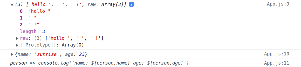
const person = {name: 'sunrise', age: 23}
const getPersonInfo = (person) => console.log(`name: ${person.name} age: ${person.age}`)
const msg = `hello ${person} ${getPersonInfo} !`
console.log(msg)
return (
<></>
)
}
export default App;App 컴포넌트를 위와 같이 작성하자! msg 변수는 Template Literal 로 작성되어 있다. msg 변수를 출력해보면 아래와 같다.

위의 출력결과를 확인해보면 객체는 [object Object] 이라는 문자열로 출력되고, 함수는 문자열로 출력된다.
그렇다면 문자열 안에 존재하는 객체나 함수를 문자열이 아닌 온전한 객체와 함수로 추출할 수는 없을까? 아래와 같이 Tagged Template Literal 을 사용하면 된다.
import './App.css';
import React, { Component } from 'react'

function App() {
  const person = {name: 'sunrise', age: 23}
  const getPersonInfo = (person) => console.log(`name: ${person.name} age: ${person.age}`)

  function tagged(string, obj, func){
    console.log(string)
    console.log(obj)
    console.log(func)
  }

  tagged`hello ${person} ${getPersonInfo} !`

  return (
    <></>
  )
}

export default App;
Tagged Template Literal 은 함수이름 뒤에 Template Literal 을 연결해주면 된다. 이렇게 하면 함수의 첫번째 파라미터로 달러와 중괄호를 제외한 문자열이 달러와 중괄호로 끊어져서 배열에 저장된다. 두번째 파라미터부터는 달러와 중괄호 사이에 삽입되는 각각의 표현식이 차례대로 들어온다. 출력 결과는 아래와 같다.
즉, Tagged Template Literal 을 이용하면 템플릿 문자열 사이 사이에 들어가는 자바스크립트 객체나 함수의 원본 값을 그대로 추출할 수 있다. styled-components 모듈도 이러한 속성을 이용하여 컴포넌트를 스타일링한다.
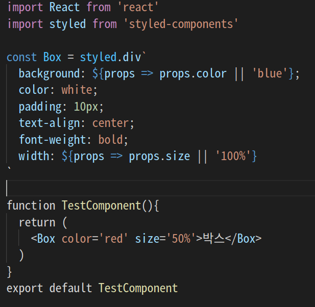
* styled-components 로 스타일링된 엘리먼트 만들기
import React from 'react'
import styled from 'styled-components'

const Box = styled.div`
  background: black;
  color: white;
  padding: 10px;
  text-align: center;
  font-weight: bold;
`

function TestComponent(){
  return (
    <Box>박스</Box>
  )
}
export default TestComponent
우선 styled-components 로 스타일링된 엘리먼트를 만드려면 컴포넌트 상단에 아래와 같이 모듈을 임포트한다.
import styled from 'styled-components'그런 다음 아래와 같이 Tagged Template Literal 을 이용하여 css 코드를 styled.div 뒤에 붙여주면 해당 스타일이 적용된 div 엘리먼트가 만들어진다.
const Box = styled.div`
  background: black;
  color: white;
  padding: 10px;
  text-align: center;
  font-weight: bold;
`
생성된 엘리먼트는 아래와 같이 컴포넌트처럼 사용하면 된다.
<Box>박스</Box>App 컴포넌트에서 정의한 컴포넌트를 임포트한 다음 렌더링해주면 된다.
import './App.css';
import React, { Component } from 'react'
import TestComponent from './TestComponent'

function App() {
  return (
    <TestComponent></TestComponent>
  )
}

export default App;
styled-components 로 스타일링한 결과는 아래와 같다.

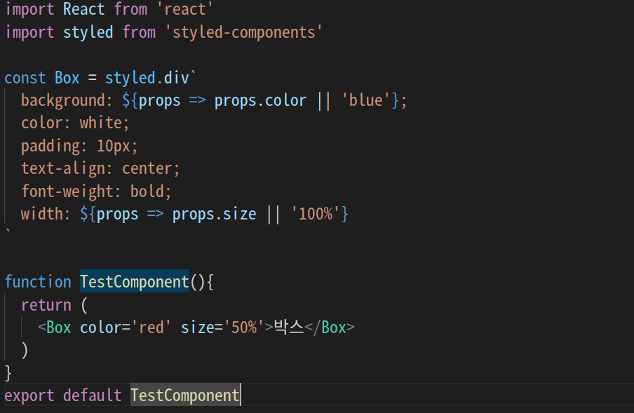
* styled-components 로 스타일링한 엘리먼트에 속성(props) 전달하기
리액트에서 컴포넌트의 의미는 재사용성에 있다. 같은 컴포넌트라도 전달하는 속성(props)에 따라 다양하게 보여줄 수 있다. styled-components 를 사용할때 속성(props)은 아래와 같이 전달하면 된다.
import React from 'react'
import styled from 'styled-components'

const Box = styled.div`
  background: ${props => props.color || 'blue'};
  color: white;
  padding: 10px;
  text-align: center;
  font-weight: bold;
`

function TestComponent(){
  return (
    <Box>박스</Box>
  )
}
export default TestComponent
TestComponent 를 위와 같이 수정하자!
background: ${props => props.color || 'blue'};styled-components 로 작성된 엘리먼트에 속성(props)을 전달하면 템플릿 내부에서 위의 함수가 실행되어 배경색이 설정된다. 위 코드에서는 전달되는 속성(props)이 없기 때문에 디폴트값으로 아래와 같이 파란색이 설정된다.

만약 아래와 같이 Box 엘리먼트에 color 속성(props)을 전달하면 속성으로 전달된 색상이 배경색으로 설정된다.
import React from 'react'
import styled from 'styled-components'

const Box = styled.div`
  background: ${props => props.color || 'blue'};
  color: white;
  padding: 10px;
  text-align: center;
  font-weight: bold;
`

function TestComponent(){
  return (
    <Box color='red'>박스</Box>
  )
}
export default TestComponent
TestComponent 를 위와 같이 수정하자! 결과는 아래와 같다.

import React from 'react'
import styled from 'styled-components'

const Box = styled.div`
  background: ${props => props.color || 'blue'};
  color: white;
  padding: 10px;
  text-align: center;
  font-weight: bold;
  width: ${props => props.size || '100%'}
`

function TestComponent(){
  return (
    <Box color='red' size='50%'>박스</Box>
  )
}
export default TestComponent
Box 엘리먼트에 size 속성도 추가로 전달하면 아래와 같이 적용된다.

근데 코드를 살펴보면 styled-components 로 작성된 css 코드는 아래와 같이 문자열처럼 보인다. css 코드에 하이라이트를 줘서 코드 가독성을 높여보자!
* 엘리먼트 속성(props)에 따른 조건부 스타일링하기
styled-components 를 이용하면 아래와 같이 속성(props)에 따라 서로 다른 스타일링이 가능하다.
import React from 'react'
import styled, { css } from 'styled-components'

const Button = styled.div`
  box-sizing: border-box;
  width: 200px;
  height: 40px;
  border: 2px solid black;
  padding: 10px;
  cursor: pointer;
  font-size: 1.2rem;
  margin: 10px;

  display: flex;
  justify-content: center;
  align-items: center;

  &:hover{
    background: black;
    color: white;
  }

  /* 여러줄의 css 코드를 설정해야 하는 경우 */
  ${props => props.dark && css`
    background: black;
    color: white;

    &:hover{
      background: white;
      color: black;
    }
  `}
`

function TestComponent(){
  return (
    <>
      <Button>사랑합니다 호갱님</Button>
      <Button dark={true}>사랑합니다 호갱님</Button>
    </>
  )
}
export default TestComponent
TestComponents 를 위와 같이 작성하자!
import styled, { css } from 'styled-components'여러줄의 css 코드를 한번에 설정하기 위해서는 css 모듈을 임포트해야 한다.
box-sizing: border-box;
width: 200px;
height: 40px;
border: 2px solid black;
padding: 10px;
cursor: pointer;
font-size: 1.2rem;
margin: 10px;

display: flex;
justify-content: center;
align-items: center;

&:hover{
background: black;
color: white;
}
버튼의 디폴트 스타일을 설정한다.
/* 여러줄의 css 코드를 설정해야 하는 경우 */
${props => props.dark && css`
background: black;
color: white;
&:hover{
background: white;
color: black;
}
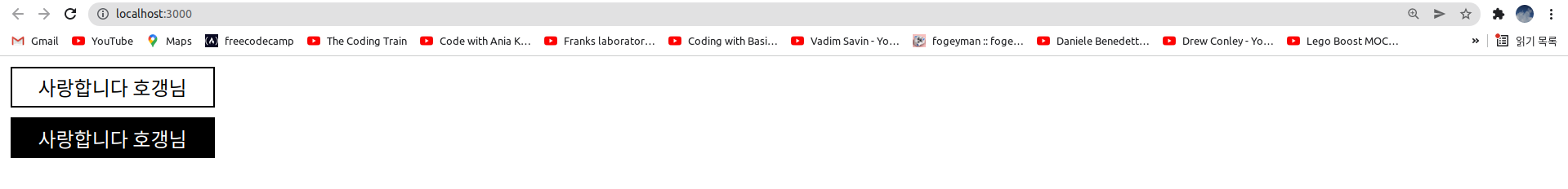
`}dark 라는 속성(props)을 전달한 경우에 위 css 코드가 적용된다. 그렇지 않으면 위 css 코드는 설정되지 않는다.
<Button>사랑합니다 호갱님</Button>
<Button dark={true}>사랑합니다 호갱님</Button>
Button 엘리먼트를 사용한다. 두번째 Button 에는 dark 속성(props)이 전달된다. 결과는 아래와 같다.
만약 css 모듈을 사용한 템플릿 내부에서 속성(props)을 사용하려면 어떻게 하면 될까?
import React from 'react'
import styled, { css } from 'styled-components'

const Button = styled.div`
  box-sizing: border-box;
  width: 200px;
  height: 40px;
  border: 2px solid black;
  padding: 10px;
  cursor: pointer;
  font-size: 1.2rem;
  margin: 10px;

  display: flex;
  justify-content: center;
  align-items: center;

  &:hover{
    background: black;
    color: white;
  }

  /* 여러줄의 css 코드를 설정해야 하는 경우 */
  ${props => props.dark && css`
    background: black;
    color: white;
    width: ${props.width || ''};

    &:hover{
      background: white;
      color: black;
    }
  `}
`

function TestComponent(){
  return (
    <>
      <Button>사랑합니다 호갱님</Button>
      <Button dark={true} width='50%'>사랑합니다 호갱님</Button>
    </>
  )
}
export default TestComponent
TestComponent 를 위와 같이 수정하자!
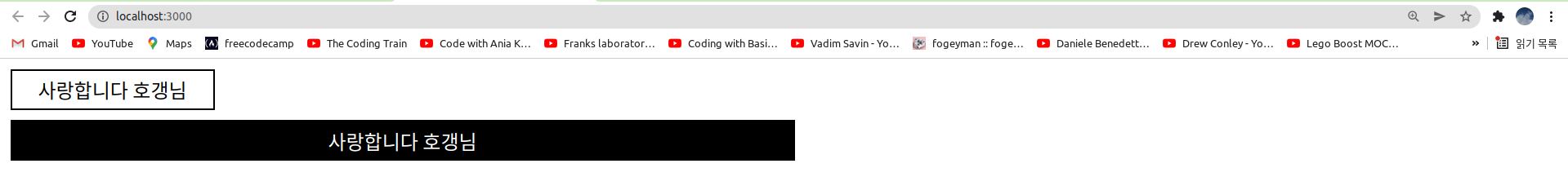
width: ${props.width || ''};위와 같이 width 를 추가한다. width 값이 null 이나 undefined 인 경우에는 width 는 설정되지 않는다.
<Button dark={true} width='50%'>사랑합니다 호갱님</Button>Button 엘리먼트에 width 속성(props)을 전달한다. 결과는 아래와 같다.
* styled-components 의 원리 이해해보기
import './App.css';
import React, { Component } from 'react'

function App() {
  const styled = {}
  styled.div = (string, ...values) => {
    console.log(values[0]) // props => props.color || 'blue'
    console.log(values[1]) // { color: 'yellow' }
    console.log(values[0](values[1])) // yellow
    console.log(string)
    console.log(string[0]) // background:

    let style = {}

    const css = string[1].split(';')
    console.log(css)

    for(let item of css){ // 스타일 문자열 파싱 및 style 객체에 설정
      if(item !== '' && item !== ' '){
        console.log(item.split(':')[0], item.split(':')[1])
        style[item.split(':')[0]] = item.split(':')[1]
      }
    }

    style = { // 배경색 설정
      ...style,
      [string[0].split(":")[0]]: values[0](values[1])
    }
    console.log(style)
    return <div style={style}>박스</div>
  }
  const Box = (props) => {
        console.log(props)
        return styled.div`background: ${props => props.color || 'blue'};padding: 1rem;display: flex; ${props}`
  }

  return (
    <div className="App">
      <Box color='yellow'></Box>
    </div>
  );
}

export default App;
App 컴포넌트를 위와 같이 작성하자!
const styled = {}styled 라는 이름의 빈 객체를 선언한다.
const Box = (props) => {
    console.log(props)
    return styled.div`background: ${props => props.color || 'blue'};padding: 1rem;display: flex; ${props}`
}
Tagged Template Literal 을 이용하여 Box 엘리먼트를 정의한다. styled.div 라는 함수 뒤에 따라오는 템플릿 리터럴은 css 코드이다. css 코드에는 props => props.color || 'blue' 라는 함수와 Box 엘리먼트의 속성(props)이 전달된다.
<Box color='yellow'></Box>Box 엘리먼트를 화면에 렌더링한다. Box 엘리먼트 내부로 color 라는 속성(props)이 전달된다.
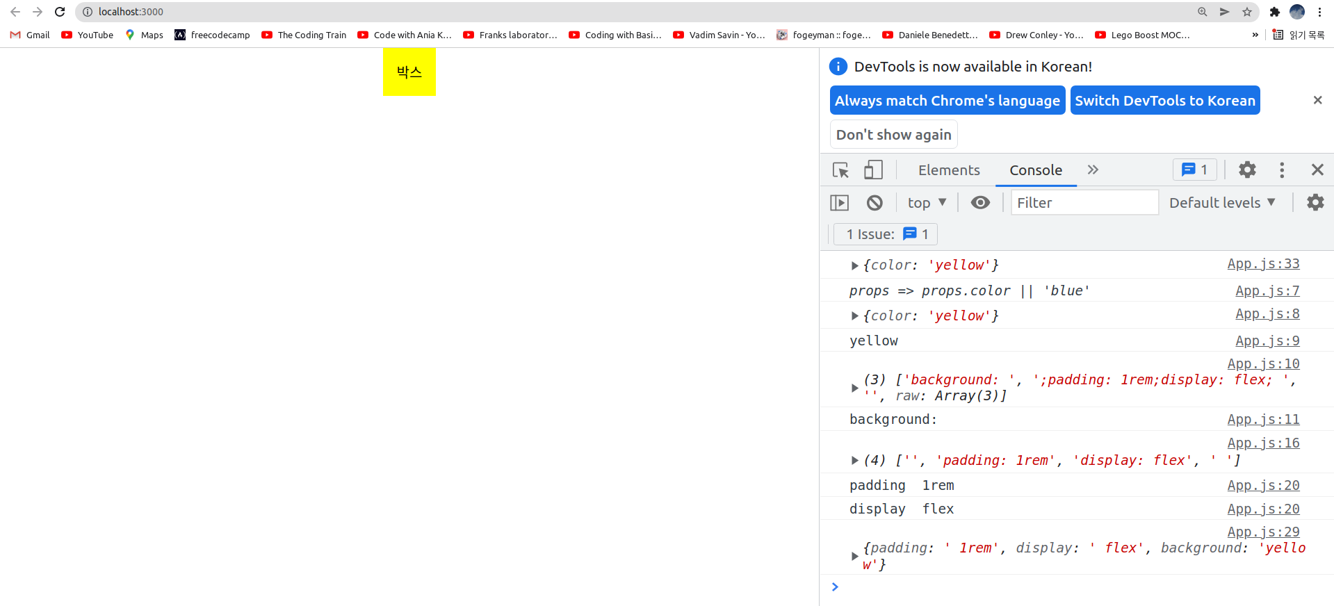
styled.div = (string, ...values) => {
    console.log(values[0]) // props => props.color || 'blue'
    console.log(values[1]) // { color: 'yellow' }
    console.log(values[0](values[1])) // yellow
    console.log(string)
    console.log(string[0]) // background:

    let style = {}

    const css = string[1].split(';')
    console.log(css)

    for(let item of css){ // 스타일 문자열 파싱 및 style 객체에 설정
      if(item !== '' && item !== ' '){
        console.log(item.split(':')[0], item.split(':')[1])
        style[item.split(':')[0]] = item.split(':')[1]
      }
    }

    style = { // 배경색 설정
      ...style,
      [string[0].split(":")[0]]: values[0](values[1])
    }
    console.log(style)
    return <div style={style}>박스</div>
  }
Tagged Template Literal 로 설정된 css 코드를 파싱(해석)해서 style 객체를 만든 다음 div 엘리먼트를 반환한다.
let style = {}style 이라는 빈 객체를 선언한다.
const css = string[1].split(';')background 속성을 제외한 나머지 css 코드를 세미콜론(;)으로 파싱한다. 즉, ;padding: 1rem;display: flex; 이라는 문자열을 세미콜론으로 분리한다.
for(let item of css){ // 스타일 문자열 파싱 및 style 객체에 설정
  if(item !== '' && item !== ' '){
    console.log(item.split(':')[0], item.split(':')[1])
    style[item.split(':')[0]] = item.split(':')[1]
  }
}
세미콜론으로 분리한 css 코드를 다시 콜론(:)으로 분리한 다음 style 객체에 저장한다. 즉, style 객체의 padding 프로퍼티의 값으로 1rem 이 설정되고, style 객체의 display 속성으로 flex 가 설정된다.
style = { // 배경색 설정
  ...style,
  [string[0].split(":")[0]]: values[0](values[1])
}
기존 style 객체에 배경색(background) 속성에 대한 설정을 추가한다. string[0].split(":")[0] 는 background 라는 문자열이다. values[0] 는 props => props.color || 'blue' 라는 함수이다. values[1] 은 { color: 'yellow' } 라는 props 객체이다. 결국, background: 'yellow' 라는 css 코드가 한 줄 추가된다.
return <div style={style}>박스</div>style 객체로 스타일이 적용된 div 엘리먼트를 반환한다.
위의 예시는 하드코딩된 단순한 예시일뿐 styled-components 가 정확하게 위와 같이 동작한다는 것은 아니다. 하지만 대략적으로 styled-components 의 동작원리를 이해하기 위한 예제이다. 결과는 아래와 같다.
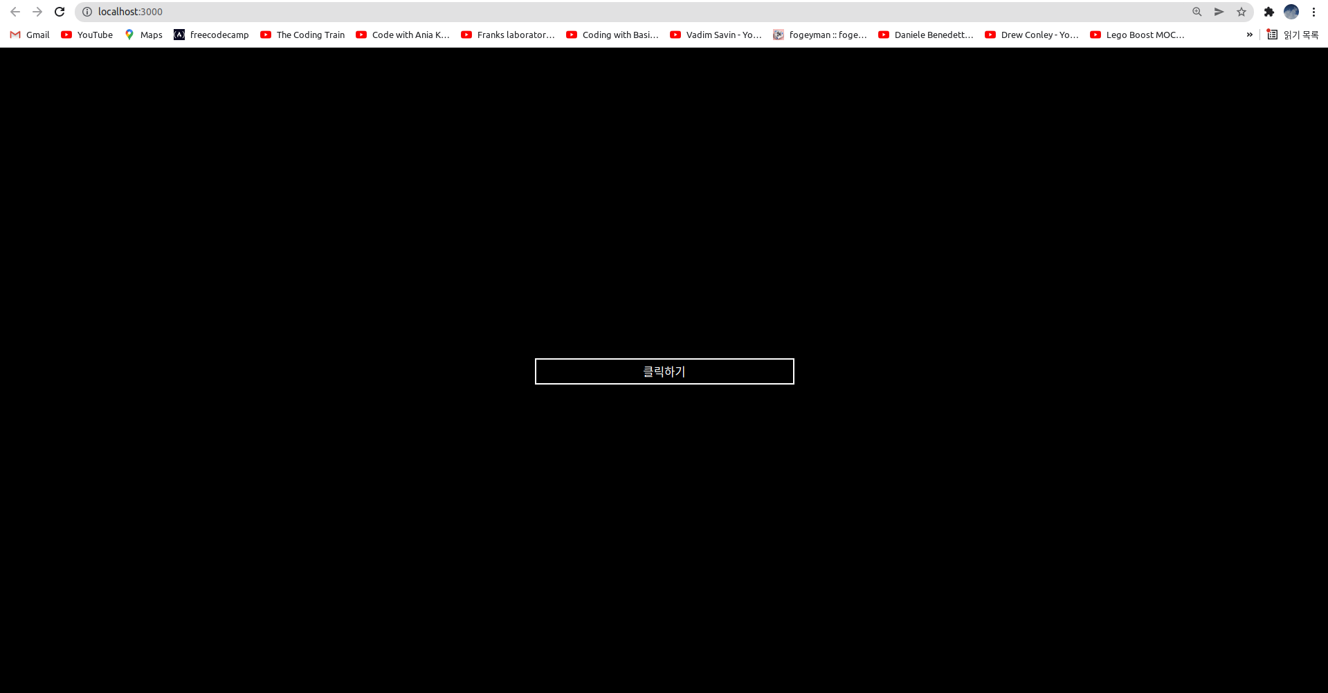
* styled-components 로 여러개의 엘리먼트 스타일링하기
import './App.css';
import React from 'react'
import styled, { css } from 'styled-components'

// styled-components 는 반드시 컴포넌트 외부에 선언되어야 함
const Container = styled.div`
    width: 100%;
    height: 100vh;
    background-color: black;

    display: flex;
    justify-content: center;
    align-items: center;
  `
const Button = styled.button`
    width: 300px;
    height: 30px;
    background-color: black;
    border: 2px solid white;
    color: white;
`

function App() {

  return (
    <Container>
      <Button>클릭하기</Button>
    </Container>
  );
}

export default App;
App 컴포넌트를 위와 같이 작성하자! Container, Button 엘리먼트를 각각 styled-components 로 스타일링한다. 결과는 아래와 같다.
* 연습문제 1
컴포넌트 스타일링 첫번째 수업에서 배운 버튼 컴포넌트를 styled-components 로 다시 만들어보자! (단, styled-components 에서 이벤트핸들러는 아래 App 컴포넌트 안의 Button 컴포넌트처럼 곧바로 onClick 속성을 사용하면 된다.)
import React from 'react'
import './Button.css'

function Button({ children, size, color, width, handleClick }){
    return <button
                className={`Button ${size} ${color} ${width}`}
                onClick={handleClick}
            >{children}</button>
}

export default Button;

Button.defaultProps = {
    size: 'medium',
    color: 'tomato',
}
.Button {
all: unset;
color: white;
cursor: pointer;
border-radius: 5px;
font-weight: bold;
margin-left: 10px;
display: inline-flex;
align-items: center;
justify-content: center;
}
.Button:hover{
opacity: 0.7;
}
/* 버튼의 크기 설정 */
.large{
height: 70px;
padding-left: 15px;
padding-right: 15px;
font-size: 1.2rem;
}
.medium{
height: 50px;
padding-left: 10px;
padding-right: 10px;
font-size: 1rem;
}
.small{
height: 30px;
padding-left: 5px;
padding-right: 5px;
font-size: 0.8rem;
}
/* 버튼의 배경색 설정 */
.blue{
background:blue;
}
.blue:hover{
background: skyblue;
}
.tomato{
background: tomato;
}
.tomato:hover{
background: lightsalmon;
}
.grey{
background: grey;
}
.grey:hover{
background: lightgray;
}
/* 전체 너비를 차지하는 버튼 */
.fullWidth{
width: 100%;
margin-left: 0px;
margin-top: 10px;
margin-bottom: 10px;
}function App() {
const handleClick = () => alert('clicked button') // 이벤트핸들러 함수
return (
<div className="App">
<Button size="small" color="blue" onClick={handleClick}>Add Todo</Button>
<Button size="medium" color="tomato">
<img src="http://simpleicon.com/wp-content/uploads/rocket.png" width="30px" height="30px"></img>
Add Todo
</Button>
<Button size="large" color="grey">Add todo</Button>
</div>
);
}
export default App;
* 연습문제 2
컴포넌트 스타일링 첫번째 수업에서 배운 모달 컴포넌트를 styled-components 로 다시 만들어보자! (단, 이 문제에서 Button 컴포넌트는 styled-components 가 아니라 이전 수업에서 만들어둔 것을 사용하기 때문에 이벤트핸들러는 handleClick 을 사용하면 된다.)
import React from 'react'
import './Modal.css'

function Modal({ open, children }){
    return <div className={`Modal ${open? "open": "close"}`}>{children}</div>
}

export default Modal;

Modal.defaultProps = {
    open: false
}
.Modal {
width: 500px;
margin: 100px auto;
border: 1px solid tan;
padding: 10px;
text-align: center;
}
.open{
display: block;
}
.close{
display: none;
}
.header, .body, .footer{
padding: 5px;
}
.header{
font-size: 1.2rem;
font-weight: bold;
}
.body{
font-size: 0.9rem;
margin: 20px;
}
.body input{
width: 60%;
height: 30px;
border: 1px solid lightgray;
border-radius: 5px;
margin-bottom: 10px;
}
.footer{
display: flex;
justify-content: flex-end;
align-items: center;
}import './App.css';
import Modal from './Modal';
import Button from './Button';
import { Component } from 'react';
class App extends Component {
state = {
open: false
}
openModal = () => {
this.setState({ open: true })
}
closeModal = () => {
this.setState({ open: false })
}
render(){
const { open } = this.state
const { openModal, closeModal} = this
return (
<div className="App">
<Button handleClick={openModal}>Add Todo</Button>
<Modal open={open}>
<div className="header">You want to add new todo ?</div>
<div className="body">
<label>todo name: <input type="text"></input></label><br/>
<label>todo description: <input type="text"></input></label>
</div>
<div className="footer">
<Button size="small">Add</Button>
<Button size="small" handleClick={closeModal}>Close</Button>
</div>
</Modal>
</div>
);
}
}
export default App;.App {
display: flex;
flex-direction: column;
justify-content: center;
align-items: center;
}'프론트엔드 > React' 카테고리의 다른 글
| 비주얼 스튜디오 코드 (vsc)에서 리액트 사용시 Emmet 적용하기 (0) | 2024.05.17 |
|---|---|
| 리액트 깃허브 페이지에 배포하는 개념 및 방법 (0) | 2023.04.08 |
| 리액트 기초이론 5 - 컴포넌트 스타일링 2 - SASS (0) | 2022.02.28 |
| 리액트 기초이론 7 - 이벤트(Event) 처리하기 (0) | 2021.11.07 |
| 리액트 기초이론 9 - 리액트 훅(React Hook) (0) | 2021.10.22 |