실습을 위한 준비를 한다.
<!DOCTYPE html>
<html lang="en">
<head>
    <meta charset="UTF-8">
    <meta http-equiv="X-UA-Compatible" content="IE=edge">
    <meta name="viewport" content="width=device-width, initial-scale=1.0">
    <title>플럭스박스</title>
    <link rel="stylesheet" href="style.css">
</head>
<body>
    <header>헤더</header>
    <main>메인</main>
    <footer>푸터</footer>
</body>
</html>
html, body{
margin: 0; padding: 0;
box-sizing: border-box;
}header, main, footer 로 분리하고 화면의 기본적인 스타일을 작성한다.
html, body{
    margin: 0; padding: 0;
    box-sizing: border-box;
}
body{
height: 100vh;
display: flex;
flex-direction: column;
}헤더, 메인, 푸터를 감싸고 있는 전체 컨테이너의 높이를 브라우저 화면 높이로 설정한다. 또한, 컨테이너에 플럭스박스를 적용하고, flex-direction: column 을 지정하여 메인축 방향을 세로방향으로 정한다. 헤더, 메인, 푸터는 세로방향으로 정렬이 되어야 하기 때문이다.
html, body{
    margin: 0; padding: 0;
    box-sizing: border-box;
}
body{
    height: 100vh;
    display: flex;
    flex-direction: column;
}
header, footer{
height: 70px;
flex: none;
}
main{
flex: 1;
background: brown;
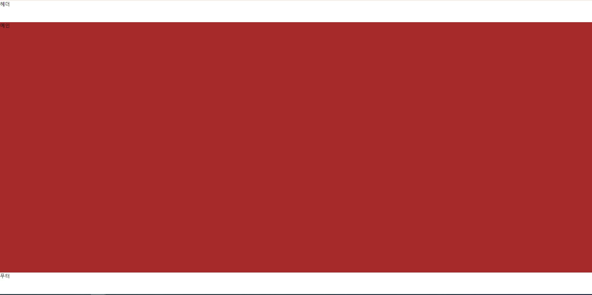
}헤더, 푸터의 높이를 고정폭으로 설정한다. 또한, 메인 컨텐츠 높이는 브라우저 전체높이에서 헤더, 푸터를 제외한 나머지를 다 차지하도록 flex:1 로 설정한다.
* 헤더영역 디자인하기
<header>
<a href="#">
<img src="logo.avif" alt="logo">
sunblocks
</a>
<nav>
<ul>
<li><a href="#">home</a></li>
<li><a href="#">about</a></li>
<li><a href="#">contact</a></li>
</ul>
</nav>
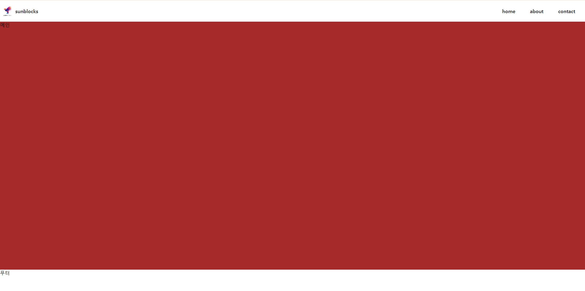
</header>헤더부분을 위와 같이 작성한다. 로고 이미지는 아무거나 다운로드 받아서 사용하면 된다.
html, body{
    margin: 0; padding: 0;
    box-sizing: border-box;
}
body{
    height: 100vh;
    display: flex;
    flex-direction: column;
}
header, footer{
    height: 70px;
    flex: none;
}
main{
    flex: 1;
    background: brown;
}
header img{
width: 50px;
height: 50px;
}우선 로고 이미지가 너무 크기 때문에 너비, 높이를 헤더 안에 들어오도록 맞춰준다.
html, body{
    margin: 0; padding: 0;
    box-sizing: border-box;
}
body{
    height: 100vh;
    display: flex;
    flex-direction: column;
}
header, footer{
    height: 70px;
    flex: none;
}
main{
    flex: 1;
    background: brown;
}
header img{
    width: 50px;
    height: 50px;
}
header{
display: flex;
justify-content: space-between;
}로고와 네비게이션 메뉴가 수평으로 나열되도록 헤더에 플럭스박스를 적용한다. 또한, 로고와 네비게이션 메뉴는 각각 웹화면의 좌측과 우측에 배치되도록 justify-content: space-between 을 적용한다.
html, body{
    margin: 0; padding: 0;
    box-sizing: border-box;
}
body{
    height: 100vh;
    display: flex;
    flex-direction: column;
}
header, footer{
    height: 70px;
    flex: none;
}
main{
    flex: 1;
    background: brown;
}
header img{
    width: 50px;
    height: 50px;
}
header{
    display: flex;
    justify-content: space-between;
}
header nav ul{
display: flex;
gap: 3rem;
list-style: none;
margin-right: 2rem;
}네비게이션 메뉴도 수평으로 나열되도록 플럭스박스를 적용하고, 각 메뉴 사이에 여백을 주기 위하에 gap 속성을 적용한다. 네비게이션 우측에 마진을 설정해서 네비게이션 메뉴가 너무 화면 우측에 붙어있지 않도록 한다.
html, body{
    margin: 0; padding: 0;
    box-sizing: border-box;
}
body{
    height: 100vh;
    display: flex;
    flex-direction: column;
}
header, footer{
    height: 70px;
    flex: none;
}
main{
    flex: 1;
    background: brown;
}
header img{
    width: 50px;
    height: 50px;
}
header{
    display: flex;
    justify-content: space-between;
    align-items: center; /* 추가 */
}
header nav ul{
    display: flex;
    gap: 3rem;
    list-style: none;
    margin-right: 2rem;
}
헤더에 align-items: center 를 적용하여 헤더 안의 아이템들이 교차축(세로) 방향으로 중앙에 정렬되도록 한다.
html, body{
    margin: 0; padding: 0;
    box-sizing: border-box;
}
body{
    height: 100vh;
    display: flex;
    flex-direction: column;
}
header, footer{
    height: 70px;
    flex: none;
}
main{
    flex: 1;
    background: brown;
}
header img{
    width: 50px;
    height: 50px;
}
header{
    display: flex;
    justify-content: space-between;
    align-items: center; /* 추가 */
}
header nav ul{
    display: flex;
    gap: 3rem;
    list-style: none;
    margin-right: 2rem;
}
a{
    text-decoration: none;
    color: #333;
    font-weight: bold;
}
링크에는 밑줄을 전부 제거한다. 그리고 웹화면의 모든 링크의 색상을 동일하게 지정한다.
html, body{
    margin: 0; padding: 0;
    box-sizing: border-box;
}
body{
    height: 100vh;
    display: flex;
    flex-direction: column;
}
header, footer{
    height: 70px;
    flex: none;
}
main{
    flex: 1;
    background: brown;
}
header img{
    width: 50px;
    height: 50px;
}
header{
    display: flex;
    justify-content: space-between;
    align-items: center; /* 추가 */
}
header nav ul{
    display: flex;
    gap: 3rem;
    list-style: none;
    margin-right: 2rem;
}
a{
    text-decoration: none;
    color: #333;
    font-weight: bold;
}
header a{
    display: flex;
    align-items: center;
}
헤더 안의 로고가 들어가는 링크에도 플럭스박스를 적용하여 로고 텍스트가 세로방향으로 중앙에 위치하도록 정렬한다.
html, body{
    margin: 0; padding: 0;
    box-sizing: border-box;
}
body{
    height: 100vh;
    display: flex;
    flex-direction: column;
}
header, footer{
    height: 70px;
    flex: none;
}
main{
    flex: 1;
    background: brown;
}
header img{
    width: 50px;
    height: 50px;
}
header{
    display: flex;
    justify-content: space-between;
    align-items: center;
}
header nav ul{
    display: flex;
    gap: 3rem;
    list-style: none;
    margin-right: 2rem;
}
a{
    text-decoration: none;
    color: #333;
    font-weight: bold;
}
header a{
    display: flex;
    align-items: center;
    transition: .3s;
}
header a:hover{
    color: brown;
}
헤더의 모든 링크에 마우스 호버시 글자색을 변경한다.
html, body{
    margin: 0; padding: 0;
    box-sizing: border-box;
}
body{
    height: 100vh;
    display: flex;
    flex-direction: column;
}
header, footer{
    height: 70px;
    flex: none;
}
main{
    flex: 1;
    background: brown;
}
header img{
    width: 50px;
    height: 50px;
}
header{
    display: flex;
    justify-content: space-between;
    align-items: center;
}
header nav ul{
    display: flex;
    gap: 3rem;
    list-style: none;
    margin-right: 2rem;
}
a{
    text-decoration: none;
    color: #333;
    font-weight: bold;
}
header a{
    display: flex;
    align-items: center;
    transition: .3s;
}
header a:hover{
    color: brown;
}
header nav ul li{
    position: relative;
}
header nav ul li::before{
    position: absolute; bottom: -5px;
    content: '';
    width: 0; height: 5px;
    border-radius: 10px;
    background: brown;
    transition: .3s;
}
header nav ul li:hover::before{
    width: 100%;
}
네비게이션 메뉴에 마우스 호버시 밑줄이 보이도록 호버 효과를 적용한다.
<nav>
    <ul>
        <li>
            <a href="#">home</a>
            <ul>
                <li><a href="#">sub1sub1sub1</a></li>
                <li><a href="#">sub2</a></li>
                <li><a href="#">sub3</a></li>
            </ul>
        </li>
        <li>
            <a href="#">about</a>
            <ul>
                <li><a href="#">sub1</a></li>
                <li><a href="#">sub2</a></li>
                <li><a href="#">sub3</a></li>
                <li><a href="#">sub4</a></li>
                <li><a href="#">sub5</a></li>
                <li><a href="#">sub6</a></li>
            </ul>
        </li>
        <li><a href="#">contact</a></li>
    </ul>
</nav>
네비게이션에 서브메뉴를 추가한다.
html, body{
    margin: 0; padding: 0;
    box-sizing: border-box;
}
body{
    height: 100vh;
    display: flex;
    flex-direction: column;
}
header, footer{
    height: 70px;
    flex: none;
}
main{
    flex: 1;
    background: brown;
}
header img{
    width: 50px;
    height: 50px;
}
header{
    display: flex;
    justify-content: space-between;
    align-items: center;
}
header > nav > ul{
    display: flex;
    gap: 3rem;
    list-style: none;
    margin-right: 2rem;
}
a{
    text-decoration: none;
    color: #333;
    font-weight: bold;
}
header > a{
    display: flex;
    align-items: center;
    transition: .3s;
}
header > a:hover{
    color: brown;
}
header > nav > ul > li{
    position: relative;
}
header > nav > ul > li::before{
    position: absolute; bottom: -5px;
    content: '';
    width: 0; height: 5px;
    border-radius: 10px;
    background: brown;
    transition: .3s;
}
header > nav > ul > li:hover::before{
    width: 100%;
}
header > nav > ul > li > ul{
    display: none;
}
서브메뉴에는 마우스 호버시 밑줄이 나타나지 않도록 하고, 메인 메뉴에만 적용될 수 있도록 자식선택자(>)로 전부 변경한다. 또한, 서브메뉴는 우선 웹화면에 보이지 않도록 가린다.
html, body{
    margin: 0; padding: 0;
    box-sizing: border-box;
}
body{
    height: 100vh;
    display: flex;
    flex-direction: column;
}
header, footer{
    height: 70px;
    flex: none;
}
main{
    flex: 1;
    background: brown;
}
header img{
    width: 50px;
    height: 50px;
}
header{
    display: flex;
    justify-content: space-between;
    align-items: center;
}
header > nav > ul{
    display: flex;
    gap: 3rem;
    list-style: none;
    margin-right: 2rem;
}
a{
    text-decoration: none;
    color: #333;
    font-weight: bold;
}
header > a{
    display: flex;
    align-items: center;
    transition: .3s;
}
header > a:hover{
    color: brown;
}
header > nav > ul > li{
    position: relative;
}
header > nav > ul > li::before{
    position: absolute; bottom: -5px;
    content: '';
    width: 0; height: 5px;
    border-radius: 10px;
    background: brown;
    transition: .3s;
}
header > nav > ul > li:hover::before{
    width: 100%;
}
header > nav > ul > li > ul{
    display: none;
}
header > nav > ul > li:hover > ul{
    display: block;
}
그런 다음 메인메뉴에 마우스 호버시 서브메뉴가 나타나도록 display: block 을 설정한다. 하지만 실제로 해보면 서브메뉴가 나타나기는 하지만 위치가 제대로 잡히지 않고 있다. 서브메뉴는 메인메뉴 바로 아래에 나란히 위치하는게 좋다.
html, body{
    margin: 0; padding: 0;
    box-sizing: border-box;
}
body{
    height: 100vh;
    display: flex;
    flex-direction: column;
}
header, footer{
    height: 70px;
    flex: none;
}
main{
    flex: 1;
    /* background: brown; */
}
header img{
    width: 50px;
    height: 50px;
}
header{
    display: flex;
    justify-content: space-between;
    align-items: center;
}
header > nav > ul{
    display: flex;
    gap: 3rem;
    list-style: none;
    margin-right: 2rem;
}
a{
    text-decoration: none;
    color: #333;
    font-weight: bold;
}
header > a{
    display: flex;
    align-items: center;
    transition: .3s;
}
header > a:hover{
    color: brown;
}
header > nav > ul > li{
    position: relative;
    display: flex; /* 추가 */
    flex-direction: column; /* 추가 */
}
header > nav > ul > li::before{
    position: absolute; bottom: -5px;
    content: '';
    width: 0; height: 5px;
    border-radius: 10px;
    background: brown;
    transition: .3s;
}
header > nav > ul > li:hover::before{
    width: 100%;
}
header > nav > ul > li > ul{
    display: none;
}
header > nav > ul > li:hover > ul{
    display: block;
    margin: 0; padding: 0; /* 추가 */
    list-style: none; /* 추가 */
    position: absolute; /* 추가 */
    top: 250%; width: auto; /* 추가 */
    background: brown; padding: .5rem .5rem; /* 추가 */
}
header > nav > ul > li > ul > li > a{
    color: #fff;
}
우선 메인메뉴와 서브메뉴가 현재 수평으로 나열되어 있으므로 메인메뉴에 flex-direction: column 으로 설정하여 메인메뉴와 서비메뉴를 세로방향으로 나열한다. 또한, 서브메뉴(ul)의 여백을 제거하고, 디폴트 목록 스타일도 제거한다. 서브메뉴의 위치를 잡아주기 위하여 position: absolute 로 설정하고, top을 100% 이상으로 설정해서 메인메뉴 하단에 서브메뉴가 위치하도록 끌어내린다.
* 메인영역 디자인하기
<main>
    <section>메인컨텐츠</section>
    <aside>사이드메뉴</aside>
</main>
메인영역을 사이드메뉴와 메인컨텐츠 부분으로 나눈다.
html, body{
margin: 0; padding: 0;
box-sizing: border-box;
}
body{
height: 100vh;
display: flex;
flex-direction: column;
}
header, footer{
height: 70px;
flex: none;
}
main{
flex: 1;
/* background: brown; */
display: flex; /* 추가 */
}
/* 헤더영역 */
header img{
width: 50px;
height: 50px;
}
header{
display: flex;
justify-content: space-between;
align-items: center;
}
header > nav > ul{
display: flex;
gap: 3rem;
list-style: none;
margin-right: 2rem;
}
a{
text-decoration: none;
color: #333;
font-weight: bold;
}
header > a{
display: flex;
align-items: center;
transition: .3s;
}
header > a:hover{
color: brown;
}
header > nav > ul > li{
position: relative;
display: flex;
flex-direction: column;
}
header > nav > ul > li::before{
position: absolute; bottom: -5px;
content: '';
width: 0; height: 5px;
border-radius: 10px;
background: brown;
transition: .3s;
}
header > nav > ul > li:hover::before{
width: 100%;
}
header > nav > ul > li > ul{
display: none;
}
header > nav > ul > li:hover > ul{
display: block;
margin: 0; padding: 0;
list-style: none;
position: absolute;
top: 250%; width: auto;
background: brown; padding: .5rem .5rem;
}
header > nav > ul > li > ul > li > a{
color: #fff;
}
/* 메인영역 */
main aside{
width: 300px;
flex: none;
border: 1px solid red;
}
main section{
flex: 1;
border: 1px solid green;
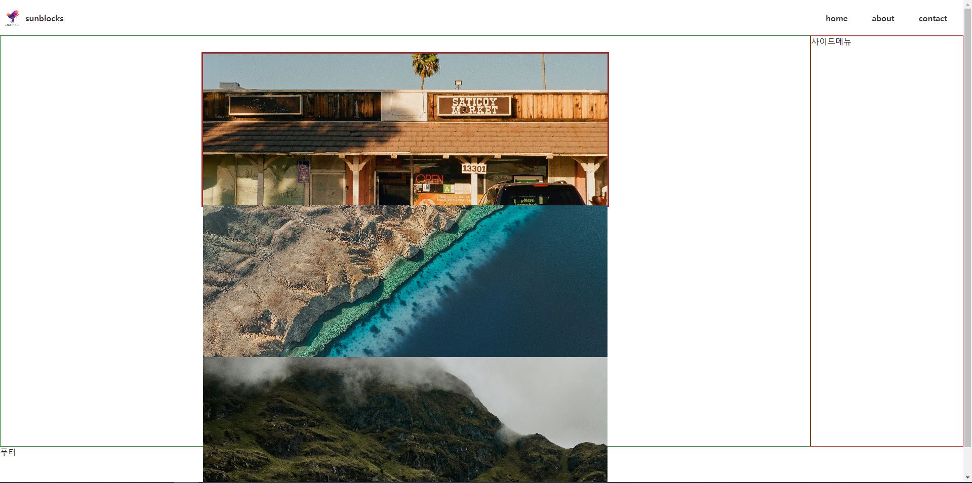
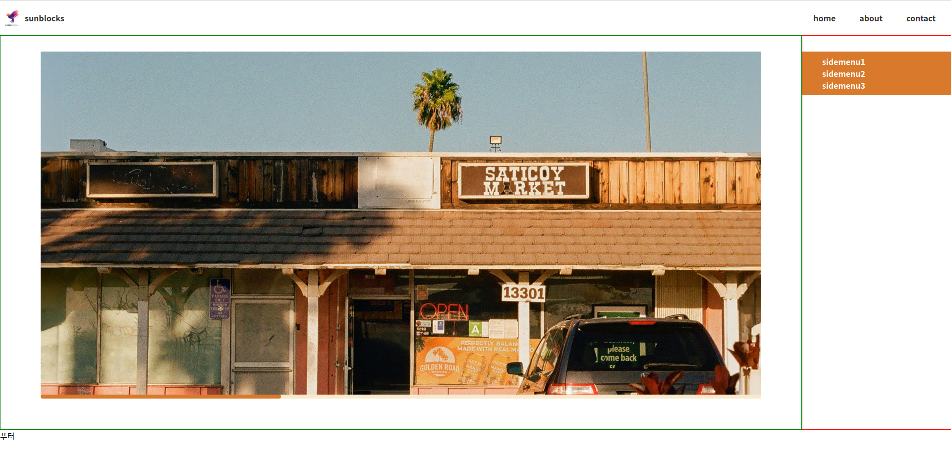
}메인영역은 사이드바 메뉴와 메인컨텐츠로 나누어지며, 수평방향으로 정렬하기 위하여 main 에 플럭스박스를 적용한다. 사이드바 메뉴는 고정폭을 지정하고, 메인컨텐츠는 flex: 1을 설정하여 디바이스 크기에 따라 너비가 변하도록 한다.
<section>
    <div class="slider">
        <div class="slide">
            <img src="slide-1.jpg" alt="slide-1">
        </div>
        <div class="slide">
            <img src="slide-2.jpg" alt="slide-2">
        </div>
        <div class="slide">
            <img src="slide-3.jpg" alt="slide-3">
        </div>
    </div>
</section>
메인컨텐츠의 히어로 영역에 슬라이드 화면을 추가한다.
html, body{
    margin: 0; padding: 0;
    box-sizing: border-box;
}
body{
    height: 100vh;
    display: flex;
    flex-direction: column;
}
header, footer{
    height: 70px;
    flex: none;
}
main{
    flex: 1;
    /* background: brown; */
    display: flex; /* 추가 */
}

/* 헤더영역 */
header img{
    width: 50px;
    height: 50px;
}
header{
    display: flex;
    justify-content: space-between;
    align-items: center;
}
header > nav > ul{
    display: flex;
    gap: 3rem;
    list-style: none;
    margin-right: 2rem;
}
a{
    text-decoration: none;
    color: #333;
    font-weight: bold;
}
header > a{
    display: flex;
    align-items: center;
    transition: .3s;
}
header > a:hover{
    color: brown;
}
header > nav > ul > li{
    position: relative;
    display: flex;
    flex-direction: column;
}
header > nav > ul > li::before{
    position: absolute; bottom: -5px;
    content: '';
    width: 0; height: 5px;
    border-radius: 10px;
    background: brown;
    transition: .3s;
}
header > nav > ul > li:hover::before{
    width: 100%;
}
header > nav > ul > li > ul{
    display: none;
}
header > nav > ul > li:hover > ul{
    display: block;
    margin: 0; padding: 0;
    list-style: none;
    position: absolute;
    top: 250%; width: auto;
    background: brown; padding: .5rem .5rem;
}
header > nav > ul > li > ul > li > a{
    color: #fff;
}

/* 메인영역 */
main aside{
    width: 300px;
    flex: none;
    border: 1px solid red;
}
main section{
    flex: 1;
    border: 1px solid green;
}
main section .slider .slide{
    width: 100%;
    height: 100%;
}
main section .slider img{
    width: 100%;
    height: 100%;
    object-fit: cover;
    object-position: center;
}
main section .slider{
    width: 50%; height: 300px;
    margin: 2rem auto;
    border: 3px solid brown;
}
슬라이드 영역에 대한 스타일 코드를 추가한다. 슬라이드 영역을 감싸고 있는 컨테이너의 너비와 높이를 설정하고, 위치도 지정한다. 각각의 슬라이드 이미지는 부모요소인 컨테이너에 맞춘다.
html, body{
margin: 0; padding: 0;
box-sizing: border-box;
}
body{
height: 100vh;
display: flex;
flex-direction: column;
}
header, footer{
height: 70px;
flex: none;
}
main{
flex: 1;
/* background: brown; */
display: flex;
}
/* 헤더영역 */
header img{
width: 50px;
height: 50px;
}
header{
display: flex;
justify-content: space-between;
align-items: center;
}
header > nav > ul{
display: flex;
gap: 3rem;
list-style: none;
margin-right: 2rem;
}
a{
text-decoration: none;
color: #333;
font-weight: bold;
}
header > a{
display: flex;
align-items: center;
transition: .3s;
}
header > a:hover{
color: brown;
}
header > nav > ul > li{
position: relative;
display: flex;
flex-direction: column;
}
header > nav > ul > li::before{
position: absolute; bottom: -5px;
content: '';
width: 0; height: 5px;
border-radius: 10px;
background: brown;
transition: .3s;
}
header > nav > ul > li:hover::before{
width: 100%;
}
header > nav > ul > li > ul{
display: none;
}
header > nav > ul > li:hover > ul{
display: block;
margin: 0; padding: 0;
list-style: none;
position: absolute;
top: 250%; width: auto;
background: brown; padding: .5rem .5rem;
}
header > nav > ul > li > ul > li > a{
color: #fff;
}
/* 메인영역 */
main aside{
width: 300px;
flex: none;
border: 1px solid red;
}
main section{
flex: 1;
border: 1px solid green;
}
main section .slider .slide{
width: 100%;
height: 100%;
}
main section .slider img{
width: 100%;
height: 100%;
object-fit: cover;
object-position: center;
}
main section .slider{
width: 50%; height: 300px;
margin: 2rem auto;
border: 3px solid brown;
display: flex; /* 추가 */
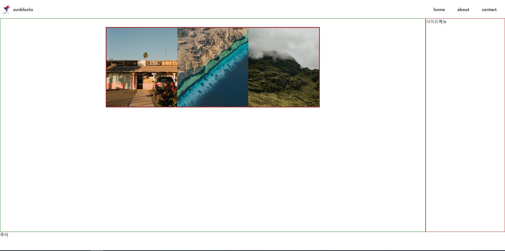
}슬라이드 이미지를 담고 있는 컨테이너에 플럭스박스를 적용하면 아래와 같이 수평으로 슬라이드가 나열된다.
html, body{
    margin: 0; padding: 0;
    box-sizing: border-box;
}
body{
    height: 100vh;
    display: flex;
    flex-direction: column;
}
header, footer{
    height: 70px;
    flex: none;
}
main{
    flex: 1;
    /* background: brown; */
    display: flex;
}

/* 헤더영역 */
header img{
    width: 50px;
    height: 50px;
}
header{
    display: flex;
    justify-content: space-between;
    align-items: center;
}
header > nav > ul{
    display: flex;
    gap: 3rem;
    list-style: none;
    margin-right: 2rem;
}
a{
    text-decoration: none;
    color: #333;
    font-weight: bold;
}
header > a{
    display: flex;
    align-items: center;
    transition: .3s;
}
header > a:hover{
    color: brown;
}
header > nav > ul > li{
    position: relative;
    display: flex;
    flex-direction: column;
}
header > nav > ul > li::before{
    position: absolute; bottom: -5px;
    content: '';
    width: 0; height: 5px;
    border-radius: 10px;
    background: brown;
    transition: .3s;
}
header > nav > ul > li:hover::before{
    width: 100%;
}
header > nav > ul > li > ul{
    display: none;
}
header > nav > ul > li:hover > ul{
    display: block;
    margin: 0; padding: 0;
    list-style: none;
    position: absolute;
    top: 250%; width: auto;
    background: brown; padding: .5rem .5rem;
}
header > nav > ul > li > ul > li > a{
    color: #fff;
}

/* 메인영역 */
main aside{
    width: 300px;
    flex: none;
    border: 1px solid red;
}
main section{
    flex: 1;
    border: 1px solid green;
}
main section .slider .slide{
    width: 100%;
    height: 100%;
    flex: none; /* 추가 */
}
main section .slider img{
    width: 100%;
    height: 100%;
    object-fit: cover;
    object-position: center;
}
main section .slider{
    width: 50%; height: 300px;
    margin: 2rem auto;
    border: 3px solid brown;
    display: flex; /* 추가 */
}
각 슬라이드 이미지에 flex:none 과 width: 100%를 설정하여 컨테이너에 하나의 슬라이드 이미지만 들어갈 수 있도록 너비를 고정한다.
html, body{
margin: 0; padding: 0;
box-sizing: border-box;
}
body{
height: 100vh;
display: flex;
flex-direction: column;
}
header, footer{
height: 70px;
flex: none;
}
main{
flex: 1;
/* background: brown; */
display: flex;
}
/* 헤더영역 */
header img{
width: 50px;
height: 50px;
}
header{
display: flex;
justify-content: space-between;
align-items: center;
}
header > nav > ul{
display: flex;
gap: 3rem;
list-style: none;
margin-right: 2rem;
}
a{
text-decoration: none;
color: #333;
font-weight: bold;
}
header > a{
display: flex;
align-items: center;
transition: .3s;
}
header > a:hover{
color: brown;
}
header > nav > ul > li{
position: relative;
display: flex;
flex-direction: column;
}
header > nav > ul > li::before{
position: absolute; bottom: -5px;
content: '';
width: 0; height: 5px;
border-radius: 10px;
background: brown;
transition: .3s;
}
header > nav > ul > li:hover::before{
width: 100%;
}
header > nav > ul > li > ul{
display: none;
}
header > nav > ul > li:hover > ul{
display: block;
margin: 0; padding: 0;
list-style: none;
position: absolute;
top: 250%; width: auto;
background: brown; padding: .5rem .5rem;
}
header > nav > ul > li > ul > li > a{
color: #fff;
}
/* 메인영역 */
main aside{
width: 300px;
flex: none;
border: 1px solid red;
}
main section{
flex: 1;
border: 1px solid green;
}
main section .slider .slide{
width: 100%;
height: 100%;
flex: none;
scroll-snap-align: center; /* 추가 */
}
main section .slider img{
width: 100%;
height: 100%;
object-fit: cover;
object-position: center;
}
main section .slider{
width: 50%; height: 300px;
margin: 2rem auto;
border: 3px solid brown;
display: flex;
overflow-x: auto; /* 추가 */
overflow-y: hidden; /* 추가 */
scroll-snap-type: x mandatory; /* 추가 */
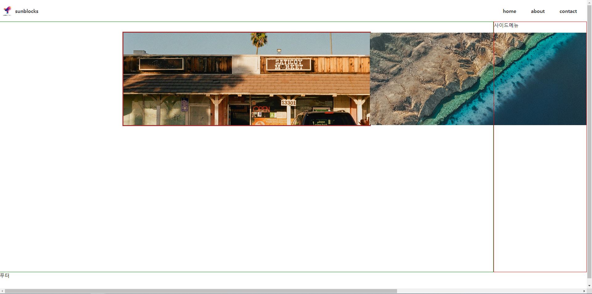
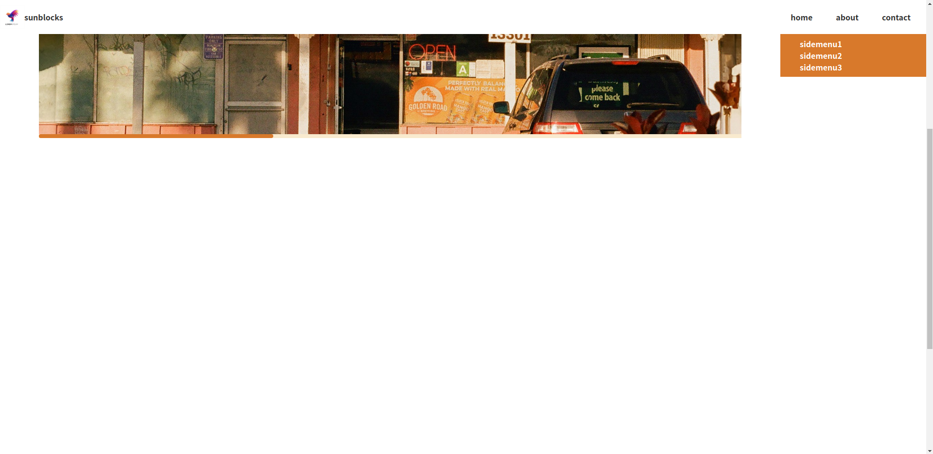
}css 의 scroll snap 을 사용하여 슬라이드 이미지가 특정 지점에서 멈추도록 한다. 수평방향 overflow 를 auto 로 설정하여 수평방향으로 스크롤이 되도록 한다.
html, body{
margin: 0; padding: 0;
box-sizing: border-box;
}
body{
height: 100vh;
display: flex;
flex-direction: column;
}
header, footer{
height: 70px;
flex: none;
}
main{
flex: 1;
/* background: brown; */
display: flex;
}
/* 헤더영역 */
header img{
width: 50px;
height: 50px;
}
header{
display: flex;
justify-content: space-between;
align-items: center;
}
header > nav > ul{
display: flex;
gap: 3rem;
list-style: none;
margin-right: 2rem;
}
a{
text-decoration: none;
color: #333;
font-weight: bold;
}
header > a{
display: flex;
align-items: center;
transition: .3s;
}
header > a:hover{
color: brown;
}
header > nav > ul > li{
position: relative;
display: flex;
flex-direction: column;
}
header > nav > ul > li::before{
position: absolute; bottom: -5px;
content: '';
width: 0; height: 5px;
border-radius: 10px;
background: brown;
transition: .3s;
}
header > nav > ul > li:hover::before{
width: 100%;
}
header > nav > ul > li > ul{
display: none;
}
header > nav > ul > li:hover > ul{
display: block;
margin: 0; padding: 0;
list-style: none;
position: absolute;
top: 250%; width: auto;
background: brown; padding: .5rem .5rem;
}
header > nav > ul > li > ul > li > a{
color: #fff;
}
/* 메인영역 */
main aside{
width: 300px;
flex: none;
border: 1px solid red;
}
main section{
flex: 1;
border: 1px solid green;
}
main section .slider .slide{
width: 100%;
height: 100%;
flex: none;
scroll-snap-align: center;
}
main section .slider img{
width: 100%;
height: 100%;
object-fit: cover;
object-position: center;
}
main section .slider{
width: 90%; height: 700px; /* 수정 */
margin: 2rem auto;
/* border: 3px solid brown; */ /* 주석처리 */
display: flex;
overflow-x: auto;
overflow-y: hidden;
scroll-snap-type: x mandatory;
}
main section .slider::-webkit-scrollbar {
height: 8px; /* 스크롤바의 너비 */
}
main section .slider::-webkit-scrollbar-thumb {
height: 30%; /* 스크롤바의 길이 */
background: #d8792b; /* 스크롤바의 색상 */
border-radius: 20px;
}
main section .slider::-webkit-scrollbar-track {
background: rgba(235, 185, 93, 0.3); /*스크롤바 뒷 배경 색상*/
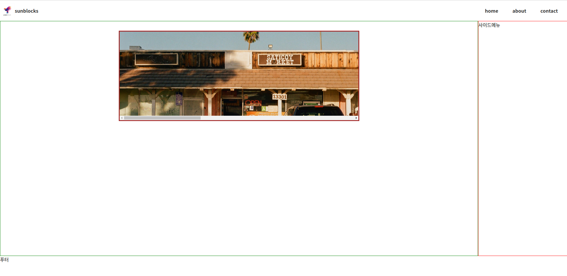
}슬라이드 컨테이너의 크기를 키우고, 보더는 주석처리한다. 스크롤바를 디자인한다.
* 사이드바 영역 디자인하기
<aside>
  <nav>
    <ul>
      <li><a href="#">sidemenu1</a></li>
      <li><a href="#">sidemenu2</a></li>
      <li><a href="#">sidemenu3</a></li>
    </ul>
  </nav>
</aside>
사이드 메뉴를 추가한다.
html, body{
  margin: 0; padding: 0;
  box-sizing: border-box;
}
body{
  height: 100vh;
  display: flex;
  flex-direction: column;
}
header, footer{
  height: 70px;
  flex: none;
}
main{
  flex: 1;
  /* background: brown; */
  display: flex;
}

/* 헤더영역 */
header img{
  width: 50px;
  height: 50px;
}
header{
  display: flex;
  justify-content: space-between;
  align-items: center;
}
header > nav > ul{
  display: flex;
  gap: 3rem;
  list-style: none;
  margin-right: 2rem;
}
a{
  text-decoration: none;
  color: #333;
  font-weight: bold;
}
header > a{
  display: flex;
  align-items: center;
  transition: .3s;
}
header > a:hover{
  color: brown;
}
header > nav > ul > li{
  position: relative;
  display: flex;
  flex-direction: column;
}
header > nav > ul > li::before{
  position: absolute; bottom: -5px;
  content: '';
  width: 0; height: 5px;
  border-radius: 10px;
  background: brown;
  transition: .3s;
}
header > nav > ul > li:hover::before{
  width: 100%;
}
header > nav > ul > li > ul{
  display: none;
}
header > nav > ul > li:hover > ul{
  display: block;
  margin: 0; padding: 0;
  list-style: none;
  position: absolute;
  top: 250%; width: auto;
  background: brown; padding: .5rem .5rem;
}
header > nav > ul > li > ul > li > a{
  color: #fff;
}

/* 메인영역 */
main aside{
  width: 300px;
  flex: none;
  border: 1px solid red;
}
main section{
  flex: 1;
  border: 1px solid green;
}
main section .slider .slide{
  width: 100%;
  height: 100%;
  flex: none;
  scroll-snap-align: center;
}
main section .slider img{
  width: 100%;
  height: 100%;
  object-fit: cover;
  object-position: center;
}
main section .slider{
  width: 90%; height: 700px; /* 수정 */
  margin: 2rem auto;
  /* border: 3px solid brown; */ /* 주석처리 */
  display: flex;
  overflow-x: auto;
  overflow-y: hidden;
  scroll-snap-type: x mandatory;
}
main section .slider::-webkit-scrollbar {
  height: 8px;  /* 스크롤바의 너비 */
}

main section .slider::-webkit-scrollbar-thumb {
  height: 30%; /* 스크롤바의 길이 */
  background: #d8792b; /* 스크롤바의 색상 */
  border-radius: 20px;
}

main section .slider::-webkit-scrollbar-track {
  background: rgba(235, 185, 93, 0.3);  /*스크롤바 뒷 배경 색상*/
}

/* 사이드바 영역 */
main aside nav ul{
  list-style: none;
  padding: .5rem; margin: 2rem;
}
main aside nav{
  background-color: #d8792b;
}
main aside nav ul li a{
  color: #fff;
}
사이드바 영역을 디자인한다.
html, body{
  margin: 0; padding: 0;
  box-sizing: border-box;
}
body{
  height: 200vh; /* 수정 */
  display: flex;
  flex-direction: column;
}
header, footer{
  height: 70px;
  flex: none;
}
main{
  flex: 1;
  /* background: brown; */
  display: flex;
}

/* 헤더영역 */
header img{
  width: 50px;
  height: 50px;
}
header{
  display: flex;
  justify-content: space-between;
  align-items: center;
}
header > nav > ul{
  display: flex;
  gap: 3rem;
  list-style: none;
  margin-right: 2rem;
}
a{
  text-decoration: none;
  color: #333;
  font-weight: bold;
}
header > a{
  display: flex;
  align-items: center;
  transition: .3s;
}
header > a:hover{
  color: brown;
}
header > nav > ul > li{
  position: relative;
  display: flex;
  flex-direction: column;
}
header > nav > ul > li::before{
  position: absolute; bottom: -5px;
  content: '';
  width: 0; height: 5px;
  border-radius: 10px;
  background: brown;
  transition: .3s;
}
header > nav > ul > li:hover::before{
  width: 100%;
}
header > nav > ul > li > ul{
  display: none;
}
header > nav > ul > li:hover > ul{
  display: block;
  margin: 0; padding: 0;
  list-style: none;
  position: absolute;
  top: 250%; width: auto;
  background: brown; padding: .5rem .5rem;
}
header > nav > ul > li > ul > li > a{
  color: #fff;
}

/* 메인영역 */
main aside{
  width: 300px;
  flex: none;
  border: 1px solid red;
}
main section{
  flex: 1;
  border: 1px solid green;
}
main section .slider .slide{
  width: 100%;
  height: 100%;
  flex: none;
  scroll-snap-align: center;
}
main section .slider img{
  width: 100%;
  height: 100%;
  object-fit: cover;
  object-position: center;
}
main section .slider{
  width: 90%; height: 700px;
  margin: 2rem auto;
  /* border: 3px solid brown; */
  display: flex;
  overflow-x: auto;
  overflow-y: hidden;
  scroll-snap-type: x mandatory;
}
main section .slider::-webkit-scrollbar {
  height: 8px;
}

main section .slider::-webkit-scrollbar-thumb {
  height: 30%;
  background: #d8792b;
  border-radius: 20px;
}

main section .slider::-webkit-scrollbar-track {
  background: rgba(235, 185, 93, 0.3);
}

/* 사이드바 영역 */
main aside nav ul{
  list-style: none;
  padding: .5rem; margin: 2rem;
}
main aside nav{
  background-color: #d8792b;
}
main aside nav ul li a{
  color: #fff;
}
웹 화면이 스크롤될 수 있도록 body 높이를 200vh 로 수정한다.
html, body{
margin: 0; padding: 0;
box-sizing: border-box;
}
body{
height: 200vh;
display: flex;
flex-direction: column;
}
header, footer{
height: 70px;
flex: none;
}
main{
flex: 1;
/* background: brown; */
display: flex;
}
/* 헤더영역 */
header img{
width: 50px;
height: 50px;
}
header{
display: flex;
justify-content: space-between;
align-items: center;
position: fixed; /* 추가 */
top: 0; left: 0; right: 0; /* 추가 */
z-index: 1; /* 추가 */
background-color: #fff; /* 추가 */
}
header > nav > ul{
display: flex;
gap: 3rem;
list-style: none;
margin-right: 2rem;
}
a{
text-decoration: none;
color: #333;
font-weight: bold;
}
header > a{
display: flex;
align-items: center;
transition: .3s;
}
header > a:hover{
color: brown;
}
header > nav > ul > li{
position: relative;
display: flex;
flex-direction: column;
}
header > nav > ul > li::before{
position: absolute; bottom: -5px;
content: '';
width: 0; height: 5px;
border-radius: 10px;
background: brown;
transition: .3s;
}
header > nav > ul > li:hover::before{
width: 100%;
}
header > nav > ul > li > ul{
display: none;
}
header > nav > ul > li:hover > ul{
display: block;
margin: 0; padding: 0;
list-style: none;
position: absolute;
top: 250%; width: auto;
background: brown; padding: .5rem .5rem;
}
header > nav > ul > li > ul > li > a{
color: #fff;
}
/* 메인영역 */
main aside{
width: 300px;
flex: none;
border: 1px solid red;
}
main section{
flex: 1;
border: 1px solid green;
}
main section .slider .slide{
width: 100%;
height: 100%;
flex: none;
scroll-snap-align: center;
}
main section .slider img{
width: 100%;
height: 100%;
object-fit: cover;
object-position: center;
}
main section .slider{
width: 90%; height: 700px;
margin: 2rem auto;
/* border: 3px solid brown; */
display: flex;
overflow-x: auto;
overflow-y: hidden;
scroll-snap-type: x mandatory;
}
main section .slider::-webkit-scrollbar {
height: 8px;
}
main section .slider::-webkit-scrollbar-thumb {
height: 30%;
background: #d8792b;
border-radius: 20px;
}
main section .slider::-webkit-scrollbar-track {
background: rgba(235, 185, 93, 0.3);
}
/* 사이드바 영역 */
main aside nav ul{
list-style: none;
padding: .5rem; margin: 2rem;
}
main aside nav{
background-color: #d8792b;
}
main aside nav ul li a{
color: #fff;
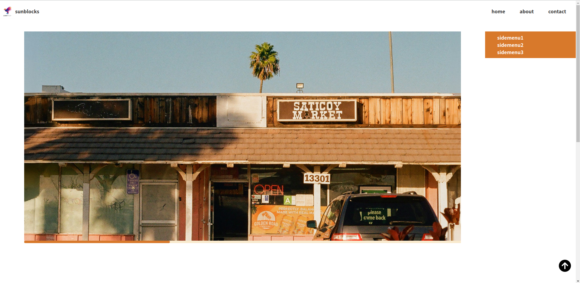
}웹 화면 스크롤시 헤더는 브라우저 상단에 고정되도록 한다. 헤더를 고정하기 위하여 position: fixed 를 설정하면 헤더 아래쪽에 위치한 main 영역이 헤더를 무시하고 브라우저 상단으로 끌려 올라온다. 그래서 헤더높이만큼 main 영역 상단에 마진을 추가한다.
html, body{
  margin: 0; padding: 0;
  box-sizing: border-box;
}
body{
  height: 200vh;
  display: flex;
  flex-direction: column;
}
header, footer{
  height: 70px;
  flex: none;
}
main{
  flex: 1;
  /* background: brown; */
  display: flex;
  margin-top: 70px; /* 추가 */
}

/* 헤더영역 */
header img{
  width: 50px;
  height: 50px;
}
header{
  display: flex;
  justify-content: space-between;
  align-items: center;
  position: fixed;
  top: 0; left: 0; right: 0;
  z-index: 1;
  background-color: #fff;
}
header > nav > ul{
  display: flex;
  gap: 3rem;
  list-style: none;
  margin-right: 2rem;
}
a{
  text-decoration: none;
  color: #333;
  font-weight: bold;
}
header > a{
  display: flex;
  align-items: center;
  transition: .3s;
}
header > a:hover{
  color: brown;
}
header > nav > ul > li{
  position: relative;
  display: flex;
  flex-direction: column;
}
header > nav > ul > li::before{
  position: absolute; bottom: -5px;
  content: '';
  width: 0; height: 5px;
  border-radius: 10px;
  background: brown;
  transition: .3s;
}
header > nav > ul > li:hover::before{
  width: 100%;
}
header > nav > ul > li > ul{
  display: none;
}
header > nav > ul > li:hover > ul{
  display: block;
  margin: 0; padding: 0;
  list-style: none;
  position: absolute;
  top: 250%; width: auto;
  background: brown; padding: .5rem .5rem;
}
header > nav > ul > li > ul > li > a{
  color: #fff;
}

/* 메인영역 */
main aside{
  width: 300px;
  flex: none;
  border: 1px solid red;
}
main section{
  flex: 1;
  border: 1px solid green;
}
main section .slider .slide{
  width: 100%;
  height: 100%;
  flex: none;
  scroll-snap-align: center;
}
main section .slider img{
  width: 100%;
  height: 100%;
  object-fit: cover;
  object-position: center;
}
main section .slider{
  width: 90%; height: 700px;
  margin: 2rem auto;
  /* border: 3px solid brown; */
  display: flex;
  overflow-x: auto;
  overflow-y: hidden;
  scroll-snap-type: x mandatory;
}
main section .slider::-webkit-scrollbar {
  height: 8px;
}

main section .slider::-webkit-scrollbar-thumb {
  height: 30%;
  background: #d8792b;
  border-radius: 20px;
}

main section .slider::-webkit-scrollbar-track {
  background: rgba(235, 185, 93, 0.3);
}

/* 사이드바 영역 */
main aside nav ul{
  list-style: none;
  padding: .5rem; margin: 2rem;
}
main aside nav{
  background-color: #d8792b;
}
main aside nav ul li a{
  color: #fff;
}
html, body{
  margin: 0; padding: 0;
  box-sizing: border-box;
}
body{
  height: 200vh;
  display: flex;
  flex-direction: column;
}
header, footer{
  height: 70px;
  flex: none;
}
main{
  flex: 1;
  /* background: brown; */
  display: flex;
  margin-top: 70px;
}

/* 헤더영역 */
header img{
  width: 50px;
  height: 50px;
}
header{
  display: flex;
  justify-content: space-between;
  align-items: center;
  position: fixed;
  top: 0; left: 0; right: 0;
  z-index: 1;
  background-color: #fff;
}
header > nav > ul{
  display: flex;
  gap: 3rem;
  list-style: none;
  margin-right: 2rem;
}
a{
  text-decoration: none;
  color: #333;
  font-weight: bold;
}
header > a{
  display: flex;
  align-items: center;
  transition: .3s;
}
header > a:hover{
  color: brown;
}
header > nav > ul > li{
  position: relative;
  display: flex;
  flex-direction: column;
}
header > nav > ul > li::before{
  position: absolute; bottom: -5px;
  content: '';
  width: 0; height: 5px;
  border-radius: 10px;
  background: brown;
  transition: .3s;
}
header > nav > ul > li:hover::before{
  width: 100%;
}
header > nav > ul > li > ul{
  display: none;
}
header > nav > ul > li:hover > ul{
  display: block;
  margin: 0; padding: 0;
  list-style: none;
  position: absolute;
  top: 250%; width: auto;
  background: brown; padding: .5rem .5rem;
}
header > nav > ul > li > ul > li > a{
  color: #fff;
}

/* 메인영역 */
main aside{
  width: 300px;
  flex: none;
  /* border: 1px solid red; */
}
main section{
  flex: 1;
  /* border: 1px solid green; */
}
main section .slider .slide{
  width: 100%;
  height: 100%;
  flex: none;
  scroll-snap-align: center;
}
main section .slider img{
  width: 100%;
  height: 100%;
  object-fit: cover;
  object-position: center;
}
main section .slider{
  width: 90%; height: 700px;
  margin: 2rem auto;
  /* border: 3px solid brown; */
  display: flex;
  overflow-x: auto;
  overflow-y: hidden;
  scroll-snap-type: x mandatory;
}
main section .slider::-webkit-scrollbar {
  height: 8px;
}

main section .slider::-webkit-scrollbar-thumb {
  height: 30%;
  background: #d8792b;
  border-radius: 20px;
}

main section .slider::-webkit-scrollbar-track {
  background: rgba(235, 185, 93, 0.3);
}

/* 사이드바 영역 */
main aside nav ul{
  list-style: none;
  padding: .5rem; margin: 2rem;
}
main aside nav{
  background-color: #d8792b;
  position: sticky; top: 70px; /* 추가 */
}
main aside nav ul li a{
  color: #fff;
}
화면 스크롤시 사이드바 영역도 함께 스크롤되다가 헤더에 닿으면 화면에 고정되도록 position: sticky 로 설정하고 고정되는 위치는 헤더높이로 지정한다.
* 푸터 디자인하기
<!DOCTYPE html>
<html lang="en">
<head>
    <meta charset="UTF-8">
    <meta http-equiv="X-UA-Compatible" content="IE=edge">
    <meta name="viewport" content="width=device-width, initial-scale=1.0">
    <title>플럭스박스</title>
    <link rel="stylesheet" href="https://cdnjs.cloudflare.com/ajax/libs/font-awesome/6.5.1/css/all.min.css" integrity="sha512-DTOQO9RWCH3ppGqcWaEA1BIZOC6xxalwEsw9c2QQeAIftl+Vegovlnee1c9QX4TctnWMn13TZye+giMm8e2LwA==" crossorigin="anonymous" referrerpolicy="no-referrer" />
    <link rel="stylesheet" href="style.css">
</head>
<body>
    <header>
        <a href="#">
            <img src="logo.avif" alt="logo">
            sunblocks
        </a>
        <nav>
            <ul>
                <li>
                    <a href="#">home</a>
                    <ul>
                        <li><a href="#">sub1sub1sub1</a></li>
                        <li><a href="#">sub2</a></li>
                        <li><a href="#">sub3</a></li>
                    </ul>
                </li>
                <li>
                    <a href="#">about</a>
                    <ul>
                        <li><a href="#">sub1</a></li>
                        <li><a href="#">sub2</a></li>
                        <li><a href="#">sub3</a></li>
                        <li><a href="#">sub4</a></li>
                        <li><a href="#">sub5</a></li>
                        <li><a href="#">sub6</a></li>
                    </ul>
                </li>
                <li><a href="#">contact</a></li>
            </ul>
        </nav>
    </header>
    <main>
        <section>
            <div class="slider">
                <div class="slide">
                    <img src="slide-1.jpg" alt="slide-1">
                </div>
                <div class="slide">
                    <img src="slide-2.jpg" alt="slide-2">
                </div>
                <div class="slide">
                    <img src="slide-3.jpg" alt="slide-3">
                </div>
            </div>
        </section>
        <aside>
          <nav>
            <ul>
              <li><a href="#">sidemenu1</a></li>
              <li><a href="#">sidemenu2</a></li>
              <li><a href="#">sidemenu3</a></li>
            </ul>
          </nav>
        </aside>
    </main>
    <footer>
      <div class="icons">
        <i class="fa-brands fa-instagram"></i>
        <i class="fa-brands fa-facebook"></i>
        <i class="fa-brands fa-twitter"></i>
        <i class="fa-brands fa-youtube"></i>
      </div>
      <div class="rights">All Rights Reserved By Sunblocks.</div>
    </footer>
</body>
</html>
푸터 영역에 컨텐츠를 채운다. 소셜 아이콘과 저작권 관련 내용이다. 또한, 폰트아우썸 아이콘을 사용하기 위한 CND 링크도 추가한다.
html, body{
margin: 0; padding: 0;
box-sizing: border-box;
}
body{
height: 200vh;
display: flex;
flex-direction: column;
}
header, footer{
height: 70px;
flex: none;
}
main{
flex: 1;
/* background: brown; */
display: flex;
margin-top: 70px;
}
/* 헤더영역 */
header img{
width: 50px;
height: 50px;
}
header{
display: flex;
justify-content: space-between;
align-items: center;
position: fixed;
top: 0; left: 0; right: 0;
z-index: 1;
background-color: #fff;
}
header > nav > ul{
display: flex;
gap: 3rem;
list-style: none;
margin-right: 2rem;
}
a{
text-decoration: none;
color: #333;
font-weight: bold;
}
header > a{
display: flex;
align-items: center;
transition: .3s;
}
header > a:hover{
color: brown;
}
header > nav > ul > li{
position: relative;
display: flex;
flex-direction: column;
}
header > nav > ul > li::before{
position: absolute; bottom: -5px;
content: '';
width: 0; height: 5px;
border-radius: 10px;
background: brown;
transition: .3s;
}
header > nav > ul > li:hover::before{
width: 100%;
}
header > nav > ul > li > ul{
display: none;
}
header > nav > ul > li:hover > ul{
display: block;
margin: 0; padding: 0;
list-style: none;
position: absolute;
top: 250%; width: auto;
background: brown; padding: .5rem .5rem;
}
header > nav > ul > li > ul > li > a{
color: #fff;
}
/* 메인영역 */
main aside{
width: 300px;
flex: none;
/* border: 1px solid red; */
}
main section{
flex: 1;
/* border: 1px solid green; */
}
main section .slider .slide{
width: 100%;
height: 100%;
flex: none;
scroll-snap-align: center;
}
main section .slider img{
width: 100%;
height: 100%;
object-fit: cover;
object-position: center;
}
main section .slider{
width: 90%; height: 700px;
margin: 2rem auto;
/* border: 3px solid brown; */
display: flex;
overflow-x: auto;
overflow-y: hidden;
scroll-snap-type: x mandatory;
}
main section .slider::-webkit-scrollbar {
height: 8px;
}
main section .slider::-webkit-scrollbar-thumb {
height: 30%;
background: #d8792b;
border-radius: 20px;
}
main section .slider::-webkit-scrollbar-track {
background: rgba(235, 185, 93, 0.3);
}
/* 사이드바 영역 */
main aside nav ul{
list-style: none;
padding: .5rem; margin: 2rem;
}
main aside nav{
background-color: #d8792b;
position: sticky; top: 70px; /* 추가 */
}
main aside nav ul li a{
color: #fff;
}
/* 푸터 영역 */
footer{
display: flex;
flex-direction: column;
align-items: center;
justify-content: center;
width: 90%;
border-top: 1px solid #777;
margin: 0 auto;
padding: .5rem 0;
}
footer .rights{
font-weight: 400;
}
footer .icons{
font-size: 1.5rem;
}
footer .icons i{
margin-right: .5rem;
transition: .3s;
}
footer .icons i:hover{
color: brown;
transform: scale(1.2);
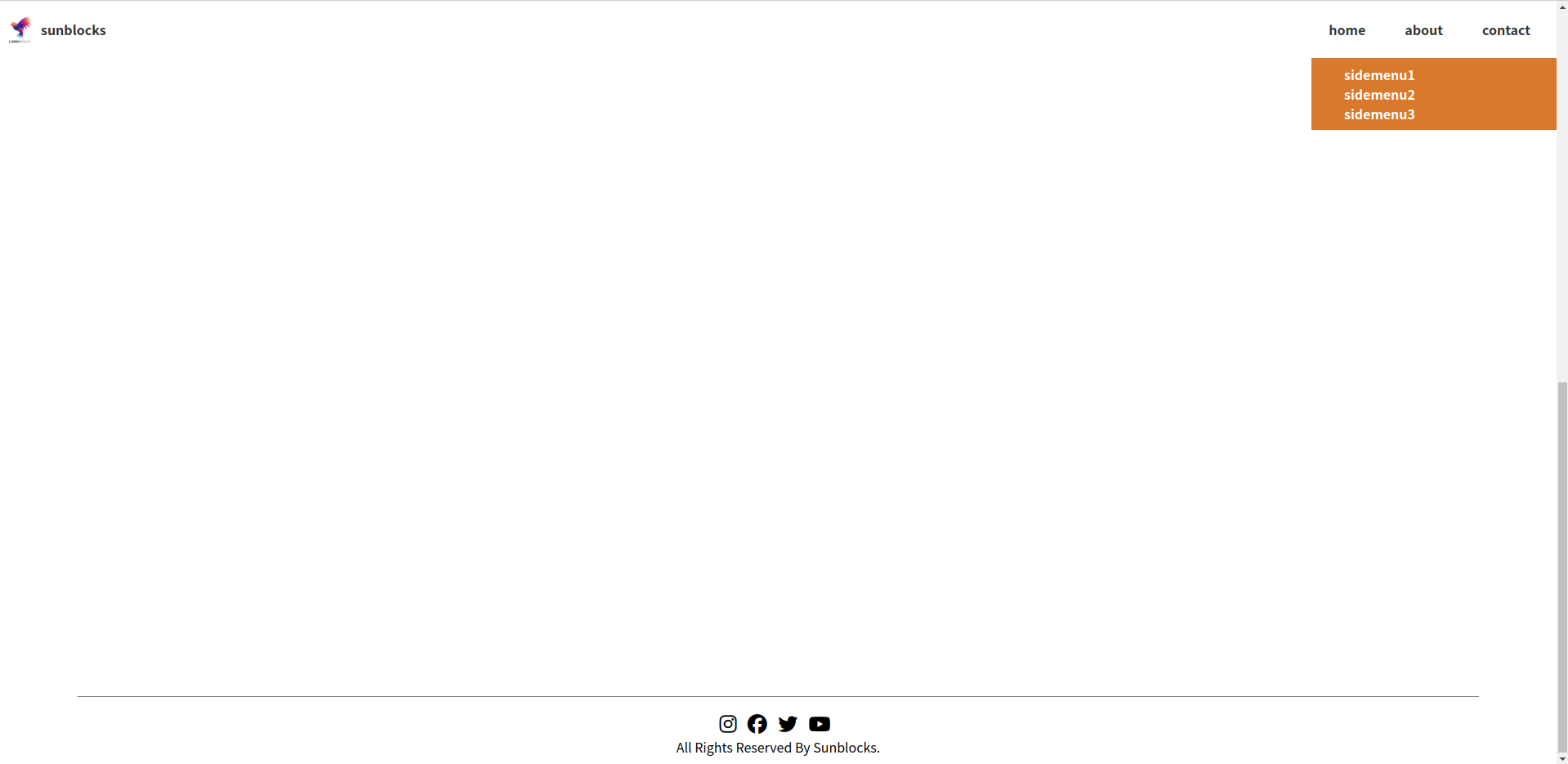
}푸터 영역의 소셜 아이콘과 저작권 텍스트를 디자인한다.
<!DOCTYPE html>
<html lang="en">
<head>
    <meta charset="UTF-8">
    <meta http-equiv="X-UA-Compatible" content="IE=edge">
    <meta name="viewport" content="width=device-width, initial-scale=1.0">
    <title>플럭스박스</title>
    <link rel="stylesheet" href="https://cdnjs.cloudflare.com/ajax/libs/font-awesome/6.5.1/css/all.min.css" integrity="sha512-DTOQO9RWCH3ppGqcWaEA1BIZOC6xxalwEsw9c2QQeAIftl+Vegovlnee1c9QX4TctnWMn13TZye+giMm8e2LwA==" crossorigin="anonymous" referrerpolicy="no-referrer" />
    <link rel="stylesheet" href="style.css">
</head>
<body>
    <header>
        <a href="#">
            <img src="logo.avif" alt="logo">
            sunblocks
        </a>
        <nav>
            <ul>
                <li>
                    <a href="#">home</a>
                    <ul>
                        <li><a href="#">sub1sub1sub1</a></li>
                        <li><a href="#">sub2</a></li>
                        <li><a href="#">sub3</a></li>
                    </ul>
                </li>
                <li>
                    <a href="#">about</a>
                    <ul>
                        <li><a href="#">sub1</a></li>
                        <li><a href="#">sub2</a></li>
                        <li><a href="#">sub3</a></li>
                        <li><a href="#">sub4</a></li>
                        <li><a href="#">sub5</a></li>
                        <li><a href="#">sub6</a></li>
                    </ul>
                </li>
                <li><a href="#">contact</a></li>
            </ul>
        </nav>
    </header>
    <main>
        <section>
            <div class="slider">
                <div class="slide">
                    <img src="slide-1.jpg" alt="slide-1">
                </div>
                <div class="slide">
                    <img src="slide-2.jpg" alt="slide-2">
                </div>
                <div class="slide">
                    <img src="slide-3.jpg" alt="slide-3">
                </div>
            </div>
        </section>
        <aside>
          <nav>
            <ul>
              <li><a href="#">sidemenu1</a></li>
              <li><a href="#">sidemenu2</a></li>
              <li><a href="#">sidemenu3</a></li>
            </ul>
          </nav>
        </aside>
    </main>
    <footer>
      <div class="icons">
        <i class="fa-brands fa-instagram"></i>
        <i class="fa-brands fa-facebook"></i>
        <i class="fa-brands fa-twitter"></i>
        <i class="fa-brands fa-youtube"></i>
      </div>
      <div class="rights">All Rights Reserved By Sunblocks.</div>
    </footer>
    <span>
      <i class="fa-solid fa-circle-arrow-up"></i>
    </span>
</body>
</html>
푸터 하단에 scroll to top 버튼을 추가한다.
html, body{
  margin: 0; padding: 0;
  box-sizing: border-box;
}
body{
  height: 200vh;
  display: flex;
  flex-direction: column;
}
header, footer{
  height: 70px;
  flex: none;
}
main{
  flex: 1;
  /* background: brown; */
  display: flex;
  margin-top: 70px;
}

/* 헤더영역 */
header img{
  width: 50px;
  height: 50px;
}
header{
  display: flex;
  justify-content: space-between;
  align-items: center;
  position: fixed;
  top: 0; left: 0; right: 0;
  z-index: 1;
  background-color: #fff;
}
header > nav > ul{
  display: flex;
  gap: 3rem;
  list-style: none;
  margin-right: 2rem;
}
a{
  text-decoration: none;
  color: #333;
  font-weight: bold;
}
header > a{
  display: flex;
  align-items: center;
  transition: .3s;
}
header > a:hover{
  color: brown;
}
header > nav > ul > li{
  position: relative;
  display: flex;
  flex-direction: column;
}
header > nav > ul > li::before{
  position: absolute; bottom: -5px;
  content: '';
  width: 0; height: 5px;
  border-radius: 10px;
  background: brown;
  transition: .3s;
}
header > nav > ul > li:hover::before{
  width: 100%;
}
header > nav > ul > li > ul{
  display: none;
}
header > nav > ul > li:hover > ul{
  display: block;
  margin: 0; padding: 0;
  list-style: none;
  position: absolute;
  top: 250%; width: auto;
  background: brown; padding: .5rem .5rem;
}
header > nav > ul > li > ul > li > a{
  color: #fff;
}

/* 메인영역 */
main aside{
  width: 300px;
  flex: none;
  /* border: 1px solid red; */
}
main section{
  flex: 1;
  /* border: 1px solid green; */
}
main section .slider .slide{
  width: 100%;
  height: 100%;
  flex: none;
  scroll-snap-align: center;
}
main section .slider img{
  width: 100%;
  height: 100%;
  object-fit: cover;
  object-position: center;
}
main section .slider{
  width: 90%; height: 700px;
  margin: 2rem auto;
  /* border: 3px solid brown; */
  display: flex;
  overflow-x: auto;
  overflow-y: hidden;
  scroll-snap-type: x mandatory;
}
main section .slider::-webkit-scrollbar {
  height: 8px;
}

main section .slider::-webkit-scrollbar-thumb {
  height: 30%;
  background: #d8792b;
  border-radius: 20px;
}

main section .slider::-webkit-scrollbar-track {
  background: rgba(235, 185, 93, 0.3);
}

/* 사이드바 영역 */
main aside nav ul{
  list-style: none;
  padding: .5rem; margin: 2rem;
}
main aside nav{
  background-color: #d8792b;
  position: sticky; top: 70px; /* 추가 */
}
main aside nav ul li a{
  color: #fff;
}

/* 푸터 영역 */
footer{
  display: flex;
  flex-direction: column;
  align-items: center;
  justify-content: center;
  width: 90%;
  border-top: 1px solid #777;
  margin: 0 auto;
  padding: .5rem 0;
}
footer .rights{
  font-weight: 400;
}
footer .icons{
  font-size: 1.5rem;
}
footer .icons i{
  margin-right: .5rem;
  transition: .3s;
}
footer .icons i:hover{
  color: brown;
  transform: scale(1.2);
}
body > span{
  position: fixed;
  bottom: 2rem; right: 1rem;
  z-index: 1;
  font-size: 2.5rem;
  cursor: pointer;
  transition: .3s;
}
body > span:hover{
  transform: translateY(-10px);
}
scroll to top 버튼을 디자인한다.
'프론트엔드 > HTML & CSS 강의' 카테고리의 다른 글
| 시맨틱 태그 심화과제 (0) | 2024.02.04 |
|---|---|
| 테이블 연습 심화과제 (0) | 2024.02.04 |
| CSS 변수와 함수 (0) | 2023.06.26 |
| 플럭스박스(flexbox) 활용 (0) | 2023.06.24 |
| 4. 박스모델 (Box Model) (0) | 2023.06.15 |